About That "Retest" Thing...
Last week, we reviewed Marko Kolanovic's research showing the positioning of hedge funds and systematic traders. The bottom line here is the equity exposure of these managers continues to be at very low levels relative to history. But with the stock market indices a chip shot away from all-time highs, the question is why are these traders so underexposed to the big rebound in stocks?
Based on the relentless rise in the major stock market indices, another question worth pondering is why trading volume has become so thin lately. According to the WSJ, only 6.2 billion shares traded hands daily last week on the Nasdaq and NYSE, which is the lowest weekly average seen in more than seven months.
Some argue that investor anxiety is to blame on both fronts. Uncertainty about a tenuous economic backdrop, trade talks, earnings, mutual fund outflows, and the political landscape could be causing some angst - and keeping investors from chasing the current run for the roses.
A third reason that investors may be exhibiting some caution here is the current state of the charts. In short, after a very rare and very perfect "V" bottom, the major indices are now bumping into what technicians tell us will be an important (as in, very important) resistance zone. As such, we should expect, at the very least, a pause in the action as traders "test" this area of resistance.
S&P 500 - Weekly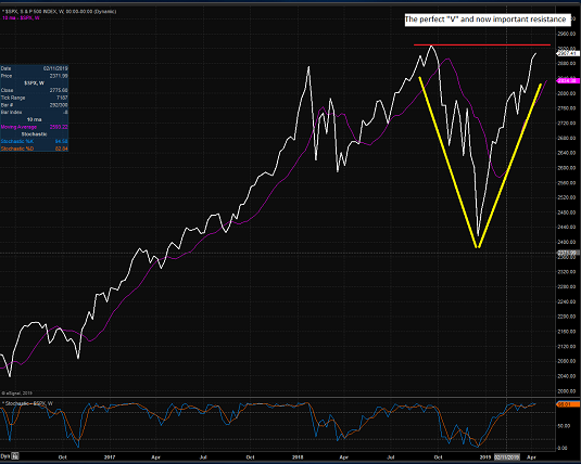
View Larger Chart
But hasn't it been the "expectations" of what will come next in Ms. Market's game that is really behind the hedgies being on the wrong side of the trade? Hasn't it been "prudent" to be cautious since December 24th? And hasn't the market made a mockery of both ideas for the past 4 months - and past 560 S&P points?
The "Retest" Was A Lock
Lest we forget, when markets fall 20% in short order there is usually a reason. In this case, it was the triumvirate of slowing global growth and fears of policy missteps by both the Fed (raising rates too far) and the administration (engaging in a prolonged trade war) that caused traders to hit the sell button early and often in the fourth quarter of last year.
It is also worth noting that the vast majority of the downside debacle occurred in rapid fashion between 12/3 and 12/24. Recall that the S&P 500 plunged -15.9% during that 13.5 day stretch. Thus, to those keeping track of such things, the move qualified as a "waterfall decline."
Every manager who has been around awhile knows that when a market experiences a "waterfall decline," the trading tends to follow a familiar pattern in the coming months. As the "crash playbook" tells us, first there is a bounce of the dead cat variety, then a retest of the lows (which can take many forms), a basing period (to make sure the worst is over), and finally, a resumption of the uptrend.
Therefore, just about everybody in the game has been looking for a retest phase since about mid-January. The reason that retests occur is rooted in psychology and human emotion. You see, usually, the initial reason for the big decline rears its ugly head again at least a time or two in the months following an emotional low. And when it does, the selling tends to resume - at least for a while. Sometimes, the lows are tested. Sometimes, they break. Oftentimes they don't. But at the very least, stocks usually pull back as some fear returns for a spell.
Until It Wasn't
But this time around, the crash playbook turned out to be useless. The market's problems were cured tout suite as the Fed caved and the administration figured out that they'd best get a trade deal done - now. Thus, there has been no retest. There has been no resurrection of the reasons for the decline. No, now it's all about future expectations and brighter days.
So, I get it. The correction has now been corrected and prices are back to where they were before the dance to the downside began. Yet at the same time, even the most ardent bulls will admit that the current pace of advance is unsustainable.
So, at some point, the current rally will pause (during the "Sell in May" period, perhaps?). At some point, stocks will pull back a bit (and perhaps test the seemingly all-important 200-day moving average?). And at some point, an entry point that so many have been looking for in 2019 will appear.
However, given the strength of the move and the readings seen on our Fundamental Factors board, I'm of the mind that any pause in the action, any pullback, or any "testing" will prove temporary as all the underinvested folks decide that new highs will be their "sign" to get back in the game.
Weekly Market Model Review
Now let's turn to the weekly review of my favorite indicators and market models...
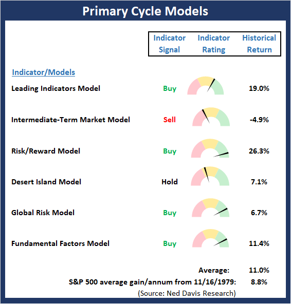
The State of the Big-Picture Market Models
I like to start each week with a review of the state of my favorite big-picture market models, which are designed to help me determine which team is in control of the primary trend.
View My Favorite Market Models Online
The Bottom Line:
- There were no major changes to the "Primary Cycle" board this week. However, there was some improvement in the readings of the Risk/Reward and Global Risk models as both are now solidly positive. Our Intermediate-Term Market model remains stubbornly concerned about the overbought condition and sentiment readings and my "Desert Island" model also appears to be a bit out of sync with the current environment. But the bottom line is the average historical return of the board is well above the historical mean.
This week's mean percentage score of my 6 favorite models advanced to 65.7% from 58% last week (Prior readings: 49.5%, 47%, 50%, 47.9%, 45.4%, 40.3%) while the median improved to 74.2% from 65.9% last week (Prior readings: 50%, 50%, 50%, 50%, 46.3%, 42.5%).
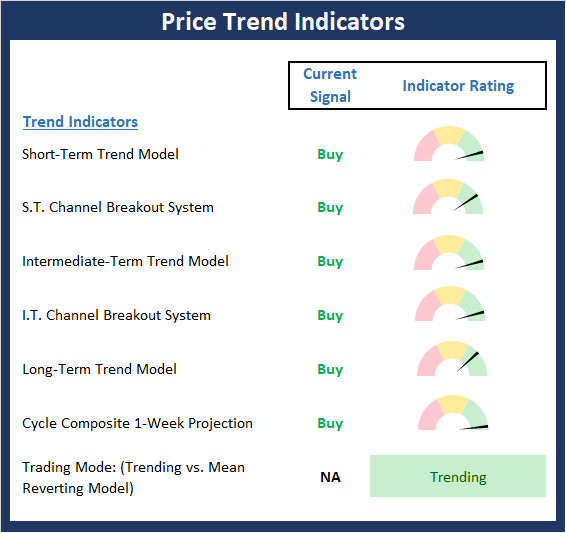
The State of the Trend
Once I've reviewed the big picture, I then turn to the "state of the trend." These indicators are designed to give us a feel for the overall health of the current short- and intermediate-term trend models.
View Trend Indicator Board Online
The Bottom Line:
- The Price Trend board has scored perfect 10.0 for a second week. Sometimes it is best not to overthink things as the trend is obviously an investor's friend here.
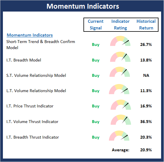
The State of Internal Momentum
Next up are the momentum indicators, which are designed to tell us whether there is any "oomph" behind the current trend.
View Momentum Indicator Board Online
The Bottom Line:
- The Momentum board is also in very good shape. And with the board also scoring a perfect 10.0, momentum confirms the message from the trend indicators. As I've been saying, the big takeaway from the strong momentum readings is this remains a buy-the-dip environment.
The State of the "Trade"
We also focus each week on the "early warning" board, which is designed to indicate when traders might start to "go the other way" -- for a trade.
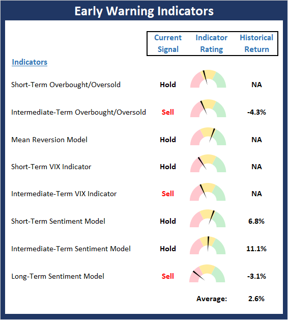
View Early Warning Indicator Board Online
The Bottom Line:
- While the Early Warning board is not overtly negative at this time (which would indicate that the odds strongly favored the bears), the board does continue to effectively wave a yellow flag. So, I'm going to repeat what I said last week and opine that the table is now "set" for the bears. However, as is often the case with mean reversion indicators, it looks like a bearish trigger will be needed to create anything more than a modest setback in the near-term.
The State of the Macro Picture
Now let's move on to the market's fundamental factors - the indicators designed to tell us the state of the big-picture market drivers including monetary conditions, the economy, inflation, and valuations.
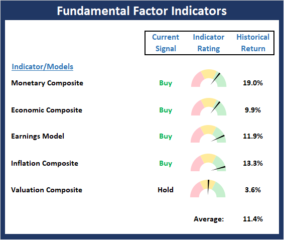
View Fundamental Indicator Board Online
The Bottom Line:
- There were some modest internal improvement to the Fundamentals board this week. Specifically, the Monetary Composite continues to advance. As I've been saying, the bottom line here is I believe the Fundamental board continues to favor the bulls.
Thought For The Day:
The pessimist complains about the wind; the optimist expects it to change; the realist adjusts the sails. - William Arthur Ward
Wishing you green screens and all the best for a great day,

David D. Moenning
Founder, Chief Investment Officer
Heritage Capital Research
HCR Focuses on a Risk-Managed Approach to Investing
What Risk Management Can and Cannot Do

HCR Awarded Top Honors in 2018 NAAIM Shark Tank Portfolio Strategy Competition
Each year, NAAIM (National Association of Active Investment Managers) hosts a competition to identify the best actively managed investment strategies. In April, HCR's Dave Moenning took home first place for his flagship risk management strategy.
Disclosures
At the time of publication, Mr. Moenning held long positions in the following securities mentioned: None - Note that positions may change at any time.
Leading Indicators Model: A group of indicators that have historically shown tendencies to lead the market at major turning points.
Intermediate-Term Market Model: A composite model (model of models) focused on trend and momentum indicators which has been designed to provide identify intermediate-term trading opportunities.
Risk/Reward Model: A model-of-models intended to provide an overall view of the state of the risk/reward environment. The model includes tape, monetary, and sentiment indicators as well as 7 big-picture market model readings.
Desert Island Model: If I was stranded on a desert island with access to only one market model to manage money with, this would be the model. The model is a comprehensive model-of-models comprised of trend, momentum, mean reversion, economic, monetary, sentiment, and factor-based indicators/models.
External Factors Model: A model-of-models designed to provide a reading on the "macro state" of the market environment. The model is comprised of indicators/models in the areas of various index yields, industrial production, investors sentiment, and historic volatility.
Short-Term Trend-and-Breadth Signal Explained: History shows the most reliable market moves tend to occur when the breadth indices are in gear with the major market averages. When the breadth measures diverge, investors should take note that a trend reversal may be at hand. This indicator incorporates NDR's All-Cap Dollar Weighted Equity Series and A/D Line. From 1998, when the A/D line is above its 5-day smoothing and the All-Cap Equal Weighted Equity Series is above its 25-day smoothing, the equity index has gained at a rate of +32.5% per year. When one of the indicators is above its smoothing, the equity index has gained at a rate of +13.3% per year. And when both are below, the equity index has lost +23.6% per year.
Channel Breakout System Explained: The short-term and intermediate-term Channel Breakout Systems are modified versions of the Donchian Channel indicator. According to Wikipedia, "The Donchian channel is an indicator used in market trading developed by Richard Donchian. It is formed by taking the highest high and the lowest low of the last n periods. The area between the high and the low is the channel for the period chosen."
Intermediate-Term Trend-and-Breadth Signal Explained: This indicator incorporates NDR's All-Cap Dollar Weighted Equity Series and A/D Line. From 1998, when the A/D line is above its 45-day smoothing and the All-Cap Equal Weighted Equity Series is above its 45-day smoothing, the equity index has gained at a rate of +17.6% per year. When one of the indicators is above its smoothing, the equity index has gained at a rate of +6.5% per year. And when both are below, the equity index has lost -1.3% per year.
Cycle Composite Projections: The cycle composite combines the 1-year Seasonal, 4-year Presidential, and 10-year Decennial cycles. The indicator reading shown uses the cycle projection for the upcoming week.
Trading Mode Indicator: This indicator attempts to identify whether the current trading environment is "trending" or "mean reverting." The indicator takes the composite reading of the Efficiency Ratio, the Average Correlation Coefficient, and Trend Strength models.
Volume Relationship Models: These models review the relationship between "supply" and "demand" volume over the short- and intermediate-term time frames.
Price Thrust Model Explained: This indicator measures the 3-day rate of change of the Value Line Composite relative to the standard deviation of the 30-day average. When the Value Line's 3-day rate of change have moved above 0.5 standard deviation of the 30-day average ROC, a "thrust" occurs and since 2000, the Value Line Composite has gained ground at a rate of +20.6% per year. When the indicator is below 0.5 standard deviation of the 30-day, the Value Line has lost ground at a rate of -10.0% per year. And when neutral, the Value Line has gained at a rate of +5.9% per year.
Volume Thrust Model Explained: This indicator uses NASDAQ volume data to indicate bullish and bearish conditions for the NASDAQ Composite Index. The indicator plots the ratio of the 10-day total of NASDAQ daily advancing volume (i.e., the total volume traded in stocks which rose in price each day) to the 10-day total of daily declining volume (volume traded in stocks which fell each day). This ratio indicates when advancing stocks are attracting the majority of the volume (readings above 1.0) and when declining stocks are seeing the heaviest trading (readings below 1.0). This indicator thus supports the case that a rising market supported by heavier volume in the advancing issues tends to be the most bullish condition, while a declining market with downside volume dominating confirms bearish conditions. When in a positive mode, the NASDAQ Composite has gained at a rate of +38.3% per year, When neutral, the NASDAQ has gained at a rate of +13.3% per year. And when negative, the NASDAQ has lost at a rate of -14.149% per year.
Breadth Thrust Model Explained: This indicator uses the number of NASDAQ-listed stocks advancing and declining to indicate bullish or bearish breadth conditions for the NASDAQ Composite. The indicator plots the ratio of the 10-day total of the number of stocks rising on the NASDAQ each day to the 10-day total of the number of stocks declining each day. Using 10-day totals smooths the random daily fluctuations and gives indications on an intermediate-term basis. As expected, the NASDAQ Composite performs much better when the 10-day A/D ratio is high (strong breadth) and worse when the indicator is in its lower mode (weak breadth). The most bullish conditions for the NASDAQ when the 10-day A/D indicator is not only high, but has recently posted an extreme high reading and thus indicated a thrust of upside momentum. Bearish conditions are confirmed when the indicator is low and has recently signaled a downside breadth thrust. In positive mode, the NASDAQ has gained at a rate of +22.1% per year since 1981. In a neutral mode, the NASDAQ has gained at a rate of +14.5% per year. And when in a negative mode, the NASDAQ has lost at a rate of -6.4% per year.
Short-Term Overbought/sold Indicator: This indicator is the current reading of the 14,1,3 stochastic oscillator. When the oscillator is above 80 and the %K is above the %D, the indicator gives an overbought reading. Conversely, when the oscillator is below 20 and %K is below its %D, the indicator is oversold.
Intermediate-Term Overbought/sold Indicator: This indicator is a 40-day RSI reading. When above 57.5, the indicator is considered overbought and wnen below 45 it is oversold.
Mean Reversion Model: This is a diffusion model consisting of five indicators that can produce buy and sell signals based on overbought/sold conditions.
VIX Indicator: This indicators looks at the current reading of the VIX relative to standard deviation bands. When the indicator reaches an extreme reading in either direction, it is an indication that a market trend could reverse in the near-term.
Short-Term Sentiment Indicator: This is a model-of-models composed of 18 independent sentiment indicators designed to indicate when market sentiment has reached an extreme from a short-term perspective. Historical analysis indicates that the stock market's best gains come after an environment has become extremely negative from a sentiment standpoint. Conversely, when sentiment becomes extremely positive, market returns have been subpar.
Intermediate-Term Sentiment Indicator: This is a model-of-models composed of 7 independent sentiment indicators designed to indicate when market sentiment has reached an extreme from a intrmediate-term perspective. Historical analysis indicates that the stock market's best gains come after an environment has become extremely negative from a sentiment standpoint. Conversely, when sentiment becomes extremely positive, market returns have been subpar.
Long-Term Sentiment Indicator: This is a model-of-models composed of 6 independent sentiment indicators designed to indicate when market sentiment has reached an extreme from a long-term perspective. Historical analysis indicates that the stock market's best gains come after an environment has become extremely negative from a sentiment standpoint. Conversely, when sentiment becomes extremely positive, market returns have been subpar.
Absolute Monetary Model Explained: The popular cliche, "Don't fight the Fed" is really a testament to the profound impact that interest rates and Fed policy have on the market. It is a proven fact that monetary conditions are one of the most powerful influences on the direction of stock prices. The Absolute Monetary Model looks at the current level of interest rates relative to historical levels and Fed policy.
Relative Monetary Model Explained: The "relative" monetary model looks at monetary indicators relative to recent levels as well as rates of change and Fed Policy.
Economic Model Explained: During the middle of bull and bear markets, understanding the overall health of the economy and how it impacts the stock market is one of the few truly logical aspects of the stock market. When our Economic model sports a "positive" reading, history (beginning in 1965) shows that stocks enjoy returns in excess of 21% per year. Yet, when the model's reading falls into the "negative" zone, the S&P has lost nearly -25% per year. However, it is vital to understand that there are times when good economic news is actually bad for stocks and vice versa. Thus, the Economic model can help investors stay in tune with where we are in the overall economic cycle.
Inflation Model Explained: They say that "the tape tells all." However, one of the best "big picture" indicators of what the market is expected to do next is inflation. Simply put, since 1962, when the model indicates that inflationary pressures are strong, stocks have lost ground. Yet, when inflationary pressures are low, the S&P 500 has gained ground at a rate in excess of 13%. The bottom line is inflation is one of the primary drivers of stock market returns.
Valuation Model Explained: If you want to get analysts really riled up, you need only to begin a discussion of market valuation. While the question of whether stocks are overvalued or undervalued appears to be a simple one, the subject is actually extremely complex. To simplify the subject dramatically, investors must first determine if they should focus on relative valuation (which include the current level of interest rates) or absolute valuation measures (the more traditional readings of Price/Earnings, Price/Dividend, and Price/Book Value). We believe that it is important to recognize that environments change. And as such, the market's focus and corresponding view of valuations are likely to change as well. Thus, we depend on our Valuation Models to help us keep our eye on the ball.
Disclosures
The opinions and forecasts expressed herein are those of Mr. David Moenning and may not actually come to pass. Mr. Moenning's opinions and viewpoints regarding the future of the markets should not be construed as recommendations. The analysis and information in this report is for informational purposes only. No part of the material presented in this report is intended as an investment recommendation or investment advice. Neither the information nor any opinion expressed constitutes a solicitation to purchase or sell securities or any investment program.
Any investment decisions must in all cases be made by the reader or by his or her investment adviser. Do NOT ever purchase any security without doing sufficient research. There is no guarantee that the investment objectives outlined will actually come to pass. All opinions expressed herein are subject to change without notice. Neither the editor, employees, nor any of their affiliates shall have any liability for any loss sustained by anyone who has relied on the information provided.
Mr. Moenning may at times have positions in the securities referred to and may make purchases or sales of these securities while publications are in circulation. Positions may change at any time.
The analysis provided is based on both technical and fundamental research and is provided "as is" without warranty of any kind, either expressed or implied. Although the information contained is derived from sources which are believed to be reliable, they cannot be guaranteed.
Investments in equities carry an inherent element of risk including the potential for significant loss of principal. Past performance is not an indication of future results.