Does #GrowthSlowing Suddenly Matter?
One of my favorite sayings on Wall Street is, "Things don't matter until they do. But then they matter a lot."
For example, the dueling issues of #GrowthSlowing and the flattening yield curve have been with us for quite some time now. In fact, we've known that global growth has been slowing for more than a year. We've known that the torrid pace of growth in the U.S. economy and corporate earnings would have to slow for almost as long. And we've been watching the yield on the U.S. 10-year fall steadily for the last 6 months.
Yet on Thursday, March 21, 2019, the stock market appeared to make a meaningful break above an important resistance zone as the S&P 500 and NASDAQ both stepped lively to their highest respective closes since last October. To the bulls, this meant that investors were ignoring the current data (you know, the growth slowing stuff) and focusing on better days ahead.
After all, the Fed has reversed course and is now on hold, and the trade deal - the deal that the bulls hope will spark a resurgence in global economic activity - is expected to get done. All good, right?
Lest we forget, the stock market is a discounting mechanism of future activity. So, the bullish premise actually made some sense.
But then it happened. The yield curve (as defined by the spread between the yield on the U.S. 3-Month T-Bill and the 10-Year Treasury Bond) inverted. Meaning that the yield of the longer-dated bonds fell below that of short-term T-Bills.
Yep, that's right; what is known as the nearly infallible predictor of U.S. recessions flashed a sell signal on Friday. And apparently the algos knew what to do with that.
Suddenly, the concept of #GrowthSlowing mattered. No one had given it a thought the day before. But now that the predictor of the last seven recessions here in the good 'ol USofA had flipped from green to red, this was suddenly a problem.
As in a drop of -2% kind of a problem.
The impetus for the rather sudden concern about the yield curve was the nasty manufacturing data out of Germany and the Eurozone. In short, Germany's PMI, as calculated by IHS Markit, fell to the lowest level since 2012 and the New Orders component hit it's lowest reading since, wait for it... 2008. Ouch.
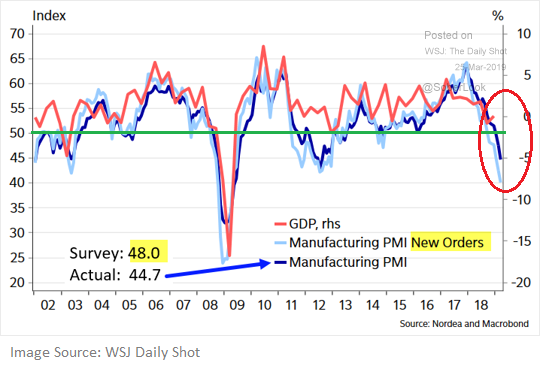
This report was accompanied by the fact that Germany's official GDP for Q4 came in at 0.0% and the PMI for the Euro area was the weakest since 2013. Now couple this not-so-hot news with some recent weak data in the U.S., the yield curve inverting, and word that the Mueller Report would be delivered imminently and well, things started to unravel pretty quickly Friday.
So, Is It Time To Worry?
Another WallStreet-ism that might be applicable here is, "one day does not a trend make."
In this case, it is important to recognize that the yield curve inverting for a single day isn't "the" signal that a recession is about to happen. Especially in the era of high-speed trading (across all markets, around the globe) where things can - and often do - turn on a dime.
No, the point is that the yield curve will need to stay inverted for some time before we should view this as a harbinger of bad things to come.
The chart below makes this point clear. On a monthly basis, the yield curve has inverted before the last three recessions. But it also important to note that the yield curve has inverted at least eight times since 1965. And yes, six times recessions did follow. But the key here is that the indicator isn't perfect. Nor has it even flashed a signal yet (although we are just a week away from the latest update).
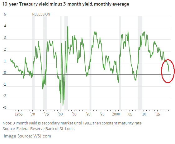
In addition, those seeing the glass as at least half-full can argue that there is generally a pretty decent lag between the time when the yield curve inverts and when a recession begins. As such, there is still time for good things to happen.
You know, like a tremendous trade deal. Or lower rates to encourage home buying and capex. Or action by the central bankers of the world. Or for the data to improve.
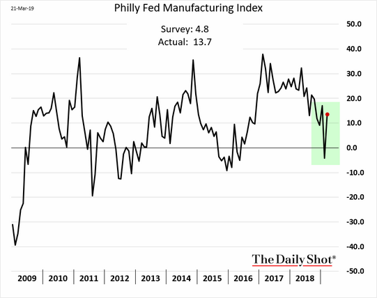
On that note, don't look now bear fans, but last week's Philly Fed report actually rebounded nicely in March.
In addition, the recent report from the Conference Board's Leading Economic Indicators came in above expectations. As did the latest data on Existing Home Sales.
Speaking of the data - particularly the U.S. data, that is - let's also keep in mind that the long government shutdown likely impacted the efficiency/accuracy of some of the numbers. So, there's that.
To be sure, the trend of a lot of economic data has not been going in the right direction. As such, it will be important to keep an extra close eye on the data in the coming months. Because in short, if the trend can turn - or at least flatten out - then the risk of recession in the U.S. declines.
The Key Point
My key point on this fine Monday morning is that from a macro point of view, nothing changed on Friday. There was no new information provided. I.E. Everybody knows that growth has been slowing.
The question we should be asking is if the slowdown is going to get worse. Remember, the U.S. economy is driven by the consumer. And the bottom line is consumers like to spend money. Unless, of course, there is a crisis that puts their jobs or the economy at risk. Then they tend to stop on a dime and wait to see if everything will be okay. But then it's back to the malls and to all those shopping sites.
So, will the inverted yield curve become reason enough for traders to move to a risk-off mode for a while? Sure, that could certainly happen. The big boys and girls on Wall Street do love a good bout of volatility to spruce up their trading returns.
But for most of this year, investors - you know, the folks with an investing time frame beyond lunch - have been looking at the bright side. And unless something bad actually happens, I would expect to see this continue. Once the dust settles, of course.
Weekly Market Model Review
Now let's turn to the weekly review of my favorite indicators and market models...
The State of the Big-Picture Market Models
I like to start each week with a review of the state of my favorite big-picture market models, which are designed to help me determine which team is in control of the primary trend.

View My Favorite Market Models Online
The Bottom Line:
- There were no changes to the "Primary Cycle" board this week. The bottom line is the board continues to suggest that this is not a low risk, pedal-to-the-metal environment and that some caution remains warranted.
This week's mean percentage score of my 6 favorite models slipped to 47% from 50% last week (Prior readings: 47.9%, 45.4%, 40.3%) while the median held steady at 50.0% from 50% last week (Prior readings: 50%, 46.3%, 42.5%).
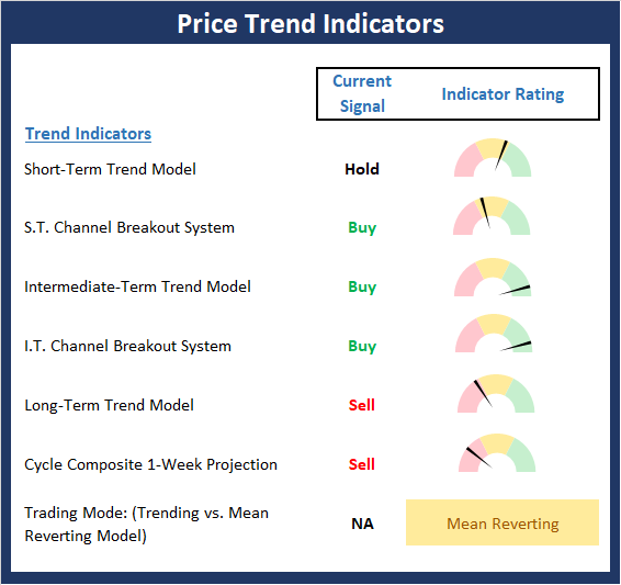
The State of the Trend
Once I've reviewed the big picture, I then turn to the "state of the trend." These indicators are designed to give us a feel for the overall health of the current short- and intermediate-term trend models.
View Trend Indicator Board Online
The Bottom Line:
- Until Friday of last week, the trend was clear. Thursday's action appeared to confirm that a breakout had occurred and that a new leg higher was about to begin. However, Friday's reaction to the yield curve inverting and late news that the Mueller Report would be released caused the sell algos to kick into high gear. The selling erased the bull's work for the week and puts the status of the near-term trend in question. The good news is the longer-term trend indicators remain in good shape.
The State of Internal Momentum
Next up are the momentum indicators, which are designed to tell us whether there is any "oomph" behind the current trend.
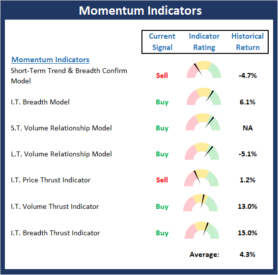
View Momentum Indicator Board Online
The Bottom Line:
- The Momentum board suggests that the internals have slipped a bit over the last few weeks. However, I will again state that due to the strong momentum seen during the initial phase of the rally, this board tells us a buy-the-dip environment remains present.
The State of the "Trade"
We also focus each week on the "early warning" board, which is designed to indicate when traders might start to "go the other way" -- for a trade.
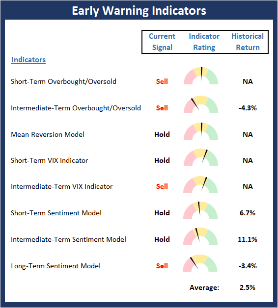
View Early Warning Indicator Board Online
The Bottom Line:
- The Early Warning board continues to wave a yellow flag but at this stage, doesn't really give either team an edge.
The State of the Macro Picture
Now let's move on to the market's fundamental factors - the indicators designed to tell us the state of the big-picture market drivers including monetary conditions, the economy, inflation, and valuations.
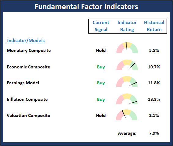
View Fundamental Indicator Board Online
The Bottom Line:
- There are no real changes to be found on the Fundamentals board. In short, the board suggests the backdrop remains constructive and for now at least, the bulls have possession.
Thought For The Day:
Those who have knowledge, don't predict. Those who predict, don't have knowledge. -Lao Tzu
Wishing you green screens and all the best for a great day,

David D. Moenning
Founder, Chief Investment Officer
Heritage Capital Research
HCR Focuses on a Risk-Managed Approach to Investing
What Risk Management Can and Cannot Do

HCR Awarded Top Honors in 2018 NAAIM Shark Tank Portfolio Strategy Competition
Each year, NAAIM (National Association of Active Investment Managers) hosts a competition to identify the best actively managed investment strategies. In April, HCR's Dave Moenning took home first place for his flagship risk management strategy.
Disclosures
At the time of publication, Mr. Moenning held long positions in the following securities mentioned: None - Note that positions may change at any time.
Leading Indicators Model: A group of indicators that have historically shown tendencies to lead the market at major turning points.
Intermediate-Term Market Model: A composite model (model of models) focused on trend and momentum indicators which has been designed to provide identify intermediate-term trading opportunities.
Risk/Reward Model: A model-of-models intended to provide an overall view of the state of the risk/reward environment. The model includes tape, monetary, and sentiment indicators as well as 7 big-picture market model readings.
Desert Island Model: If I was stranded on a desert island with access to only one market model to manage money with, this would be the model. The model is a comprehensive model-of-models comprised of trend, momentum, mean reversion, economic, monetary, sentiment, and factor-based indicators/models.
External Factors Model: A model-of-models designed to provide a reading on the "macro state" of the market environment. The model is comprised of indicators/models in the areas of various index yields, industrial production, investors sentiment, and historic volatility.
Short-Term Trend-and-Breadth Signal Explained: History shows the most reliable market moves tend to occur when the breadth indices are in gear with the major market averages. When the breadth measures diverge, investors should take note that a trend reversal may be at hand. This indicator incorporates NDR's All-Cap Dollar Weighted Equity Series and A/D Line. From 1998, when the A/D line is above its 5-day smoothing and the All-Cap Equal Weighted Equity Series is above its 25-day smoothing, the equity index has gained at a rate of +32.5% per year. When one of the indicators is above its smoothing, the equity index has gained at a rate of +13.3% per year. And when both are below, the equity index has lost +23.6% per year.
Channel Breakout System Explained: The short-term and intermediate-term Channel Breakout Systems are modified versions of the Donchian Channel indicator. According to Wikipedia, "The Donchian channel is an indicator used in market trading developed by Richard Donchian. It is formed by taking the highest high and the lowest low of the last n periods. The area between the high and the low is the channel for the period chosen."
Intermediate-Term Trend-and-Breadth Signal Explained: This indicator incorporates NDR's All-Cap Dollar Weighted Equity Series and A/D Line. From 1998, when the A/D line is above its 45-day smoothing and the All-Cap Equal Weighted Equity Series is above its 45-day smoothing, the equity index has gained at a rate of +17.6% per year. When one of the indicators is above its smoothing, the equity index has gained at a rate of +6.5% per year. And when both are below, the equity index has lost -1.3% per year.
Cycle Composite Projections: The cycle composite combines the 1-year Seasonal, 4-year Presidential, and 10-year Decennial cycles. The indicator reading shown uses the cycle projection for the upcoming week.
Trading Mode Indicator: This indicator attempts to identify whether the current trading environment is "trending" or "mean reverting." The indicator takes the composite reading of the Efficiency Ratio, the Average Correlation Coefficient, and Trend Strength models.
Volume Relationship Models: These models review the relationship between "supply" and "demand" volume over the short- and intermediate-term time frames.
Price Thrust Model Explained: This indicator measures the 3-day rate of change of the Value Line Composite relative to the standard deviation of the 30-day average. When the Value Line's 3-day rate of change have moved above 0.5 standard deviation of the 30-day average ROC, a "thrust" occurs and since 2000, the Value Line Composite has gained ground at a rate of +20.6% per year. When the indicator is below 0.5 standard deviation of the 30-day, the Value Line has lost ground at a rate of -10.0% per year. And when neutral, the Value Line has gained at a rate of +5.9% per year.
Volume Thrust Model Explained: This indicator uses NASDAQ volume data to indicate bullish and bearish conditions for the NASDAQ Composite Index. The indicator plots the ratio of the 10-day total of NASDAQ daily advancing volume (i.e., the total volume traded in stocks which rose in price each day) to the 10-day total of daily declining volume (volume traded in stocks which fell each day). This ratio indicates when advancing stocks are attracting the majority of the volume (readings above 1.0) and when declining stocks are seeing the heaviest trading (readings below 1.0). This indicator thus supports the case that a rising market supported by heavier volume in the advancing issues tends to be the most bullish condition, while a declining market with downside volume dominating confirms bearish conditions. When in a positive mode, the NASDAQ Composite has gained at a rate of +38.3% per year, When neutral, the NASDAQ has gained at a rate of +13.3% per year. And when negative, the NASDAQ has lost at a rate of -13.239% per year.
Breadth Thrust Model Explained: This indicator uses the number of NASDAQ-listed stocks advancing and declining to indicate bullish or bearish breadth conditions for the NASDAQ Composite. The indicator plots the ratio of the 10-day total of the number of stocks rising on the NASDAQ each day to the 10-day total of the number of stocks declining each day. Using 10-day totals smooths the random daily fluctuations and gives indications on an intermediate-term basis. As expected, the NASDAQ Composite performs much better when the 10-day A/D ratio is high (strong breadth) and worse when the indicator is in its lower mode (weak breadth). The most bullish conditions for the NASDAQ when the 10-day A/D indicator is not only high, but has recently posted an extreme high reading and thus indicated a thrust of upside momentum. Bearish conditions are confirmed when the indicator is low and has recently signaled a downside breadth thrust. In positive mode, the NASDAQ has gained at a rate of +22.1% per year since 1981. In a neutral mode, the NASDAQ has gained at a rate of +14.5% per year. And when in a negative mode, the NASDAQ has lost at a rate of -6.4% per year.
Short-Term Overbought/sold Indicator: This indicator is the current reading of the 14,1,3 stochastic oscillator. When the oscillator is above 80 and the %K is above the %D, the indicator gives an overbought reading. Conversely, when the oscillator is below 20 and %K is below its %D, the indicator is oversold.
Intermediate-Term Overbought/sold Indicator: This indicator is a 40-day RSI reading. When above 57.5, the indicator is considered overbought and wnen below 45 it is oversold.
Mean Reversion Model: This is a diffusion model consisting of five indicators that can produce buy and sell signals based on overbought/sold conditions.
VIX Indicator: This indicators looks at the current reading of the VIX relative to standard deviation bands. When the indicator reaches an extreme reading in either direction, it is an indication that a market trend could reverse in the near-term.
Short-Term Sentiment Indicator: This is a model-of-models composed of 18 independent sentiment indicators designed to indicate when market sentiment has reached an extreme from a short-term perspective. Historical analysis indicates that the stock market's best gains come after an environment has become extremely negative from a sentiment standpoint. Conversely, when sentiment becomes extremely positive, market returns have been subpar.
Intermediate-Term Sentiment Indicator: This is a model-of-models composed of 7 independent sentiment indicators designed to indicate when market sentiment has reached an extreme from a intrmediate-term perspective. Historical analysis indicates that the stock market's best gains come after an environment has become extremely negative from a sentiment standpoint. Conversely, when sentiment becomes extremely positive, market returns have been subpar.
Long-Term Sentiment Indicator: This is a model-of-models composed of 6 independent sentiment indicators designed to indicate when market sentiment has reached an extreme from a long-term perspective. Historical analysis indicates that the stock market's best gains come after an environment has become extremely negative from a sentiment standpoint. Conversely, when sentiment becomes extremely positive, market returns have been subpar.
Absolute Monetary Model Explained: The popular cliche, "Don't fight the Fed" is really a testament to the profound impact that interest rates and Fed policy have on the market. It is a proven fact that monetary conditions are one of the most powerful influences on the direction of stock prices. The Absolute Monetary Model looks at the current level of interest rates relative to historical levels and Fed policy.
Relative Monetary Model Explained: The "relative" monetary model looks at monetary indicators relative to recent levels as well as rates of change and Fed Policy.
Economic Model Explained: During the middle of bull and bear markets, understanding the overall health of the economy and how it impacts the stock market is one of the few truly logical aspects of the stock market. When our Economic model sports a "positive" reading, history (beginning in 1965) shows that stocks enjoy returns in excess of 21% per year. Yet, when the model's reading falls into the "negative" zone, the S&P has lost nearly -25% per year. However, it is vital to understand that there are times when good economic news is actually bad for stocks and vice versa. Thus, the Economic model can help investors stay in tune with where we are in the overall economic cycle.
Inflation Model Explained: They say that "the tape tells all." However, one of the best "big picture" indicators of what the market is expected to do next is inflation. Simply put, since 1962, when the model indicates that inflationary pressures are strong, stocks have lost ground. Yet, when inflationary pressures are low, the S&P 500 has gained ground at a rate in excess of 13%. The bottom line is inflation is one of the primary drivers of stock market returns.
Valuation Model Explained: If you want to get analysts really riled up, you need only to begin a discussion of market valuation. While the question of whether stocks are overvalued or undervalued appears to be a simple one, the subject is actually extremely complex. To simplify the subject dramatically, investors must first determine if they should focus on relative valuation (which include the current level of interest rates) or absolute valuation measures (the more traditional readings of Price/Earnings, Price/Dividend, and Price/Book Value). We believe that it is important to recognize that environments change. And as such, the market's focus and corresponding view of valuations are likely to change as well. Thus, we depend on our Valuation Models to help us keep our eye on the ball.
Disclosures
The opinions and forecasts expressed herein are those of Mr. David Moenning and may not actually come to pass. Mr. Moenning's opinions and viewpoints regarding the future of the markets should not be construed as recommendations. The analysis and information in this report is for informational purposes only. No part of the material presented in this report is intended as an investment recommendation or investment advice. Neither the information nor any opinion expressed constitutes a solicitation to purchase or sell securities or any investment program.
Any investment decisions must in all cases be made by the reader or by his or her investment adviser. Do NOT ever purchase any security without doing sufficient research. There is no guarantee that the investment objectives outlined will actually come to pass. All opinions expressed herein are subject to change without notice. Neither the editor, employees, nor any of their affiliates shall have any liability for any loss sustained by anyone who has relied on the information provided.
Mr. Moenning may at times have positions in the securities referred to and may make purchases or sales of these securities while publications are in circulation. Positions may change at any time.
The analysis provided is based on both technical and fundamental research and is provided "as is" without warranty of any kind, either expressed or implied. Although the information contained is derived from sources which are believed to be reliable, they cannot be guaranteed.
Investments in equities carry an inherent element of risk including the potential for significant loss of principal. Past performance is not an indication of future results.