Garden-Variety So Far, But...
I've got an early meeting (who's idea was it to schedule a board meeting for 7:00am on a Monday??) and I am traveling the rest of the week, so I'm up early and would like to apologize in advance if this morning's market missive meanders more than normal!
From my seat, the key question of the day/month/quarter is if the current correction will morph into a cyclical bear market cycle. So far at least, the downside action we've seen since the beginning of October would qualify as a garden-variety correction. Yes, the action has been wild and woolly at times as the machines push the market to and fro at an eye-popping rate. Yet, it is important to recognize that on a closing basis, the S&P's decline has totaled -9.88%, which by historical standards is pretty standard fare as corrections go.
The damage done to the Smallcaps and Midcaps has not been quite as orderly as the iShares Russell 2000 ETF (NYSE: IWM) has pulled back -15.6% at its low and the SPDR Midcap 400 has dropped -12.9%.
This is to say nothing of the outright bear market that is occurring in so many markets outside our shores. For example, the iShares China EFT (NYSE: FXI) had fallen -29.15% as of Monday's close, Europe (as measured by the iShares Eurozone ETF - symbol EZU) was down -22.6%, and the emerging markets (NYSE: EEM) were off -27.8%.
The problem is that since 1970, there have been 31 corrections of 10% or more in the global markets. The median decline has been -19% on the ACWI (the current decline is -13.6%) and the odds of the decline growing to -15% or more is 55%. The important thing to remember is that we now live in a global marketplace. As such, it is tough for any single country to avoid the pain if the rest of the global markets are in a world of hurt. Thus, it isn't much of a stretch to think that there may be some additional downside ahead in the global markets and that the U.S. might have some catching up to do.
Putting The Correction in Perspective
To clarify, my view is the secular bull market that began on March 9, 2009 is ongoing and is not at risk here. And even if the bears do get their game on and push the S&P below the February lows (a move that would undoubtedly invigorate the bears to push prices lower - likely in a "whoosh" fashion), this is unlikely to change. So, we're not talking about another market Armageddon such as occurred in 2000-02 and 2007-09. No, instead, I think we're talking about a cyclical move (aka a "mini" bear) within the context of a secular bull trend.
Valuations Might Provide a Clue
In pondering the question at hand (as in, will we see a cyclical or "mini" bear unfold in the coming months?) I found myself tinkering around with valuation metrics. The chart below caught my eye.
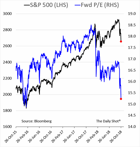
At first blush, this chart appears to be encouraging because the blue line, which is the the S&P's "Forward P/E" (the Price-to-Earnings ratio using the estimated earnings for the next 12 months) is suddenly much lower/improved. In fact, it's back to where it was in February of 2016. You know, the last time a cyclical bear market ended. This is good, right?
Being curious, I then wondered about the upside potential from this new, much improved valuation level. So, I dug into the NDR database and found that the 12-month projection for EPS (earnings per share) of the S&P 500 is $176.52.
The Upside Projection
I then grabbed my trusty solar-powered calculator and did some math. I figured that once this correction blew over, the market multiple would return to "normal." And based on the latest cycle, it looked to me that the Forward P/E could easily advance back to the 17 to 17.5 range without the bears screaming about things becoming overheated again. After all, 17 - 17.5 is about the middle of what we've seen over the last three years.
Doing some additional work on the calculator, I found that the S&P could advance to the 3000 - 3090 zone based on this range for the Forward P/E multiple. From Friday's close, this means the market would have upside potential of between 10% and 13.4% over the next year. Not too shabby, right?
I then decided to dig deeper. I was curious as to what the long-term average was for the Forward P/E multiple. In short, this is when the air went out of my upside argument balloon.
You see, the average Forward P/E multiple over the last 35 years has been... wait for it... 14.8. Ugh.
So... 14.8 times $176.52 is 2612, or 4.2% BELOW where the S&P closed on Friday. Thus, if we see average multiples applied to the earnings estimates (estimates that are usually revised lower as time goes on), the upside in the market for the next 12 months is -4.2%. Not exactly a desired result.
Normal or "Abby Normal?"
But... We are not living in "normal" times, are we? No, we currently live in a world where stocks are the best game in town. And because of this, investors have been willing to pay more for a dollar of earnings than they did in the past. And as long as this remains the case, the bulls can't be blamed for holding out some hope.
Finally, I'm reminded of the fact that the best returns typically come from the depths of bear-market despair. So, if the bears are able to find their mojo and can push prices lower in the coming days/weeks/months, it means that opportunities will present themselves once the bear cycle ends. And yes, the bear cycle will end. It always does!
Moving On... Now let's turn to the weekly review of my favorite indicators and market models...
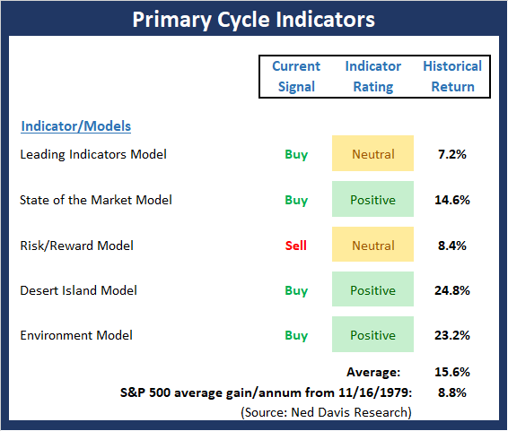
The State of the Big-Picture Market Models
I like to start each week with a review of the state of my favorite big-picture market models, which are designed to help me determine which team is in control of the primary trend.
View My Favorite Market Models Online
The Bottom Line:
- The Primary Cycle board continues to send an interesting message. While the board did a splendid job of providing an early warning that all was not right with the world well before the current corrective phase began, the message now appears to be more upbeat. Thus, my takeaway is that the secular bull remains intact and that we are currently seeing either a garden-variety correction, which was triggered by fear/uncertainty over the course of Fed policy, the state of the Trade War, and the impact of the mid-term Elections, or the early phases of a cyclical or "mini" bear. Stay tuned.
This week's mean percentage score of my 5 favorite models improved to 63.5 (from 62.0%) while the median also advanced to 75% (also from 70%). Finally, it is worth noting that the historical return of the S&P 500 given the current model readings is well above the average.
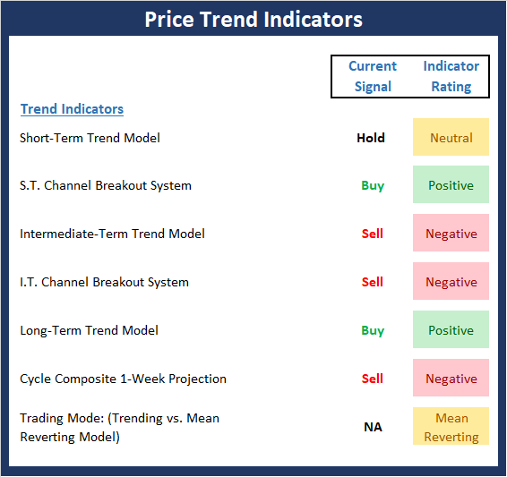
The State of the Trend
Once I've reviewed the big picture, I then turn to the "state of the trend." These indicators are designed to give us a feel for the overall health of the current short- and intermediate-term trend models.
View Trend Indicator Board Online
The Bottom Line:
- Like the major averages, the Trend board has improved a bit to start the week. However, make no mistake about it; a fair amount of technical/trend damage has been done during the decline. Thus, unless there is an actual deal with China and Powell announces the Fed is going to pump the brakes or become "data dependent" in 2019, we can probably expect a bottoming process to play out. The good news is that we are now in the most favorable seasonal period and any good news on any of the news fronts could be rewarded with higher prices.
The State of Internal Momentum
Next up are the momentum indicators, which are designed to tell us whether there is any "oomph" behind the current trend.

View Momentum Indicator Board Online
The Bottom Line:
- There is some good news to report on the momentum front this week. First, our I.T. Breadth Model, which had been very close to issuing an important sell signal, improved last week. This is one of the first positive signs from the momentum category we've seen in a while. Next, the Price Thrust indicator reached the "it's so bad, it's good" zone and has now reversed. And finally, while both the Volume and Breadth Thrust indicators remain on sell signals, the readings upticked to neutral. The end result is a historical return that is above the mean.
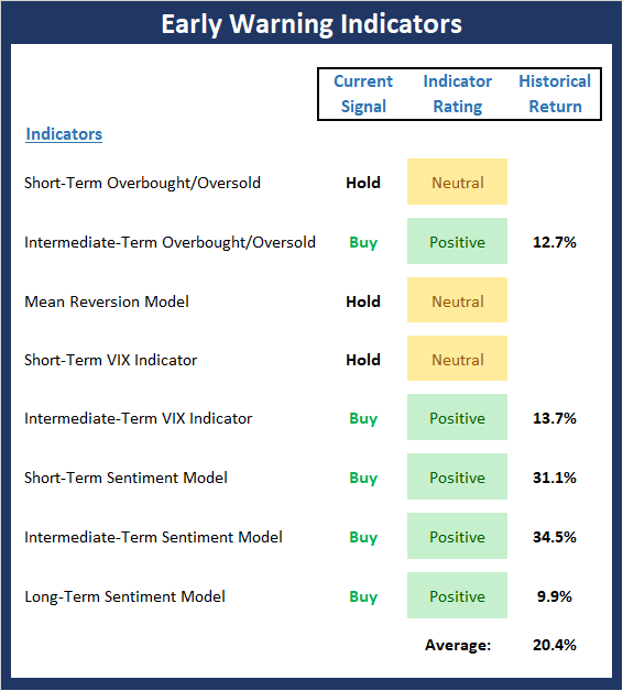
The State of the "Trade"
We also focus each week on the "early warning" board, which is designed to indicate when traders might start to "go the other way" -- for a trade.
View Early Warning Indicator Board Online
The Bottom Line:
- The "Early Warning" board, which, as I've been saying, did a great job of alerting us to the fact that the table had been set for the bears, continues to give the near-term edge to the bulls. It is worth noting that (a) some of the short-term oversold condition has now been worked off, (b) the Mean Reversion model (which gave a timely buy signal last week) is now back to neutral, and (c) sentiment remains negative enough to continue to favor the bulls.
The State of the Macro Picture
Now let's move on to the market's "environmental factors" - the indicators designed to tell us the state of the big-picture market drivers including monetary conditions, the economy, inflation, and valuations.
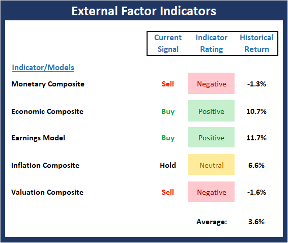
View Environment Indicator Board Online
The Bottom Line:
- There are only slight changes to the External Factors board this week. First, and perhaps most importantly, the Inflation model, which has done a great job alerting us to the trend of inflation over the past three years, appears to have reversed. And while the reading is still in the neutral zone, the trend is important here. Thus, this remains something to keep an eye on in the coming months. In addition, all of our favorite Valuation models are showing improvement. But, the bad news is all remain in the "very overvalued" zone. So, while I hate to sound like a broken record, this board tells us the risk factors remain elevated.
Thought For The Day:
If you don't like something, change it. If you can't change it, change your attitude. -Dr. Maya Angelou
Wishing you green screens and all the best for a great day,

David D. Moenning
Founder, Chief Investment Officer
Heritage Capital Research
HCR Focuses on a Risk-Managed Approach to Investing
What Risk Management Can and Cannot Do

ANNOUNCEMENT:
HCR Awarded Top Honors in 2018 NAAIM Shark Tank Portfolio Strategy Competition
Each year, NAAIM (National Association of Active Investment Managers) hosts a competition to identify the best actively managed investment strategies. In April, HCR's Dave Moenning took home first place for his flagship risk management strategy.
Disclosures
At the time of publication, Mr. Moenning held long positions in the following securities mentioned: none - Note that positions may change at any time.
Indicators Explained
Short-Term Trend-and-Breadth Signal Explained: History shows the most reliable market moves tend to occur when the breadth indices are in gear with the major market averages. When the breadth measures diverge, investors should take note that a trend reversal may be at hand. This indicator incorporates NDR's All-Cap Dollar Weighted Equity Series and A/D Line. From 1998, when the A/D line is above its 5-day smoothing and the All-Cap Equal Weighted Equity Series is above its 25-day smoothing, the equity index has gained at a rate of +32.5% per year. When one of the indicators is above its smoothing, the equity index has gained at a rate of +13.3% per year. And when both are below, the equity index has lost +23.6% per year.
Channel Breakout System Explained: The short-term and intermediate-term Channel Breakout Systems are modified versions of the Donchian Channel indicator. According to Wikipedia, "The Donchian channel is an indicator used in market trading developed by Richard Donchian. It is formed by taking the highest high and the lowest low of the last n periods. The area between the high and the low is the channel for the period chosen."
Intermediate-Term Trend-and-Breadth Signal Explained: This indicator incorporates NDR's All-Cap Dollar Weighted Equity Series and A/D Line. From 1998, when the A/D line is above its 45-day smoothing and the All-Cap Equal Weighted Equity Series is above its 45-day smoothing, the equity index has gained at a rate of +17.6% per year. When one of the indicators is above its smoothing, the equity index has gained at a rate of +6.5% per year. And when both are below, the equity index has lost -1.3% per year.
Cycle Composite Projections: The cycle composite combines the 1-year Seasonal, 4-year Presidential, and 10-year Decennial cycles. The indicator reading shown uses the cycle projection for the upcoming week.
Trading Mode Indicator: This indicator attempts to identify whether the current trading environment is "trending" or "mean reverting." The indicator takes the composite reading of the Efficiency Ratio, the Average Correlation Coefficient, and Trend Strength models.
Volume Relationship Models: These models review the relationship between "supply" and "demand" volume over the short- and intermediate-term time frames.
Price Thrust Model Explained: This indicator measures the 3-day rate of change of the Value Line Composite relative to the standard deviation of the 30-day average. When the Value Line's 3-day rate of change have moved above 0.5 standard deviation of the 30-day average ROC, a "thrust" occurs and since 2000, the Value Line Composite has gained ground at a rate of +20.6% per year. When the indicator is below 0.5 standard deviation of the 30-day, the Value Line has lost ground at a rate of -10.0% per year. And when neutral, the Value Line has gained at a rate of +5.9% per year.
Volume Thrust Model Explained: This indicator uses NASDAQ volume data to indicate bullish and bearish conditions for the NASDAQ Composite Index. The indicator plots the ratio of the 10-day total of NASDAQ daily advancing volume (i.e., the total volume traded in stocks which rose in price each day) to the 10-day total of daily declining volume (volume traded in stocks which fell each day). This ratio indicates when advancing stocks are attracting the majority of the volume (readings above 1.0) and when declining stocks are seeing the heaviest trading (readings below 1.0). This indicator thus supports the case that a rising market supported by heavier volume in the advancing issues tends to be the most bullish condition, while a declining market with downside volume dominating confirms bearish conditions. When in a positive mode, the NASDAQ Composite has gained at a rate of +38.3% per year, When neutral, the NASDAQ has gained at a rate of +13.3% per year. And when negative, the NASDAQ has lost at a rate of -11.3% per year.
Breadth Thrust Model Explained: This indicator uses the number of NASDAQ-listed stocks advancing and declining to indicate bullish or bearish breadth conditions for the NASDAQ Composite. The indicator plots the ratio of the 10-day total of the number of stocks rising on the NASDAQ each day to the 10-day total of the number of stocks declining each day. Using 10-day totals smooths the random daily fluctuations and gives indications on an intermediate-term basis. As expected, the NASDAQ Composite performs much better when the 10-day A/D ratio is high (strong breadth) and worse when the indicator is in its lower mode (weak breadth). The most bullish conditions for the NASDAQ when the 10-day A/D indicator is not only high, but has recently posted an extreme high reading and thus indicated a thrust of upside momentum. Bearish conditions are confirmed when the indicator is low and has recently signaled a downside breadth thrust. In positive mode, the NASDAQ has gained at a rate of +22.1% per year since 1981. In a neutral mode, the NASDAQ has gained at a rate of +14.5% per year. And when in a negative mode, the NASDAQ has lost at a rate of -6.4% per year.
Short-Term Overbought/sold Indicator: This indicator is the current reading of the 14,1,3 stochastic oscillator. When the oscillator is above 80 and the %K is above the %D, the indicator gives an overbought reading. Conversely, when the oscillator is below 20 and %K is below its %D, the indicator is oversold.
Intermediate-Term Overbought/sold Indicator: This indicator is a 40-day RSI reading. When above 57.5, the indicator is considered overbought and when below 45 it is oversold.
Mean Reversion Model: This is a diffusion model consisting of five indicators that can produce buy and sell signals based on overbought/sold conditions.
VIX Indicator: This indicator looks at the current reading of the VIX relative to standard deviation bands. When the indicator reaches an extreme reading in either direction, it is an indication that a market trend could reverse in the near-term.
Short-Term Sentiment Indicator: This is a model-of-models composed of 18 independent sentiment indicators designed to indicate when market sentiment has reached an extreme from a short-term perspective. Historical analysis indicates that the stock market's best gains come after an environment has become extremely negative from a sentiment standpoint. Conversely, when sentiment becomes extremely positive, market returns have been subpar.
Intermediate-Term Sentiment Indicator: This is a model-of-models composed of 7 independent sentiment indicators designed to indicate when market sentiment has reached an extreme from an intermediate-term perspective. Historical analysis indicates that the stock market's best gains come after an environment has become extremely negative from a sentiment standpoint. Conversely, when sentiment becomes extremely positive, market returns have been subpar.
Long-Term Sentiment Indicator: This is a model-of-models composed of 6 independent sentiment indicators designed to indicate when market sentiment has reached an extreme from a long-term perspective. Historical analysis indicates that the stock market's best gains come after an environment has become extremely negative from a sentiment standpoint. Conversely, when sentiment becomes extremely positive, market returns have been subpar.
Absolute Monetary Model Explained: The popular cliché, "Don't fight the Fed" is really a testament to the profound impact that interest rates and Fed policy have on the market. It is a proven fact that monetary conditions are one of the most powerful influences on the direction of stock prices. The Absolute Monetary Model looks at the current level of interest rates relative to historical levels and Fed policy.
Relative Monetary Model Explained: The "relative" monetary model looks at monetary indicators relative to recent levels as well as rates of change and Fed Policy.
Economic Model Explained: During the middle of bull and bear markets, understanding the overall health of the economy and how it impacts the stock market is one of the few truly logical aspects of the stock market. When our Economic model sports a "positive" reading, history (beginning in 1965) shows that stocks enjoy returns in excess of 21% per year. Yet, when the model's reading falls into the "negative" zone, the S&P has lost nearly -25% per year. However, it is vital to understand that there are times when good economic news is actually bad for stocks and vice versa. Thus, the Economic model can help investors stay in tune with where we are in the overall economic cycle.
Inflation Model Explained: They say that "the tape tells all." However, one of the best "big picture" indicators of what the market is expected to do next is inflation. Simply put, since 1962, when the model indicates that inflationary pressures are strong, stocks have lost ground. Yet, when inflationary pressures are low, the S&P 500 has gained ground at a rate in excess of 13%. The bottom line is inflation is one of the primary drivers of stock market returns.
Valuation Model Explained: If you want to get analysts really riled up, you need only to begin a discussion of market valuation. While the question of whether stocks are overvalued or undervalued appears to be a simple one, the subject is extremely complex. To simplify the subject dramatically, investors must first determine if they should focus on relative valuation (which include the current level of interest rates) or absolute valuation measures (the more traditional readings of Price/Earnings, Price/Dividend, and Price/Book Value). We believe that it is important to recognize that environments change. And as such, the market's focus and corresponding view of valuations are likely to change as well. Thus, we depend on our Valuation Models to help us keep our eye on the ball.
Disclosures
The opinions and forecasts expressed herein are those of Mr. David Moenning and may not actually come to pass. Mr. Moenning's opinions and viewpoints regarding the future of the markets should not be construed as recommendations. The analysis and information in this report is for informational purposes only. No part of the material presented in this report is intended as an investment recommendation or investment advice. Neither the information nor any opinion expressed constitutes a solicitation to purchase or sell securities or any investment program.
Any investment decisions must in all cases be made by the reader or by his or her investment adviser. Do NOT ever purchase any security without doing sufficient research. There is no guarantee that the investment objectives outlined will actually come to pass. All opinions expressed herein are subject to change without notice. Neither the editor, employees, nor any of their affiliates shall have any liability for any loss sustained by anyone who has relied on the information provided.
Mr. Moenning may at times have positions in the securities referred to and may make purchases or sales of these securities while publications are in circulation. Positions may change at any time.
The analysis provided is based on both technical and fundamental research and is provided "as is" without warranty of any kind, either expressed or implied. Although the information contained is derived from sources which are believed to be reliable, they cannot be guaranteed.
Investments in equities carry an inherent element of risk including the potential for significant loss of principal. Past performance is not an indication of future results.