Here We Go Again?
For those of you keeping score at home, the S&P 500 is in the midst of the second longest stretch without a 3% correction in the last 10 years (source: Ned Davis Research Group). Although the action was certainly exciting at times last week, that streak remains intact as the S&P closed Thursday down just 2.55% from the recent high and rose 0.4% on Friday. And based on the action in the early going, it appears that the bears will make another attempt to push lower again this morning.
Granted, it took some impressive "dip buying" to keep the market out of the -3% correction zone last week as both Thursday and Friday saw pretty big intraday reversals. But the bottom line is the current pullback can so far be categorized as garden variety.
Yet the recent volatility does not allow pundits to sow seeds of fear by pronouncing that the next big, bad, decline is just around the corner. And with the memories of the market's Q4 frightening market hysterics still fresh, investors can't be blamed for worrying that something ugly is about to happen again.
Pullbacks vs. Bears
At this stage of the game, it is important to recognize that trade news alone isn't likely to cause the type of devastation that tends to occur in bear markets. And so far at least, the action doesn't even resemble the near-bear seen at the end of last year. Hedge funds aren't blowing up and causing forced selling. The Fed isn't on the warpath. The economy isn't in bad shape. Inflation isn't a problem. And valuations aren't extraordinary relative to the last twenty years.
To borrow an argument made by Leon Cooperman on Friday, the conditions for an important top in the stock market just aren't present at the current time. So, unless things change, investors should probably view the current sloppy action as a normal pullback and act accordingly.
Remember, history (and the database at Ned Davis Research Group) reminds us that corrections are normal. In fact, the S&P 500 has, on average, experienced corrections of at least 5% more than three times a year and has seen at least one decline of 10% or more in any given year. Thus, the current pullback of -2.5% on a closing basis and -4.35% on an intraday basis doesn't appear to be anything out of the ordinary. Well, at least at this stage.
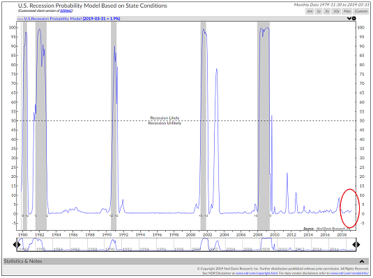
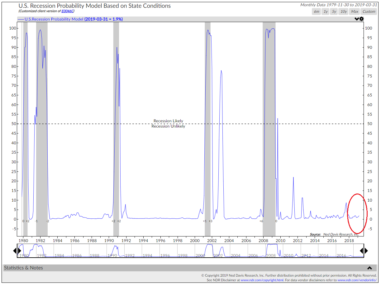
The question, of course, is if the decline will worsen. As you are likely aware, history shows that the biggest and baddest stock market declines tend to be accompanied by a recession in the U.S. And since there has been a lot of talk about the state of the economy since last fall, I thought it might be time to check in on NDR's U.S. Recession Probability Model.
This model uses a regression of state coincident indexes from the Federal Reserve Bank of Philadelphia. The state indices combine nonfarm employment, average manufacturing hours worked, the unemployment rate, and real wages/salaries. The idea is to look at the "health" of the state economies in order to get a feel for the state of the overall economy.
As the chart below shows, the odds of a recession in the near term remain very low - at least as far as the health of state economies are concerned.
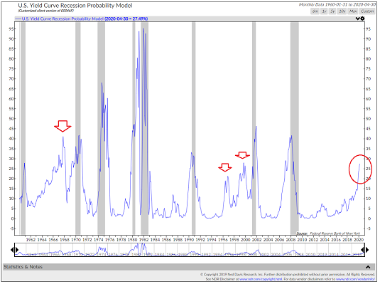
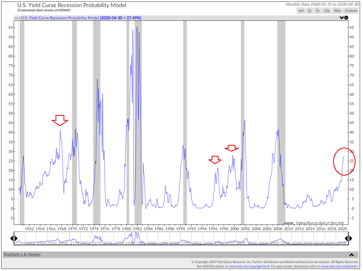
Another way to look at the probability of recession is through the lens of the yield curve. The thinking here is that when yields on longer-term bonds (typically the U.S. 10-Year) fall below short-term yields (typically the 2-year), it means the bond market is worried about economic growth.
There has been MUCH discussion on this topic lately as the yield curve has long been viewed as a strong predictor of recessions. The key is that some versions of the yield curve have briefly inverted - yet others have not. But as the chart below shows, there can be no arguing that the risks associated with the flattening yield curve are on the rise.
However, it is also important to take note of the red arrows on the chart. The bottom line is that a flattening or inverted yield curve does not always mean a recession is likely in the near future.
Back to Trade
To be sure, headlines on the state of trade negotiations with China have driven stock prices of late and will again today as there is word that the Chinese are talking about dumping U.S. Treasury Bonds. And I think everybody will agree than a protracted trade war would be negative for all parties involved as well as the global economy. Yet, with negotiations ongoing, the market appears to be thinking that a deal will get done at some point.
Another thought is to calculate how the current tariffs would impact our economy if left in place for an extended period of time. According to Mr. Cooperman, this could knock 0.5% off GDP, add to inflation measures, and cut $5 from S&P 500 earnings. And according to Cooperman's back-of-the-napkin analysis, $5 times a 17 multiple equals 85 S&P points, which is about the size of the decline we've seen so far.
My Models Suggest...
While it is fun to prognosticate what is likely to occur on the economic/earnings/inflation/yield fronts, I'm not a fan of making predictions about what is going to happen next in Ms. Market's game. No, I prefer to try and stay in tune with what IS happening now.
It is for this reason that I rely on a myriad of indicators/models to suggest what is actually going on in the market. So, my final point on this fine Monday morning is that in order to get a feel for the big-picture market backdrop, it is a good idea to review the fundamentals. And it is precisely for this reason that we built our Fundamental Indicators scoreboard.
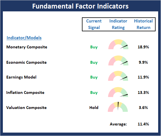
View Fundamental Indicator Board Online
As you can see from the board, the "fundies" are in pretty good shape. Monetary conditions remain positive. The Economic composite suggests the economy is doing just fine. Earnings remain strong. Inflation is low. And Valuations are relatively neutral. So, as Mr. Cooperman pointed out last week, conditions are not set for a significant top in the stock market.
However, this does NOT mean that a "bad news panic" can't occur/continue due to trade. No, the point is that the risk of a recession appears to be low and as such, any corrective action in the stock market is likely to be temporary.
Disclosures
At the time of publication, Mr. Moenning held long positions in the following securities mentioned: None - Note that positions may change at any time.
Weekly Market Model Review
Now let's turn to the weekly review of my favorite indicators and market models...
The State of My Favorite Big-Picture Market Models
Despite the recent pullback in stock prices, the Primary Cycle board remains in good shape. I will note however that the Global Risk Model has pulled back a bit recently and is now positive by the slimmest of margins. But the bottom line is with the board still positive overall, investors may want to use the current dip to put money to work.
This week's mean percentage score of my 6 favorite models pulled back for a second straight week to 81.1% from 83.9% last week (Prior readings: 84.7%, 74.6%, 58.0%, 49.5%, 47%, 50%) while the median slipped to 82.5% from 86.7% last week (Prior readings: 86.7%, 81.8%, 65.9%, 50%, 50%, 50%, 50%).
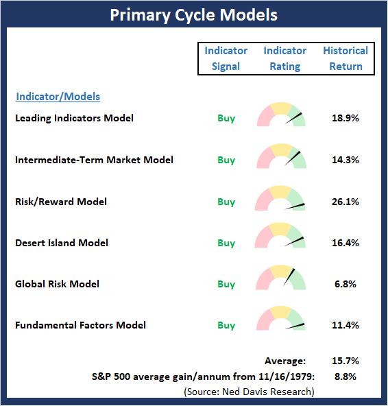
View My Favorite Market Models Online
The State of the Trend
The long-awaited pullback continued last week as traders and their computers moved to a risk-off position in response to news relating to trade. However, by the end of the week, hope for a deal increased and a modest rebound ensued. The fact that stocks have pulled back should come as no surprise to anyone paying attention as the market had become overbought and sentiment was overly positive. As a reminder, the market historically has experienced an average of 3 pullbacks of 5% or more per year. And given that the current run without a 3% decline was the second longest since the bull began in 2009, the bears were due.
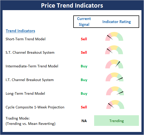
View Trend Indicator Board Online
The State of Internal Momentum
Not surprisingly, the Momentum Board has weakened a bit over the last couple weeks as three shorter-term sell signals have occurred in the areas of price and price/volume thrusts. However, from a big picture standpoint, the models are still in decent shape and supportive of the bulls.
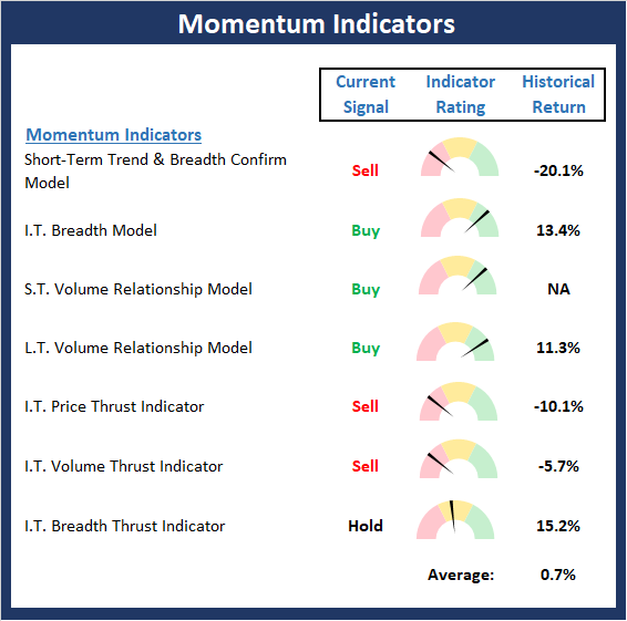
View Momentum Indicator Board Online
The State of the "Trade"
The message from the Early Warning board has shifted gears. Recall that the board did a nice job of warning that conditions were ripe for some form of a pullback. Now the board suggests that the winds are shifting, and the indicators are starting to favor the bulls. To be sure, this is not a "pound the table" situation. But the improvement in the indicators suggest that investors can begin looking for entry points.

View Early Warning Indicator Board Online
The State of the Fundamental Backdrop
There were no real changes to the Fundamentals board this week as the backdrop continues to support an ongoing bull market. So, as Leon Cooperman suggested last week, conditions are not present for a major decline at this time.
View Fundamental Indicator Board Online
Thought For The Day:
A smile is the lighting system of the face, the cooling system of the head and the heating system of the heart. - Unknown
Wishing you green screens and all the best for a great day,

David D. Moenning
Founder, Chief Investment Officer
Heritage Capital Research

HCR Focuses on a Risk-Managed Approach to Investing
What Risk Management Can and Cannot Do
Leading Indicators Model: A group of indicators that have historically shown tendencies to lead the market at major turning points.
Intermediate-Term Market Model: A composite model (model of models) focused on trend and momentum indicators which has been designed to provide identify intermediate-term trading opportunities.
Risk/Reward Model: A model-of-models intended to provide an overall view of the state of the risk/reward environment. The model includes tape, monetary, and sentiment indicators as well as 7 big-picture market model readings.
Desert Island Model: If I was stranded on a desert island with access to only one market model to manage money with, this would be the model. The model is a comprehensive model-of-models comprised of trend, momentum, mean reversion, economic, monetary, sentiment, and factor-based indicators/models.
External Factors Model: A model-of-models designed to provide a reading on the "macro state" of the market environment. The model is comprised of indicators/models in the areas of various index yields, industrial production, investors sentiment, and historic volatility.
Short-Term Trend-and-Breadth Signal Explained: History shows the most reliable market moves tend to occur when the breadth indices are in gear with the major market averages. When the breadth measures diverge, investors should take note that a trend reversal may be at hand. This indicator incorporates NDR's All-Cap Dollar Weighted Equity Series and A/D Line. From 1998, when the A/D line is above its 5-day smoothing and the All-Cap Equal Weighted Equity Series is above its 25-day smoothing, the equity index has gained at a rate of +32.5% per year. When one of the indicators is above its smoothing, the equity index has gained at a rate of +13.3% per year. And when both are below, the equity index has lost +23.6% per year.
Channel Breakout System Explained: The short-term and intermediate-term Channel Breakout Systems are modified versions of the Donchian Channel indicator. According to Wikipedia, "The Donchian channel is an indicator used in market trading developed by Richard Donchian. It is formed by taking the highest high and the lowest low of the last n periods. The area between the high and the low is the channel for the period chosen."
Intermediate-Term Trend-and-Breadth Signal Explained: This indicator incorporates NDR's All-Cap Dollar Weighted Equity Series and A/D Line. From 1998, when the A/D line is above its 45-day smoothing and the All-Cap Equal Weighted Equity Series is above its 45-day smoothing, the equity index has gained at a rate of +17.6% per year. When one of the indicators is above its smoothing, the equity index has gained at a rate of +6.5% per year. And when both are below, the equity index has lost -1.3% per year.
Cycle Composite Projections: The cycle composite combines the 1-year Seasonal, 4-year Presidential, and 10-year Decennial cycles. The indicator reading shown uses the cycle projection for the upcoming week.
Trading Mode Indicator: This indicator attempts to identify whether the current trading environment is "trending" or "mean reverting." The indicator takes the composite reading of the Efficiency Ratio, the Average Correlation Coefficient, and Trend Strength models.
Volume Relationship Models: These models review the relationship between "supply" and "demand" volume over the short- and intermediate-term time frames.
Price Thrust Model Explained: This indicator measures the 3-day rate of change of the Value Line Composite relative to the standard deviation of the 30-day average. When the Value Line's 3-day rate of change have moved above 0.5 standard deviation of the 30-day average ROC, a "thrust" occurs and since 2000, the Value Line Composite has gained ground at a rate of +20.6% per year. When the indicator is below 0.5 standard deviation of the 30-day, the Value Line has lost ground at a rate of -10.0% per year. And when neutral, the Value Line has gained at a rate of +5.9% per year.
Volume Thrust Model Explained: This indicator uses NASDAQ volume data to indicate bullish and bearish conditions for the NASDAQ Composite Index. The indicator plots the ratio of the 10-day total of NASDAQ daily advancing volume (i.e., the total volume traded in stocks which rose in price each day) to the 10-day total of daily declining volume (volume traded in stocks which fell each day). This ratio indicates when advancing stocks are attracting the majority of the volume (readings above 1.0) and when declining stocks are seeing the heaviest trading (readings below 1.0). This indicator thus supports the case that a rising market supported by heavier volume in the advancing issues tends to be the most bullish condition, while a declining market with downside volume dominating confirms bearish conditions. When in a positive mode, the NASDAQ Composite has gained at a rate of +38.3% per year, When neutral, the NASDAQ has gained at a rate of +13.3% per year. And when negative, the NASDAQ has lost at a rate of -14.279% per year.
Breadth Thrust Model Explained: This indicator uses the number of NASDAQ-listed stocks advancing and declining to indicate bullish or bearish breadth conditions for the NASDAQ Composite. The indicator plots the ratio of the 10-day total of the number of stocks rising on the NASDAQ each day to the 10-day total of the number of stocks declining each day. Using 10-day totals smooths the random daily fluctuations and gives indications on an intermediate-term basis. As expected, the NASDAQ Composite performs much better when the 10-day A/D ratio is high (strong breadth) and worse when the indicator is in its lower mode (weak breadth). The most bullish conditions for the NASDAQ when the 10-day A/D indicator is not only high, but has recently posted an extreme high reading and thus indicated a thrust of upside momentum. Bearish conditions are confirmed when the indicator is low and has recently signaled a downside breadth thrust. In positive mode, the NASDAQ has gained at a rate of +22.1% per year since 1981. In a neutral mode, the NASDAQ has gained at a rate of +14.5% per year. And when in a negative mode, the NASDAQ has lost at a rate of -6.4% per year.
Short-Term Overbought/sold Indicator: This indicator is the current reading of the 14,1,3 stochastic oscillator. When the oscillator is above 80 and the %K is above the %D, the indicator gives an overbought reading. Conversely, when the oscillator is below 20 and %K is below its %D, the indicator is oversold.
Intermediate-Term Overbought/sold Indicator: This indicator is a 40-day RSI reading. When above 57.5, the indicator is considered overbought and wnen below 45 it is oversold.
Mean Reversion Model: This is a diffusion model consisting of five indicators that can produce buy and sell signals based on overbought/sold conditions.
VIX Indicator: This indicators looks at the current reading of the VIX relative to standard deviation bands. When the indicator reaches an extreme reading in either direction, it is an indication that a market trend could reverse in the near-term.
Short-Term Sentiment Indicator: This is a model-of-models composed of 18 independent sentiment indicators designed to indicate when market sentiment has reached an extreme from a short-term perspective. Historical analysis indicates that the stock market's best gains come after an environment has become extremely negative from a sentiment standpoint. Conversely, when sentiment becomes extremely positive, market returns have been subpar.
Intermediate-Term Sentiment Indicator: This is a model-of-models composed of 7 independent sentiment indicators designed to indicate when market sentiment has reached an extreme from a intrmediate-term perspective. Historical analysis indicates that the stock market's best gains come after an environment has become extremely negative from a sentiment standpoint. Conversely, when sentiment becomes extremely positive, market returns have been subpar.
Long-Term Sentiment Indicator: This is a model-of-models composed of 6 independent sentiment indicators designed to indicate when market sentiment has reached an extreme from a long-term perspective. Historical analysis indicates that the stock market's best gains come after an environment has become extremely negative from a sentiment standpoint. Conversely, when sentiment becomes extremely positive, market returns have been subpar.
Absolute Monetary Model Explained: The popular cliche, "Don't fight the Fed" is really a testament to the profound impact that interest rates and Fed policy have on the market. It is a proven fact that monetary conditions are one of the most powerful influences on the direction of stock prices. The Absolute Monetary Model looks at the current level of interest rates relative to historical levels and Fed policy.
Relative Monetary Model Explained: The "relative" monetary model looks at monetary indicators relative to recent levels as well as rates of change and Fed Policy.
Economic Model Explained: During the middle of bull and bear markets, understanding the overall health of the economy and how it impacts the stock market is one of the few truly logical aspects of the stock market. When our Economic model sports a "positive" reading, history (beginning in 1965) shows that stocks enjoy returns in excess of 21% per year. Yet, when the model's reading falls into the "negative" zone, the S&P has lost nearly -25% per year. However, it is vital to understand that there are times when good economic news is actually bad for stocks and vice versa. Thus, the Economic model can help investors stay in tune with where we are in the overall economic cycle.
Inflation Model Explained: They say that "the tape tells all." However, one of the best "big picture" indicators of what the market is expected to do next is inflation. Simply put, since 1962, when the model indicates that inflationary pressures are strong, stocks have lost ground. Yet, when inflationary pressures are low, the S&P 500 has gained ground at a rate in excess of 13%. The bottom line is inflation is one of the primary drivers of stock market returns.
Valuation Model Explained: If you want to get analysts really riled up, you need only to begin a discussion of market valuation. While the question of whether stocks are overvalued or undervalued appears to be a simple one, the subject is actually extremely complex. To simplify the subject dramatically, investors must first determine if they should focus on relative valuation (which include the current level of interest rates) or absolute valuation measures (the more traditional readings of Price/Earnings, Price/Dividend, and Price/Book Value). We believe that it is important to recognize that environments change. And as such, the market's focus and corresponding view of valuations are likely to change as well. Thus, we depend on our Valuation Models to help us keep our eye on the ball.
Disclosures
The opinions and forecasts expressed herein are those of Mr. David Moenning and may not actually come to pass. Mr. Moenning's opinions and viewpoints regarding the future of the markets should not be construed as recommendations. The analysis and information in this report is for informational purposes only. No part of the material presented in this report is intended as an investment recommendation or investment advice. Neither the information nor any opinion expressed constitutes a solicitation to purchase or sell securities or any investment program.
Any investment decisions must in all cases be made by the reader or by his or her investment adviser. Do NOT ever purchase any security without doing sufficient research. There is no guarantee that the investment objectives outlined will actually come to pass. All opinions expressed herein are subject to change without notice. Neither the editor, employees, nor any of their affiliates shall have any liability for any loss sustained by anyone who has relied on the information provided.
Mr. Moenning may at times have positions in the securities referred to and may make purchases or sales of these securities while publications are in circulation. Positions may change at any time.
The analysis provided is based on both technical and fundamental research and is provided "as is" without warranty of any kind, either expressed or implied. Although the information contained is derived from sources which are believed to be reliable, they cannot be guaranteed.
Investments in equities carry an inherent element of risk including the potential for significant loss of principal. Past performance is not an indication of future results.