Some Surprisingly Bad Data To Contend With
Last week, we highlighted what we deemed to be Some Surprisingly Good Data. We cited the surge in Empire State General Business Conditions Index, the readings from US Home Purchases, Retail Sales, and even Hotel Occupancies as data that surprised to the upside - in a pretty big way.
The positive surprises helped fuel the narrative that the stock market was advancing on the idea that the economy was indeed recovering. And perhaps recovering faster than anyone had expected. As such, current prices, which the bears argued were getting ahead of themselves, could be seen as appropriate.
After all, states were reopening. Workers were going back to their offices. People were heading back to their favorite restaurants. Airlines were adding flights. And professional sports were coming back. There was hope. And the feeling was that maybe, just maybe, we could put COVID-19 in the rear-view mirror. Which is certainly what the White House would have us believe. Things were good.
But... Right on schedule following the re-openings and the national protests, the coronavirus made a comeback. A pretty impressive comeback, at that. Which, in short, puts a big dent in the bullish thesis that everything is all better now.
I know, I know, you've heard the COVID story already. You've watched it on the news. You've read the stories and the news alerts on your phones. And like many, you are probably tired of hearing about COVID stuff.
But, just as last week's missive detailed some surprisingly good data/charts. This week we are going to look at some surprisingly bad data. As in some REALLY surprisingly bad data.
Lest we forget, the country began reopening stores, restaurants, bars, hair salons, etc. because, we had COVID on the run. The curve had been flattened. The risk of the health care system being overwhelmed in the state you reside had fallen. And so it was time to get things back to normal.
First, let's take a look at what "curve flattening" and a positive trend in the number of new cases of coronavirus looks like. Below is a chart of the number of daily new cases and a 5-day moving average in the United Kingdom to give you a clear picture of the trend.
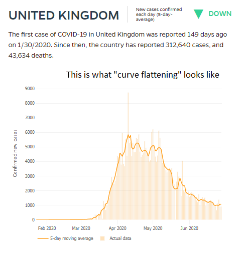
View Chart Online
Source: Johns Hopkins University
As it says on the chart, THIS is what "curve flattening" looks like. This is what a decline in the risk of COVID spread looks like.
From my seat, it is important to recall that the outbreak in UK was behind the U.S. by at least a couple weeks. As such, it would be safe to assume that a graph of new COVID cases would look similar in the good 'ol USofA. But that's where you'd be wrong. As in REALLY wrong!
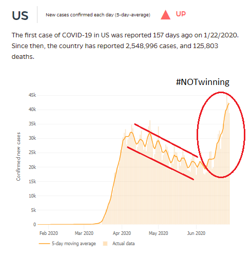
View Chart Online
Source: Johns Hopkins University
Yes, in late May, the trend of new cases in the U.S. was definitely going the right direction. But then folks got impatient.
Instead of remaining diligent and actually flattening the curve, many states decided it was time to get back to business. The daily briefings from the White House stopped. No, instead of sticking to the plan and reopening when the data warranted, we wanted to move on - NOW.
People were tired of hearing the warnings from Dr. Fauci. They were sick of hearing about COVID. Lots of folks wanted to, in the words of a former neighbor, "get my life back."
So, we reopened. Despite the fact that at the time the states reopened, exactly ZERO met the criteria outlined by the CDC and the White House. No, everyone had coronavirus fatigue. It was time to move on.
Except, apparently it wasn't.
Unfortunately, as of Friday, the 5-day moving average of cases in the United States is roughly double where it stood near the end of May.
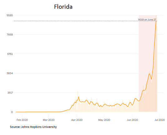
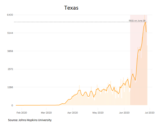
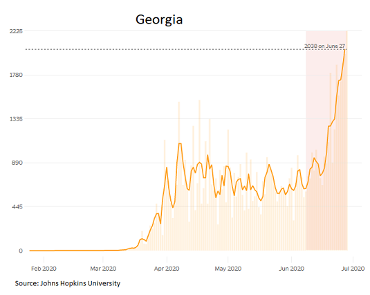
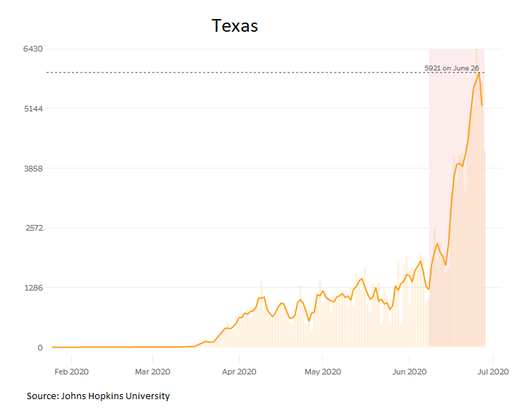
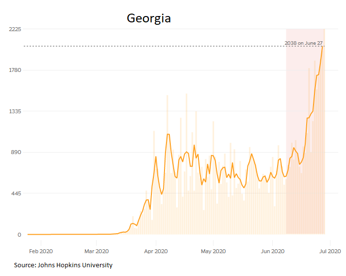
Below are some of the really bad charts I've been talking about. Charts of new cases from Arizona, Florida, Texas, and Georgia.

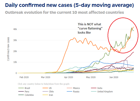
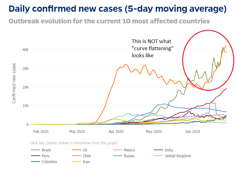
Also in the category of surprisingly bad data/charts is the trend of the virus around the world. First up is a chart of the 5-day moving averages of the 10 most affected countries. Note that the US and Brazil are leading the way higher here.
View Chart Online
Source: Johns Hopkins University, The New York Times
As I've noted, this is NOT what "curve flattening" looks like.
Next is the argument that the U.S. is doing better than other countries. Well, it clearly looks like we may be better than some countries, such as Brazil and India.

View Chart Online
Source: Johns Hopkins University

View Chart Online
Source: Johns Hopkins University
But this is definitely NOT the case when compared to Europe, Canada, or Japan, which are developed countries with somewhat similar economic systems.
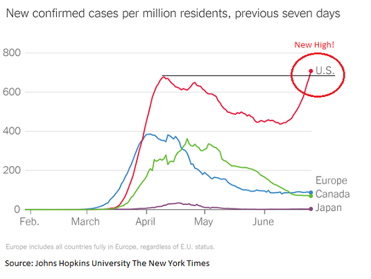
Then there is the idea that the U.S. is doing better because our death rate is lower. Also not true compared to Europe, Canada, and Japan.

The Point
My point on this fine Monday morning, is that a healthy part of the bull case for the stock market is that we can reopen the country and that the economy will recover in short order.
However, in order for this to occur, people have to feel safe enough to go to a restaurant, head back to the malls, or get on a plane. And the bottom line is that unless/until the current spike in cases falls and the curve is ACTUALLY flattened, people are unlikely to feel safe.
Thus, the question becomes, how long will it take for the virus to be contained? And can the stock market continue to ignore the surprisingly bad news on the virus, to look ahead, and to assume that growth will resume tout suite?
Obviously, I don't have the answers here. But these are the important questions I'll be wrestling with over the holiday weekend.
Here's wishing everyone a Happy Fourth!
Weekly Market Model Review
Each week we do a disciplined, deep dive into our key market indicators and models. The overall goal of this exercise is to (a) remove emotion from the investment process, (b) stay "in tune" with the primary market cycles, and (c) remain cognizant of the risk/reward environment.
The Major Market Models
We start with six of our favorite long-term market models. These models are designed to help determine the "state" of the overall market.
There are no changes to report on the Primary Cycle board this week. However, I will note that the hypothetical average historical return for the S&P 500 based on the current readings of the models moved up to +13.4% from +10.7%. As such, there was some internal improvement in a couple models. Overall, the board suggests that the bulls be given the benefit of any doubt here and the dips (even the scary ones) should be bought.

* Source: Ned Davis Research (NDR) as of the date of publication. Historical returns are hypothetical average annual performances calculated by NDR. Past performances do not guarantee future results or profitability - NOT INDIVIDUAL INVESTMENT ADVICE.
View My Favorite Market Models Online
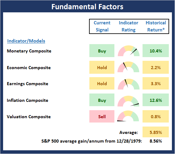
The State of the Fundamental Backdrop
Next, we review the market's fundamental factors in the areas of interest rates, the economy, inflation, and valuations.
There are also no changes to the Fundamental Factors board to report this week. Clearly the board offers a mixed bag and/or something for both teams to crow about. The bulls can cite, overwhelmingly positive monetary conditions and low inflation while the bears will argue that valuations are a problem and the economy is questionable. The bottom line is this is what makes a market.
* Source: Ned Davis Research (NDR) as of the date of publication. Historical returns are hypothetical average annual performances calculated by NDR. Past performances do not guarantee future results or profitability - NOT INDIVIDUAL INVESTMENT ADVICE.
View Fundamental Indicator Board Online
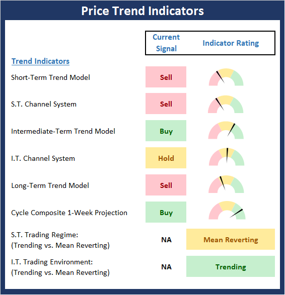
The State of the Trend
After looking at the big-picture models and the fundamental backdrop, I like to look at the state of the trend. This board of indicators is designed to tell us about the overall technical health of the current trend.
The trend board took a hit last week as five of the board's components faltered. As such, we've got to rate the board as moderately negative - especially from a short-term perspective. However, I'll also note that the S&P is currently flirting with its 200-day moving average, which while not exactly a strong timing indicator, is viewed by many as the line of demarcation between a bullish and bearish environment. Personally, I'm watching key support at 2965 as the really important line in the sand.
NOT INDIVIDUAL INVESTMENT ADVICE.
View Trend Indicator Board Online
The State of Internal Momentum
Next, we analyze the "oomph" behind the current trend via our group of market momentum indicators/models.
The Momentum Board also gave up some ground last week. But given that stocks are currently in a consolidation phase, this is to be expected. So, since there isn't an abundance of red on the board and the volume/thrust indicators remain in decent shape, I'm willing to exhibit some patience here and allow the bulls the chance to work through what appears to be a consolidation phase.
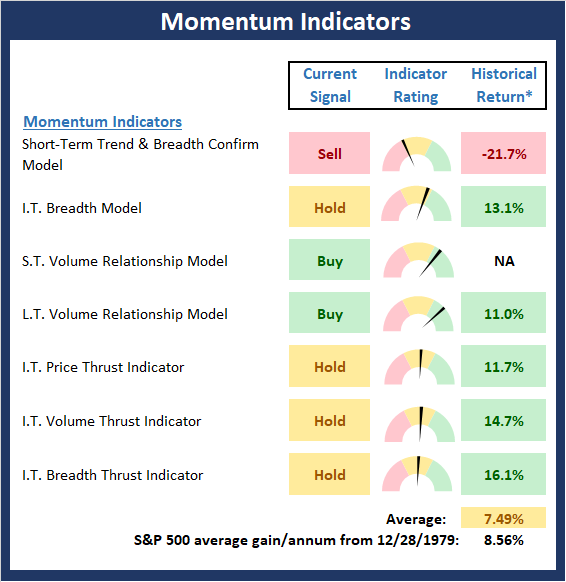
* Source: Ned Davis Research (NDR) as of the date of publication. Historical returns are hypothetical average annual performances calculated by NDR. Past performances do not guarantee future results or profitability - NOT INDIVIDUAL INVESTMENT ADVICE.
View Momentum Indicator Board Online
Early Warning Signals
Once we have identified the current environment, the state of the trend, and the degree of momentum behind the move, we then review the potential for a counter-trend move to begin. This batch of indicators is designed to suggest when the table is set for the trend to "go the other way."
The Early Warning board continues to sport a lot of contradictory evidence, which suggest that neither team holds an edge to start the week. However, we will note that stocks are becoming oversold and sentiment is sinking from a near-term perspective - a positive from a contrarian point of view.
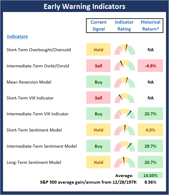
* Source: Ned Davis Research (NDR) as of the date of publication. Historical returns are hypothetical average annual performances calculated by NDR. Past performances do not guarantee future results or profitability - NOT INDIVIDUAL INVESTMENT ADVICE.
View Early Warning Indicator Board Online
Thought For The Day:
Walk on with hope in your heart and you'll never walk alone. --Oscar Hammerstein
Wishing you green screens and all the best for a great day,

David D. Moenning
Founder, Chief Investment Officer
Heritage Capital Research

Disclosures
At the time of publication, Mr. Moenning held long positions in the following securities mentioned: none - Note that positions may change at any time.
Leading Indicators Model: A group of indicators that have historically shown tendencies to lead the market at major turning points.
Intermediate-Term Market Model: A composite model (model of models) focused on trend and momentum indicators which has been designed to provide identify intermediate-term trading opportunities.
Risk/Reward Model: A model-of-models intended to provide an overall view of the state of the risk/reward environment. The model includes tape, monetary, and sentiment indicators as well as 7 big-picture market model readings.
Desert Island Model: If I was stranded on a desert island with access to only one market model to manage money with, this would be the model. The model is a comprehensive model-of-models comprised of trend, momentum, mean reversion, economic, monetary, sentiment, and factor-based indicators/models.
External Factors Model: A model-of-models designed to provide a reading on the "macro state" of the market environment. The model is comprised of indicators/models in the areas of various index yields, industrial production, investors sentiment, and historic volatility.
Short-Term Trend-and-Breadth Signal Explained: History shows the most reliable market moves tend to occur when the breadth indices are in gear with the major market averages. When the breadth measures diverge, investors should take note that a trend reversal may be at hand. This indicator incorporates NDR's All-Cap Dollar Weighted Equity Series and A/D Line. From 1998, when the A/D line is above its 5-day smoothing and the All-Cap Equal Weighted Equity Series is above its 25-day smoothing, the equity index has gained at a rate of +32.5% per year. When one of the indicators is above its smoothing, the equity index has gained at a rate of +13.3% per year. And when both are below, the equity index has lost +23.6% per year.
Channel Breakout System Explained: The short-term and intermediate-term Channel Breakout Systems are modified versions of the Donchian Channel indicator. According to Wikipedia, "The Donchian channel is an indicator used in market trading developed by Richard Donchian. It is formed by taking the highest high and the lowest low of the last n periods. The area between the high and the low is the channel for the period chosen."
Intermediate-Term Trend-and-Breadth Signal Explained: This indicator incorporates NDR's All-Cap Dollar Weighted Equity Series and A/D Line. From 1998, when the A/D line is above its 45-day smoothing and the All-Cap Equal Weighted Equity Series is above its 45-day smoothing, the equity index has gained at a rate of +17.6% per year. When one of the indicators is above its smoothing, the equity index has gained at a rate of +6.5% per year. And when both are below, the equity index has lost -1.3% per year.
Cycle Composite Projections: The cycle composite combines the 1-year Seasonal, 4-year Presidential, and 10-year Decennial cycles. The indicator reading shown uses the cycle projection for the upcoming week.
Trading Mode Indicator: This indicator attempts to identify whether the current trading environment is "trending" or "mean reverting." The indicator takes the composite reading of the Efficiency Ratio, the Average Correlation Coefficient, and Trend Strength models.
Volume Relationship Models: These models review the relationship between "supply" and "demand" volume over the short- and intermediate-term time frames.
Price Thrust Model Explained: This indicator measures the 3-day rate of change of the Value Line Composite relative to the standard deviation of the 30-day average. When the Value Line's 3-day rate of change have moved above 0.5 standard deviation of the 30-day average ROC, a "thrust" occurs and since 2000, the Value Line Composite has gained ground at a rate of +20.6% per year. When the indicator is below 0.5 standard deviation of the 30-day, the Value Line has lost ground at a rate of -10.0% per year. And when neutral, the Value Line has gained at a rate of +5.26% per year.
Volume Thrust Model Explained: This indicator uses NASDAQ volume data to indicate bullish and bearish conditions for the NASDAQ Composite Index. The indicator plots the ratio of the 10-day total of NASDAQ daily advancing volume (i.e., the total volume traded in stocks which rose in price each day) to the 10-day total of daily declining volume (volume traded in stocks which fell each day). This ratio indicates when advancing stocks are attracting the majority of the volume (readings above 1.0) and when declining stocks are seeing the heaviest trading (readings below 1.0). This indicator thus supports the case that a rising market supported by heavier volume in the advancing issues tends to be the most bullish condition, while a declining market with downside volume dominating confirms bearish conditions. When in a positive mode, the NASDAQ Composite has gained at a rate of +38.3% per year, When neutral, the NASDAQ has gained at a rate of +13.3% per year. And when negative, the NASDAQ has lost at a rate of -15.269% per year.
Breadth Thrust Model Explained: This indicator uses the number of NASDAQ-listed stocks advancing and declining to indicate bullish or bearish breadth conditions for the NASDAQ Composite. The indicator plots the ratio of the 10-day total of the number of stocks rising on the NASDAQ each day to the 10-day total of the number of stocks declining each day. Using 10-day totals smooths the random daily fluctuations and gives indications on an intermediate-term basis. As expected, the NASDAQ Composite performs much better when the 10-day A/D ratio is high (strong breadth) and worse when the indicator is in its lower mode (weak breadth). The most bullish conditions for the NASDAQ when the 10-day A/D indicator is not only high, but has recently posted an extreme high reading and thus indicated a thrust of upside momentum. Bearish conditions are confirmed when the indicator is low and has recently signaled a downside breadth thrust. In positive mode, the NASDAQ has gained at a rate of +22.1% per year since 1981. In a neutral mode, the NASDAQ has gained at a rate of +14.5% per year. And when in a negative mode, the NASDAQ has lost at a rate of -6.4% per year.
Short-Term Overbought/sold Indicator: This indicator is the current reading of the 14,1,3 stochastic oscillator. When the oscillator is above 80 and the %K is above the %D, the indicator gives an overbought reading. Conversely, when the oscillator is below 20 and %K is below its %D, the indicator is oversold.
Intermediate-Term Overbought/sold Indicator: This indicator is a 40-day RSI reading. When above 57.5, the indicator is considered overbought and wnen below 45 it is oversold.
Mean Reversion Model: This is a diffusion model consisting of five indicators that can produce buy and sell signals based on overbought/sold conditions.
VIX Indicator: This indicators looks at the current reading of the VIX relative to standard deviation bands. When the indicator reaches an extreme reading in either direction, it is an indication that a market trend could reverse in the near-term.
Short-Term Sentiment Indicator: This is a model-of-models composed of 18 independent sentiment indicators designed to indicate when market sentiment has reached an extreme from a short-term perspective. Historical analysis indicates that the stock market's best gains come after an environment has become extremely negative from a sentiment standpoint. Conversely, when sentiment becomes extremely positive, market returns have been subpar.
Intermediate-Term Sentiment Indicator: This is a model-of-models composed of 7 independent sentiment indicators designed to indicate when market sentiment has reached an extreme from a intermediate-term perspective. Historical analysis indicates that the stock market's best gains come after an environment has become extremely negative from a sentiment standpoint. Conversely, when sentiment becomes extremely positive, market returns have been subpar.
Long-Term Sentiment Indicator: This is a model-of-models composed of 6 independent sentiment indicators designed to indicate when market sentiment has reached an extreme from a long-term perspective. Historical analysis indicates that the stock market's best gains come after an environment has become extremely negative from a sentiment standpoint. Conversely, when sentiment becomes extremely positive, market returns have been subpar.
Absolute Monetary Model Explained: The popular cliche, "Don't fight the Fed" is really a testament to the profound impact that interest rates and Fed policy have on the market. It is a proven fact that monetary conditions are one of the most powerful influences on the direction of stock prices. The Absolute Monetary Model looks at the current level of interest rates relative to historical levels and Fed policy.
Relative Monetary Model Explained: The "relative" monetary model looks at monetary indicators relative to recent levels as well as rates of change and Fed Policy.
Economic Model Explained: During the middle of bull and bear markets, understanding the overall health of the economy and how it impacts the stock market is one of the few truly logical aspects of the stock market. When our Economic model sports a "positive" reading, history (beginning in 1965) shows that stocks enjoy returns in excess of 21% per year. Yet, when the model's reading falls into the "negative" zone, the S&P has lost nearly -25% per year. However, it is vital to understand that there are times when good economic news is actually bad for stocks and vice versa. Thus, the Economic model can help investors stay in tune with where we are in the overall economic cycle.
Inflation Model Explained: They say that "the tape tells all." However, one of the best "big picture" indicators of what the market is expected to do next is inflation. Simply put, since 1962, when the model indicates that inflationary pressures are strong, stocks have lost ground. Yet, when inflationary pressures are low, the S&P 500 has gained ground at a rate in excess of 13%. The bottom line is inflation is one of the primary drivers of stock market returns.
Valuation Model Explained: If you want to get analysts really riled up, you need only to begin a discussion of market valuation. While the question of whether stocks are overvalued or undervalued appears to be a simple one, the subject is actually extremely complex. To simplify the subject dramatically, investors must first determine if they should focus on relative valuation (which include the current level of interest rates) or absolute valuation measures (the more traditional readings of Price/Earnings, Price/Dividend, and Price/Book Value). We believe that it is important to recognize that environments change. And as such, the market's focus and corresponding view of valuations are likely to change as well. Thus, we depend on our Valuation Models to help us keep our eye on the ball.
Disclosures
NOT INVESTMENT ADVICE. The opinions and forecasts expressed herein are those of Mr. David Moenning and Heritage Capital Research and may not actually come to pass. The opinions and viewpoints regarding the future of the markets should not be construed as recommendations. The analysis and information in this report is for informational purposes only. No part of the material presented in this report is intended as an investment recommendation or investment advice. Neither the information nor any opinion expressed constitutes a solicitation to purchase or sell securities or any investment program.
Any investment decisions must in all cases be made by the reader or by his or her investment adviser. Do NOT ever purchase any security without doing sufficient research. There is no guarantee that the investment objectives outlined will actually come to pass. All opinions expressed herein are subject to change without notice. Neither the editor, employees, nor any of their affiliates shall have any liability for any loss sustained by anyone who has relied on the information provided.
Mr. Moenning of Heritage Capital Research is an investment adviser representative of Eastsound Capital Advisors, LLC, a registered investment advisor. The adviser may not transact business in states where it is not appropriately registered, excluded or exempted from registration. Individualized responses to persons that involve either the effecting of transaction in securities, or the rendering of personalized investment advice for compensation, will not be made without registration or exemption.
Mr. Moenning and Heritage Capital Research may at times have positions in the securities referred to and may make purchases or sales of these securities while publications are in circulation. Positions may change at any time.
The analysis provided is based on both technical and fundamental research and is provided "as is" without warranty of any kind, either expressed or implied. Although the information contained is derived from sources which are believed to be reliable, they cannot be guaranteed.
The author neither endorses nor warrants the content of this site, any embedded advertisement, or any linked resource. The author or his managed funds may hold either long or short positions in the referenced securities. Republication rights must be expressly granted by author in writing.
Investments in equities carry an inherent element of risk including the potential for significant loss of principal. Past performance is not an indication of future results.