The Pause That Refreshes?
Now that the S&P 500 has managed to move to new all-time highs, the obvious question becomes, where do we go from here?
Our furry friends in the bear camp contend that the prolonged period of consolidation that occurred between January 26 and August 24 means the current run for the roses is likely doomed to fail. The bear thinking is the January peak had been overdone and the bulls simply don't have the macro firepower to keep things going. And the fact that it took the bulls nearly 7 months to make a fresh new high is Exhibit A in the latter argument. There seems to be a general consensus that long pauses in between new highs aren't a good thing.
Those seeing the market's glass as at least half empty also suggest that seasonality, the possibility that earnings have peaked, the Fed's plans to keep raising rates, the mid-term election uncertainty, the trade war, and the President's legal issues will combine to keep stock prices from getting overly enthusiastic in the near-term.
However, if one removes the talking head chatter and the daily news flow, the actual history of long pauses between new highs in the stock market appears to be encouraging.
The History Of Long Pauses
According to Ned Davis Research Group, there have been seven prior instances where the S&P 500 experienced a long pause between new all-time highs (defined as a period of at least 6 months). So, the first point is that while long pauses between new highs aren't the norm, they are not all that unusual either.
Digging into the data, we find that once the long pause ended and the S&P 500 made a new high, the bulls tended to remain in control of the game for some time. An average of 355 trading days to be exact.
And during that time, the bulls managed to distance themselves from the old highs and keep movin' on up - by an average of 38.7%. Thus, one could argue that strength tends to beget strength in these types of markets.
Yes, there were a couple instances where the bulls quickly surrendered - 1948 and 1990. The 1990 case can be blamed on the start of the first Gulf War. If you will recall, there was a great deal of angst about what would happen to the economies of the world when Iraq decided to try and expand its beach front holdings. I don't have much info on the 1948 event. So, I'll go ahead and say that with these two exceptions (where the S&P 500 gained 6.6% and 4.1% respectively before the bears took charge), history shows that most of these long pauses in between new highs appeared to reinvigorate the bulls.
The Only Game In Town?
The bears are also quick to point out that the U.S. stock market appears to be the only game in town these days as a great many foreign developed and emerging markets are struggling mightily. The thinking here seems to be that the U.S. simply can't go it alone.
However, history suggests otherwise.
Again, turning to the historical data (and the computers at NDR), it appears that since MSCI started keeping the ACWI ex-US index in 1987, there have been 10 prior cases where the S&P 500 has outperformed the ACWI ex-US Index by a significant margin (defined here as at least 10%) over a 12-month period.
Cutting to the chase... In all 10 cases, the S&P 500 was higher one year later - by an average of 16.8%.
Yes, there were drawdowns along the way - there usually are over a twelve-month period. However, when the S&P 500 was not in the midst of a bear market during the time of the drawdown, the pullbacks were much shorter and much shallower than average.
So, the takeaways from this morning's brief history lesson are (1) long pauses between new highs in the stock market are not bearish omens. In fact, the bulls tend to romp higher once the pause ends. (2) The U.S. can "go it alone" with regard to the global markets. One can even argue that the U.S. leadership keeps the bulls engaged.
And finally, if the bears do come to call after a long pause where the U.S. is leading the charge, the damage tends to be less severe than average.
So, from my seat, these are a couple more reasons why it is probably a good idea to continue to stay seated on the bull train. Sure, the ride may be bumpy at times - it usually is. But, this is simply how the game is played and it is important to remember that some of the bear arguments these days aren't rooted in fact.
Moving On... Now let's turn to the weekly review of my favorite indicators and market models... "But first a word from our sponsor ;-)"...
INTRODUCING: THE ELEVATION STRATEGY
A Tax-Efficient Risk Management Strategy for the U.S. Stock Market
Believed to be unique in the industry, the Elevation strategy is a long-term, risk-managed portfolio solution designed for growth-oriented investors seeking a tax-efficient, risk-managed approach to the stock market. Our tests show that 75% of the Strategy's profitable trades since 3/31/1999 would have qualified as long-term for tax purposes.
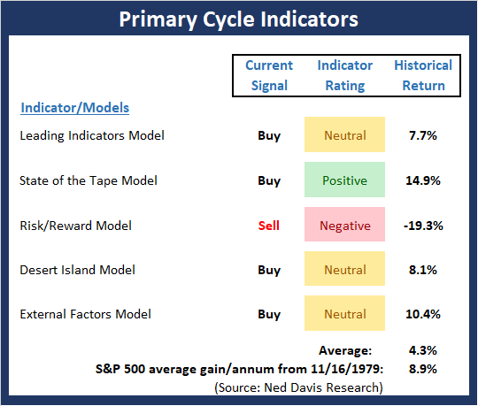
The State of the Big-Picture Market Models
I like to start each week with a review of the state of my favorite big-picture market models, which are designed to help me determine which team is in control of the primary cycle.
View My Favorite Market Models Online
The Bottom Line:
- Despite the market moving to a fresh all-time high last week, some of the readings from our Primary Cycle board went the other way. For example, the Desert Island slipped back into the neutral zone while the Risk Reward models fell into the red. The good news is that none of the recent buy signals have been reversed and the moves were very small in absolute terms. Such is the case when indicators wind up flirting with important lines in the sand. The bottom line is it the board now has a more neutral look than it did to start last week.
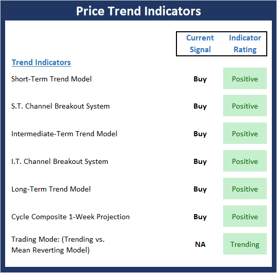
The State of the Trend
Once I've reviewed the big picture, I then turn to the "state of the trend." These indicators are designed to give us a feel for the overall health of the current short- and intermediate-term trend models.
View Trend Indicator Board Online
The Bottom Line:
- It is said that the most bullish thing a market can do is make new highs. Not surprisingly then, the Trend Board is in good shape to start the week.
The State of Internal Momentum
Next up are the momentum indicators, which are designed to tell us whether there is any "oomph" behind the current trend.

View Momentum Indicator Board Online
The Bottom Line:
- There is good news and bad news to be found on the Momentum board this week. The good news is the "thrust" indicators are now all green and the historical return of the market given the current state of the momentum indicator readings is strong. However, the intermediate-term breadth model slipped a bit as the momentum the broad market has failed to impress. But given the abundance of green on this screen, the bulls should be given the benefit of any doubt.
The State of the "Trade"
We also focus each week on the "early warning" board, which is designed to indicate when traders might start to "go the other way" -- for a trade.
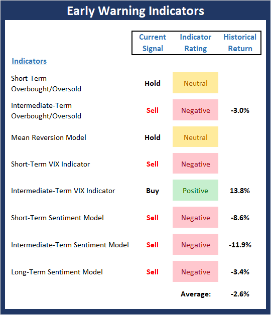
View Early Warning Indicator Board Online
The Bottom Line:
- The "Early Warning" board appears to be suggesting that the bears may have an opening in the near-term. Stocks are once again overbought and sentiment has become overly optimistic. As such, we should be on the lookout for a reversal "trigger" and then be ready to observe if the bears can generate any momentum when their turn comes.
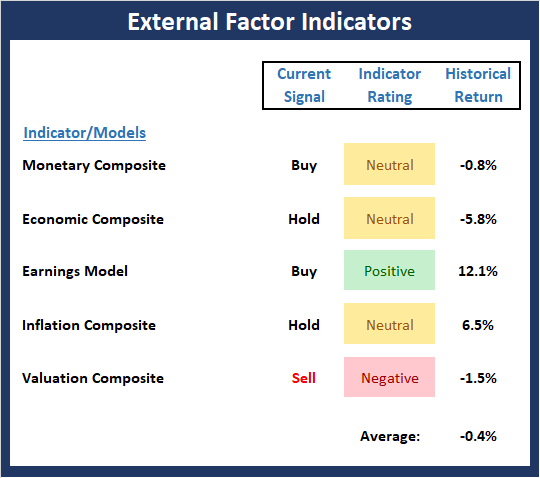
The State of the Macro Picture
Now let's move on to the market's "external factors" - the indicators designed to tell us the state of the big-picture market drivers including monetary conditions, the economy, inflation, and valuations.
View External Factors Indicator Board Online
The Bottom Line:
- The External Factors board continues to be unimpressed by the recent price action. This tells me that we are not in the early innings of the game and to remain alert for any changes to the macro picture.
Thought For The Day:
I don't know what my future holds, but I do know who holds my future. -Tim Tebow
Wishing you green screens and all the best for a great day,

David D. Moenning
Founder, Chief Investment Officer
Heritage Capital Research
HCR Focuses on a Risk-Managed Approach to Investing
What Risk Management Can and Cannot Do

ANNOUNCEMENT:
HCR Awarded Top Honors in 2018 NAAIM Shark Tank Portfolio Strategy Competition
Each year, NAAIM (National Association of Active Investment Managers) hosts a competition to identify the best actively managed investment strategies. In April, HCR's Dave Moenning took home first place for his flagship risk management strategy.
Disclosures
At the time of publication, Mr. Moenning held long positions in the following securities mentioned: None - Note that positions may change at any time.
Indicators Explained
Short-Term Trend-and-Breadth Signal Explained: History shows the most reliable market moves tend to occur when the breadth indices are in gear with the major market averages. When the breadth measures diverge, investors should take note that a trend reversal may be at hand. This indicator incorporates NDR's All-Cap Dollar Weighted Equity Series and A/D Line. From 1998, when the A/D line is above its 5-day smoothing and the All-Cap Equal Weighted Equity Series is above its 25-day smoothing, the equity index has gained at a rate of +32.5% per year. When one of the indicators is above its smoothing, the equity index has gained at a rate of +13.3% per year. And when both are below, the equity index has lost +23.6% per year.
Channel Breakout System Explained: The short-term and intermediate-term Channel Breakout Systems are modified versions of the Donchian Channel indicator. According to Wikipedia, "The Donchian channel is an indicator used in market trading developed by Richard Donchian. It is formed by taking the highest high and the lowest low of the last n periods. The area between the high and the low is the channel for the period chosen."
Intermediate-Term Trend-and-Breadth Signal Explained: This indicator incorporates NDR's All-Cap Dollar Weighted Equity Series and A/D Line. From 1998, when the A/D line is above its 45-day smoothing and the All-Cap Equal Weighted Equity Series is above its 45-day smoothing, the equity index has gained at a rate of +17.6% per year. When one of the indicators is above its smoothing, the equity index has gained at a rate of +6.5% per year. And when both are below, the equity index has lost -1.3% per year.
Cycle Composite Projections: The cycle composite combines the 1-year Seasonal, 4-year Presidential, and 10-year Decennial cycles. The indicator reading shown uses the cycle projection for the upcoming week.
Trading Mode Indicator: This indicator attempts to identify whether the current trading environment is "trending" or "mean reverting." The indicator takes the composite reading of the Efficiency Ratio, the Average Correlation Coefficient, and Trend Strength models.
Volume Relationship Models: These models review the relationship between "supply" and "demand" volume over the short- and intermediate-term time frames.
Price Thrust Model Explained: This indicator measures the 3-day rate of change of the Value Line Composite relative to the standard deviation of the 30-day average. When the Value Line's 3-day rate of change have moved above 0.5 standard deviation of the 30-day average ROC, a "thrust" occurs and since 2000, the Value Line Composite has gained ground at a rate of +20.6% per year. When the indicator is below 0.5 standard deviation of the 30-day, the Value Line has lost ground at a rate of -10.0% per year. And when neutral, the Value Line has gained at a rate of +5.9% per year.
Volume Thrust Model Explained: This indicator uses NASDAQ volume data to indicate bullish and bearish conditions for the NASDAQ Composite Index. The indicator plots the ratio of the 10-day total of NASDAQ daily advancing volume (i.e., the total volume traded in stocks which rose in price each day) to the 10-day total of daily declining volume (volume traded in stocks which fell each day). This ratio indicates when advancing stocks are attracting the majority of the volume (readings above 1.0) and when declining stocks are seeing the heaviest trading (readings below 1.0). This indicator thus supports the case that a rising market supported by heavier volume in the advancing issues tends to be the most bullish condition, while a declining market with downside volume dominating confirms bearish conditions. When in a positive mode, the NASDAQ Composite has gained at a rate of +38.3% per year, When neutral, the NASDAQ has gained at a rate of +13.3% per year. And when negative, the NASDAQ has lost at a rate of -9.3% per year.
Breadth Thrust Model Explained: This indicator uses the number of NASDAQ-listed stocks advancing and declining to indicate bullish or bearish breadth conditions for the NASDAQ Composite. The indicator plots the ratio of the 10-day total of the number of stocks rising on the NASDAQ each day to the 10-day total of the number of stocks declining each day. Using 10-day totals smooths the random daily fluctuations and gives indications on an intermediate-term basis. As expected, the NASDAQ Composite performs much better when the 10-day A/D ratio is high (strong breadth) and worse when the indicator is in its lower mode (weak breadth). The most bullish conditions for the NASDAQ when the 10-day A/D indicator is not only high, but has recently posted an extreme high reading and thus indicated a thrust of upside momentum. Bearish conditions are confirmed when the indicator is low and has recently signaled a downside breadth thrust. In positive mode, the NASDAQ has gained at a rate of +22.1% per year since 1981. In a neutral mode, the NASDAQ has gained at a rate of +14.5% per year. And when in a negative mode, the NASDAQ has lost at a rate of -6.4% per year.
Short-Term Overbought/sold Indicator: This indicator is the current reading of the 14,1,3 stochastic oscillator. When the oscillator is above 80 and the %K is above the %D, the indicator gives an overbought reading. Conversely, when the oscillator is below 20 and %K is below its %D, the indicator is oversold.
Intermediate-Term Overbought/sold Indicator: This indicator is a 40-day RSI reading. When above 57.5, the indicator is considered overbought and when below 45 it is oversold.
Mean Reversion Model: This is a diffusion model consisting of five indicators that can produce buy and sell signals based on overbought/sold conditions.
VIX Indicator: This indicator looks at the current reading of the VIX relative to standard deviation bands. When the indicator reaches an extreme reading in either direction, it is an indication that a market trend could reverse in the near-term.
Short-Term Sentiment Indicator: This is a model-of-models composed of 18 independent sentiment indicators designed to indicate when market sentiment has reached an extreme from a short-term perspective. Historical analysis indicates that the stock market's best gains come after an environment has become extremely negative from a sentiment standpoint. Conversely, when sentiment becomes extremely positive, market returns have been subpar.
Intermediate-Term Sentiment Indicator: This is a model-of-models composed of 7 independent sentiment indicators designed to indicate when market sentiment has reached an extreme from an intermediate-term perspective. Historical analysis indicates that the stock market's best gains come after an environment has become extremely negative from a sentiment standpoint. Conversely, when sentiment becomes extremely positive, market returns have been subpar.
Long-Term Sentiment Indicator: This is a model-of-models composed of 6 independent sentiment indicators designed to indicate when market sentiment has reached an extreme from a long-term perspective. Historical analysis indicates that the stock market's best gains come after an environment has become extremely negative from a sentiment standpoint. Conversely, when sentiment becomes extremely positive, market returns have been subpar.
Absolute Monetary Model Explained: The popular cliché, "Don't fight the Fed" is really a testament to the profound impact that interest rates and Fed policy have on the market. It is a proven fact that monetary conditions are one of the most powerful influences on the direction of stock prices. The Absolute Monetary Model looks at the current level of interest rates relative to historical levels and Fed policy.
Relative Monetary Model Explained: The "relative" monetary model looks at monetary indicators relative to recent levels as well as rates of change and Fed Policy.
Economic Model Explained: During the middle of bull and bear markets, understanding the overall health of the economy and how it impacts the stock market is one of the few truly logical aspects of the stock market. When our Economic model sports a "positive" reading, history (beginning in 1965) shows that stocks enjoy returns in excess of 21% per year. Yet, when the model's reading falls into the "negative" zone, the S&P has lost nearly -25% per year. However, it is vital to understand that there are times when good economic news is actually bad for stocks and vice versa. Thus, the Economic model can help investors stay in tune with where we are in the overall economic cycle.
Inflation Model Explained: They say that "the tape tells all." However, one of the best "big picture" indicators of what the market is expected to do next is inflation. Simply put, since 1962, when the model indicates that inflationary pressures are strong, stocks have lost ground. Yet, when inflationary pressures are low, the S&P 500 has gained ground at a rate in excess of 13%. The bottom line is inflation is one of the primary drivers of stock market returns.
Valuation Model Explained: If you want to get analysts really riled up, you need only to begin a discussion of market valuation. While the question of whether stocks are overvalued or undervalued appears to be a simple one, the subject is extremely complex. To simplify the subject dramatically, investors must first determine if they should focus on relative valuation (which include the current level of interest rates) or absolute valuation measures (the more traditional readings of Price/Earnings, Price/Dividend, and Price/Book Value). We believe that it is important to recognize that environments change. And as such, the market's focus and corresponding view of valuations are likely to change as well. Thus, we depend on our Valuation Models to help us keep our eye on the ball.
Disclosures
The opinions and forecasts expressed herein are those of Mr. David Moenning and may not actually come to pass. Mr. Moenning's opinions and viewpoints regarding the future of the markets should not be construed as recommendations. The analysis and information in this report is for informational purposes only. No part of the material presented in this report is intended as an investment recommendation or investment advice. Neither the information nor any opinion expressed constitutes a solicitation to purchase or sell securities or any investment program.
Any investment decisions must in all cases be made by the reader or by his or her investment adviser. Do NOT ever purchase any security without doing sufficient research. There is no guarantee that the investment objectives outlined will actually come to pass. All opinions expressed herein are subject to change without notice. Neither the editor, employees, nor any of their affiliates shall have any liability for any loss sustained by anyone who has relied on the information provided.
Mr. Moenning may at times have positions in the securities referred to and may make purchases or sales of these securities while publications are in circulation. Positions may change at any time.
The analysis provided is based on both technical and fundamental research and is provided "as is" without warranty of any kind, either expressed or implied. Although the information contained is derived from sources which are believed to be reliable, they cannot be guaranteed.
Investments in equities carry an inherent element of risk including the potential for significant loss of principal. Past performance is not an indication of future results.