Understanding The Algos and Systematic Sellers
Before we dive in to any sort of subjective analysis about the current state of the markets or what may or may not come next, I think it is important to note that our Indicator Boards did a pretty darn good job of waving yellow flags well before the current correction began.
While I learned a long time ago that is a VERY bad idea to brag in this business, I would like to point out that the boards had been warning us for weeks that all was not right with the indicator world and/or that risk factors were elevated. For example, take a peek at the August 20 report titled, All Is Not Right With The World. As such, anyone paying attention to our weekly review of the state of the indicators should not have been surprised by some corrective action.
On a personal note, having some sort of a "heads up" that the indicators were not in their happy places in advance of the negative action gave us time to prepare and make some adjustments. For example, in portfolios that focus on market leadership, we have positions allocated to both the leading factors and the leading major market indices. For much of the year, selecting these positions had been easy-peasy. The leading factor had clearly been momentum and the leading major index had been the NASDAQ 100.
However, as the indicators faltered, and technical divergences developed, there was a distinct shift in our leadership work. So, at the beginning of the month, factor leadership shifted from momentum to minimum volatility and the NDX was replaced by the Dow. Whether or not this type of leadership holds beyond the next week or so is anybody's guess. But I wanted to provide an example of how one could use the "message" from Indicator Boards that are updated here each week.
Getting back to the current market action, the timing and severity of the current correction probably did surprise a few folks, including yours truly.
Frankly, I had been looking for an extended period of "sloppy action" into the traditional "year-end rally" period. My thinking was that the market had to deal with growing uncertainty relating to rates, inflation, and the mid-terms, as well as the seasonal pattern and technical divergences. But, to be clear, I most certainly did not expect to see the Dow dive nearly 1400 points in a matter of hours (14 trading hours, to be exact) last week.
As the "fast money" folks love to remind us on their TV appearances, "risk happens fast" in this age of high-speed trading. And as I've opined a time or twenty, it is the propensity for trend-following algos to simply chase their tails until the closing bell rings (or a reversal occurs) that tends to exaggerate the type of move we saw last week.
Understanding the Algos
Another important thing to understand about how/why these market declines tend to occur in a fast and furious fashion is all the money tied to what is referred to as "systematic trading." In English, this is forced selling created by quant-trading strategies favored by CTAs and other "volatility targeting" strategies. (Risk-parity would be the poster child here).
The key point to understand is that when the stock market makes a big move, these quant-based strategies automatically make adjustments on the fly. In simple terms, when stocks plunge, computers tell volatility-targeted portfolios to reduce their exposure to stocks and increase their exposure to lower volatility areas such as bonds.
So, as a stock market decline unfolds, these "systematic" strategies continue to rebalance their targeted volatility exposure in lock step. They simply rinse and repeat until the volatility target of the portfolio is achieved.
From my seat, this is important stuff to understand and helps explain what I like to call "algos gone wild" - or exaggerated moves in the market.
The Good News
The good news is that analysts are able to quantify the amount of "systematic" strategies out there, and, in turn, how much more selling these funds will need to do from here. Cutting to the chase, knowing how much stock still needs to be sold by computers can help us identify what is "real" and what is "artificial."
So, here's what I've found on the subject...
Nomura’s Charlie McElligott said that Thursday that based on the firm's estimates, CTAs de-risked in equities to the tune of some $88 billion on Wednesday. McElligott also suggested that a break below 2719 would trigger further systematic de-risking to the tune of $57 billion in S&P futures. (Note that the S&P cash traded to a low of 2710.51 on Friday before quickly rebounding above the line in the sand.)
Next, according to JPMorgan's Marko Kolanovic, who heads the firm's global macro quantitative and derivatives research area, approximately 70% of the systematic selling that needs to be done has already occurred. In a research note dated Friday, Kolanovic wrote, "We think that the majority of systematic selling is behind us (~70%)."
Kolanovic went on to say, "The remaining part of systematic selling is from volatility targeting (insurance, parity funds, etc.) which will go on for several more days."
The note added that JPM believes the recent selling pressure from systematic systems will likely wane going forward. Kolanovic explained that volatility targeters tend to sell over a longer period of time than other systematic strategies (between 3 and 10 days). As such, "these flows should be easier to digest by the market," Kolanovic says.
According to Barclays Capital, volatility-controlled strategies/funds still needed to cut $130 billion in equities and another $40 billion in ETFs as Friday's session began. So... if you were wondering why Friday's bounce was less than robust and appeared to be met with some intense selling throughout the day, the work of these systematic sellers would appear to be the answer.
Looking Ahead
So, the question on everybody's mind is, where do we go from here? As expected, the perma-bears tell us that all is lost, and that last week's action was just the beginning of what surely will amount to the next 2008-type decline.
On the other side of the field, our heroes in horns suggest that the economy is strong, rates will remain historically constructive even after the Fed's "terminal rate" is achieved, there are no signs of a recession or runaway inflation, and that earnings are expected to grow 12% next year. As such, conditions do not appear to be ripe for a bear market.
From my seat, reality likely lies somewhere in between, and it will take time for the macro picture to become clear again. To be sure, there are issues for investors to sort through. And what folks are thinking will likely become clearer as the "systematic selling" runs its course.
On that note, Kolanovic also suggests that it will soon be time to "buy the dip" - assuming, of course, that volatility doesn't pick up again and ignite another round of risk-off selling, that is. Also, Nomura's McElligott wrote a rather bullish piece on Friday entitled, "Making the case for equities long into year-end." McElligott cited "cleaner positioning" after this week's wash out, buybacks, and seasonality. And Goldman wrote Friday, "Despite the recent sell-ff, equity fundamentals are strong and we remain constructive on the past of the S&P 500," with a year-end target of 2850.
I, for one, will be leaning heavily on my key market indicators to help me figure out whether this move will wind up in the garden-variety correction camp, or something far furrier.
Moving On... Now let's turn to the weekly review of my favorite indicators and market models...
The State of the Big-Picture Market Models
I like to start each week with a review of the state of my favorite big-picture market models, which are designed to help me determine which team is in control of the primary cycle.
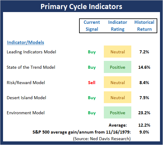
View My Favorite Market Models Online
The Bottom Line:
- There can be no denying that the Primary Cycle board has been waving a yellow flag regarding the overall state of the market for some time now. This week, the indicator rating of my Environment model actually upticked to positive, but by the skinniest of margins. It is also worth noting that the State of the Trend model is now close to issuing a bear market sell signal.
This week's mean percentage score of my 5 favorite models improved a bit to 58.3% while the median pulled back to 58.3%.
The State of the Trend
Once I've reviewed the big picture, I then turn to the "state of the trend." These indicators are designed to give us a feel for the overall health of the current short- and intermediate-term trend models.
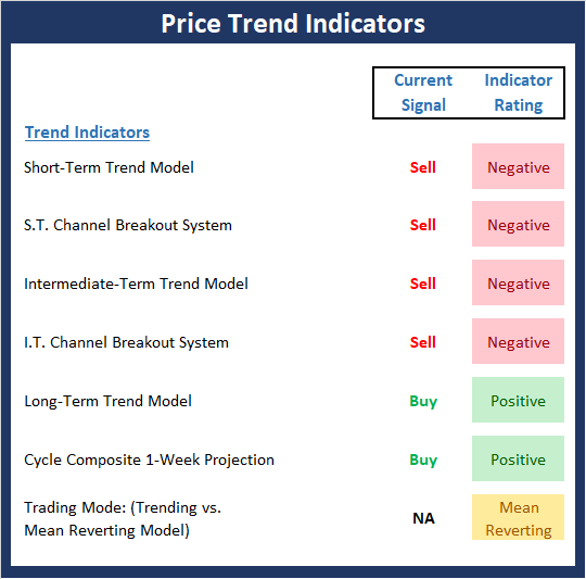
View Trend Indicator Board Online
The Bottom Line:
- The Trend board also provided a "heads up" that all was not well with the indicator world before the recent shellacking in stocks. Not surprisingly, this week's board isn't exactly a cheery sight. The cycle composite suggests some sideways-to-up movement to be followed by a retest down. P.S. the S&P 500 starts the week almost exactly in line with the cycle composite.
The State of Internal Momentum
Next up are the momentum indicators, which are designed to tell us whether there is any "oomph" behind the current trend.
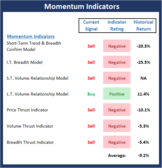
View Momentum Indicator Board Online
The Bottom Line:
- The Momentum board also should be credited with providing a warning that the major indices were due to falter. In short, the momentum indicators created classic divergences well in advance of the correction. Currently the board is, as you'd expect, negative.
The State of the "Trade"
We also focus each week on the "early warning" board, which is designed to indicate when traders might start to "go the other way" -- for a trade.
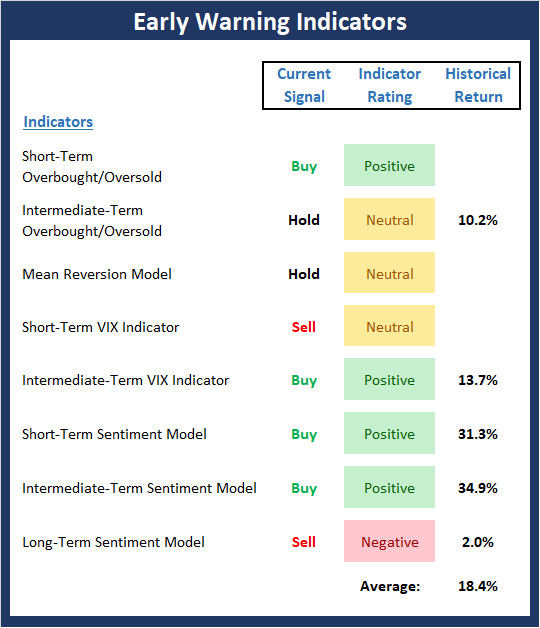
View Early Warning Indicator Board Online
The Bottom Line:
- The "Early Warning" board did its job by alerting us to the fact that the table had been set and that the bears were due to get in the game. As such, it is important to note that the board is now starting to swing the other way. This tells us that we should be alert for, at the very least, an oversold bounce.
The State of the Macro Picture
Now let's move on to the market's "environmental factors" - the indicators designed to tell us the state of the big-picture market drivers including monetary conditions, the economy, inflation, and valuations.
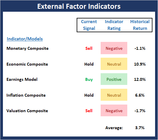
View Environment Indicator Board Online
The Bottom Line:
- The External Factors board, which did a very good job of alerting us to the fact that risk was high well before the correction began, continues to suggest that some caution remains warranted.
Thought For The Day:
Big shots are little shots that kept shooting. -Chistopher Morley
Wishing you green screens and all the best for a great day,

David D. Moenning
Founder, Chief Investment Officer
Heritage Capital Research
HCR Focuses on a Risk-Managed Approach to Investing
What Risk Management Can and Cannot Do

ANNOUNCEMENT:
HCR Awarded Top Honors in 2018 NAAIM Shark Tank Portfolio Strategy Competition
Each year, NAAIM (National Association of Active Investment Managers) hosts a competition to identify the best actively managed investment strategies. In April, HCR's Dave Moenning took home first place for his flagship risk management strategy.
Disclosures
At the time of publication, Mr. Moenning held long positions in the following securities mentioned: none - Note that positions may change at any time.
Indicators Explained
Short-Term Trend-and-Breadth Signal Explained: History shows the most reliable market moves tend to occur when the breadth indices are in gear with the major market averages. When the breadth measures diverge, investors should take note that a trend reversal may be at hand. This indicator incorporates NDR's All-Cap Dollar Weighted Equity Series and A/D Line. From 1998, when the A/D line is above its 5-day smoothing and the All-Cap Equal Weighted Equity Series is above its 25-day smoothing, the equity index has gained at a rate of +32.5% per year. When one of the indicators is above its smoothing, the equity index has gained at a rate of +13.3% per year. And when both are below, the equity index has lost +23.6% per year.
Channel Breakout System Explained: The short-term and intermediate-term Channel Breakout Systems are modified versions of the Donchian Channel indicator. According to Wikipedia, "The Donchian channel is an indicator used in market trading developed by Richard Donchian. It is formed by taking the highest high and the lowest low of the last n periods. The area between the high and the low is the channel for the period chosen."
Intermediate-Term Trend-and-Breadth Signal Explained: This indicator incorporates NDR's All-Cap Dollar Weighted Equity Series and A/D Line. From 1998, when the A/D line is above its 45-day smoothing and the All-Cap Equal Weighted Equity Series is above its 45-day smoothing, the equity index has gained at a rate of +17.6% per year. When one of the indicators is above its smoothing, the equity index has gained at a rate of +6.5% per year. And when both are below, the equity index has lost -1.3% per year.
Cycle Composite Projections: The cycle composite combines the 1-year Seasonal, 4-year Presidential, and 10-year Decennial cycles. The indicator reading shown uses the cycle projection for the upcoming week.
Trading Mode Indicator: This indicator attempts to identify whether the current trading environment is "trending" or "mean reverting." The indicator takes the composite reading of the Efficiency Ratio, the Average Correlation Coefficient, and Trend Strength models.
Volume Relationship Models: These models review the relationship between "supply" and "demand" volume over the short- and intermediate-term time frames.
Price Thrust Model Explained: This indicator measures the 3-day rate of change of the Value Line Composite relative to the standard deviation of the 30-day average. When the Value Line's 3-day rate of change have moved above 0.5 standard deviation of the 30-day average ROC, a "thrust" occurs and since 2000, the Value Line Composite has gained ground at a rate of +20.6% per year. When the indicator is below 0.5 standard deviation of the 30-day, the Value Line has lost ground at a rate of -10.0% per year. And when neutral, the Value Line has gained at a rate of +5.9% per year.
Volume Thrust Model Explained: This indicator uses NASDAQ volume data to indicate bullish and bearish conditions for the NASDAQ Composite Index. The indicator plots the ratio of the 10-day total of NASDAQ daily advancing volume (i.e., the total volume traded in stocks which rose in price each day) to the 10-day total of daily declining volume (volume traded in stocks which fell each day). This ratio indicates when advancing stocks are attracting the majority of the volume (readings above 1.0) and when declining stocks are seeing the heaviest trading (readings below 1.0). This indicator thus supports the case that a rising market supported by heavier volume in the advancing issues tends to be the most bullish condition, while a declining market with downside volume dominating confirms bearish conditions. When in a positive mode, the NASDAQ Composite has gained at a rate of +38.3% per year, When neutral, the NASDAQ has gained at a rate of +13.3% per year. And when negative, the NASDAQ has lost at a rate of -10.13% per year.
Breadth Thrust Model Explained: This indicator uses the number of NASDAQ-listed stocks advancing and declining to indicate bullish or bearish breadth conditions for the NASDAQ Composite. The indicator plots the ratio of the 10-day total of the number of stocks rising on the NASDAQ each day to the 10-day total of the number of stocks declining each day. Using 10-day totals smooths the random daily fluctuations and gives indications on an intermediate-term basis. As expected, the NASDAQ Composite performs much better when the 10-day A/D ratio is high (strong breadth) and worse when the indicator is in its lower mode (weak breadth). The most bullish conditions for the NASDAQ when the 10-day A/D indicator is not only high, but has recently posted an extreme high reading and thus indicated a thrust of upside momentum. Bearish conditions are confirmed when the indicator is low and has recently signaled a downside breadth thrust. In positive mode, the NASDAQ has gained at a rate of +22.1% per year since 1981. In a neutral mode, the NASDAQ has gained at a rate of +14.5% per year. And when in a negative mode, the NASDAQ has lost at a rate of -6.4% per year.
Short-Term Overbought/sold Indicator: This indicator is the current reading of the 14,1,3 stochastic oscillator. When the oscillator is above 80 and the %K is above the %D, the indicator gives an overbought reading. Conversely, when the oscillator is below 20 and %K is below its %D, the indicator is oversold.
Intermediate-Term Overbought/sold Indicator: This indicator is a 40-day RSI reading. When above 57.5, the indicator is considered overbought and when below 45 it is oversold.
Mean Reversion Model: This is a diffusion model consisting of five indicators that can produce buy and sell signals based on overbought/sold conditions.
VIX Indicator: This indicator looks at the current reading of the VIX relative to standard deviation bands. When the indicator reaches an extreme reading in either direction, it is an indication that a market trend could reverse in the near-term.
Short-Term Sentiment Indicator: This is a model-of-models composed of 18 independent sentiment indicators designed to indicate when market sentiment has reached an extreme from a short-term perspective. Historical analysis indicates that the stock market's best gains come after an environment has become extremely negative from a sentiment standpoint. Conversely, when sentiment becomes extremely positive, market returns have been subpar.
Intermediate-Term Sentiment Indicator: This is a model-of-models composed of 7 independent sentiment indicators designed to indicate when market sentiment has reached an extreme from an intermediate-term perspective. Historical analysis indicates that the stock market's best gains come after an environment has become extremely negative from a sentiment standpoint. Conversely, when sentiment becomes extremely positive, market returns have been subpar.
Long-Term Sentiment Indicator: This is a model-of-models composed of 6 independent sentiment indicators designed to indicate when market sentiment has reached an extreme from a long-term perspective. Historical analysis indicates that the stock market's best gains come after an environment has become extremely negative from a sentiment standpoint. Conversely, when sentiment becomes extremely positive, market returns have been subpar.
Absolute Monetary Model Explained: The popular cliché, "Don't fight the Fed" is really a testament to the profound impact that interest rates and Fed policy have on the market. It is a proven fact that monetary conditions are one of the most powerful influences on the direction of stock prices. The Absolute Monetary Model looks at the current level of interest rates relative to historical levels and Fed policy.
Relative Monetary Model Explained: The "relative" monetary model looks at monetary indicators relative to recent levels as well as rates of change and Fed Policy.
Economic Model Explained: During the middle of bull and bear markets, understanding the overall health of the economy and how it impacts the stock market is one of the few truly logical aspects of the stock market. When our Economic model sports a "positive" reading, history (beginning in 1965) shows that stocks enjoy returns in excess of 21% per year. Yet, when the model's reading falls into the "negative" zone, the S&P has lost nearly -25% per year. However, it is vital to understand that there are times when good economic news is actually bad for stocks and vice versa. Thus, the Economic model can help investors stay in tune with where we are in the overall economic cycle.
Inflation Model Explained: They say that "the tape tells all." However, one of the best "big picture" indicators of what the market is expected to do next is inflation. Simply put, since 1962, when the model indicates that inflationary pressures are strong, stocks have lost ground. Yet, when inflationary pressures are low, the S&P 500 has gained ground at a rate in excess of 13%. The bottom line is inflation is one of the primary drivers of stock market returns.
Valuation Model Explained: If you want to get analysts really riled up, you need only to begin a discussion of market valuation. While the question of whether stocks are overvalued or undervalued appears to be a simple one, the subject is extremely complex. To simplify the subject dramatically, investors must first determine if they should focus on relative valuation (which include the current level of interest rates) or absolute valuation measures (the more traditional readings of Price/Earnings, Price/Dividend, and Price/Book Value). We believe that it is important to recognize that environments change. And as such, the market's focus and corresponding view of valuations are likely to change as well. Thus, we depend on our Valuation Models to help us keep our eye on the ball.
Disclosures
The opinions and forecasts expressed herein are those of Mr. David Moenning and may not actually come to pass. Mr. Moenning's opinions and viewpoints regarding the future of the markets should not be construed as recommendations. The analysis and information in this report is for informational purposes only. No part of the material presented in this report is intended as an investment recommendation or investment advice. Neither the information nor any opinion expressed constitutes a solicitation to purchase or sell securities or any investment program.
Any investment decisions must in all cases be made by the reader or by his or her investment adviser. Do NOT ever purchase any security without doing sufficient research. There is no guarantee that the investment objectives outlined will actually come to pass. All opinions expressed herein are subject to change without notice. Neither the editor, employees, nor any of their affiliates shall have any liability for any loss sustained by anyone who has relied on the information provided.
Mr. Moenning may at times have positions in the securities referred to and may make purchases or sales of these securities while publications are in circulation. Positions may change at any time.
The analysis provided is based on both technical and fundamental research and is provided "as is" without warranty of any kind, either expressed or implied. Although the information contained is derived from sources which are believed to be reliable, they cannot be guaranteed.
Investments in equities carry an inherent element of risk including the potential for significant loss of principal. Past performance is not an indication of future results.