The Biggest Change Seen Last Week Was...
I like to start each week by reviewing (a) my key market indicators and (b) the macro picture of the current market environment. As such, my Monday morning market missive is intended to cover both.
Let's start by taking a quick survey of the damage the stock market's decline has inflicted. Despite the fact that the dance to downside is just two weeks old, the S&P 500 closed Friday down -8.8% from its January 26 all-time high. So, the good news is that the longest period in history without a -0.6% and/or a -3% drop has ended. And the second longest stretch in history without a -5% pullback is also over. Oh, and since the market was off -10.16% as of Thursday's close, we can also put a check mark next to the "correction" box as well.
From an indicator standpoint, it will suffice to say that the current dive has displayed far more violence than almost anyone other than the perma-bears had expected. And because of the extreme volatility, the market's internals have taken a hit.
Gone are all the bright green boxes our indicator boards were sporting just a few weeks back. No, today there is a lot more yellow and even a fair amount of red. To be sure, change happens fast in Ms. Market's game.
A New Signal To Consider
The biggest change seen last week was the sell signal flashed on Wednesday by our recently upgraded "State of the Tape" model. This is a model-of-models designed to indicate the technical health of the stock market and covers everything from the technical state of the S&P's 100+ industries, to the slope and deviation of the trend, to internal market momentum, and some pretty nifty reversal analysis.
Although I don't like to use any single indicator or model in a vacuum, this one is pretty important in my work as it is also one of the components of my "Desert Island" model (so named because if I was stranded on a deserted island and had to manage money with just one model, it would be this one). And while all market indicators/models flash false signals from time to time, it was the "Desert Island" model that caused the latest iteration of my tactical risk-managed portfolios to be less-than fully invested when the current correction began. And to me, this is what managing the risk of the environment is all about.
Speaking of risk management, I have been saying for some time now that risk factors in the market had become elevated. I opined on multiple occasions that I believed it was time to remove the turbochargers from your portfolio and to perhaps "coast" for a while. And while I most definitely did NOT "call" a correction of this magnitude or a pullback displaying the degree of volatility seen over the past two weeks, I am pleased to have provided ample warning that the odds of a correction were rising in a meaningful way.
What About The Fundamentals?
The trick now is to try and determine where we go from here. And for me, this is where a review of the fundamental picture comes in.
From a macro point of view, I don't see any signs that this correction has been triggered by economic fundamentals. The economy is growing. Inflation remains low by historical standards. The chances of recession are small. Earnings are rising. And all of the above can be said about the global economies as well.
In my opinion, other than the swift rise in interest rates, there really isn't much about the stock market's corrective action that is fundamental in nature.
The Macro View: It's About Rates
Yet at the same time, we must recognize that at least some part of this move can be tied to the spike in interest rates. And the key to the rate issue appears to be the massive increase in supply on the horizon coupled with what is likely to be a distinct reduction in demand.
My friend over at Forecast Capital Management, Mr. Jason Hilliard, summed up the situation nicely in his most recent missive. Jason writes:
If you look at supply and demand dynamics, we think U.S. Treasuries are at risk, especially in the long end of the curve. In 2018, the two largest marginal buyers of duration, the Fed and foreign capital (China in particular), will be selling or be buying less, while at the same time issuance out of the Treasury is moving substantially higher. The decrease in demand couldn't come at a worse time. Last week the Treasury disclosed that it plans to sell significantly more government bonds (over $600 million) in the first half of this year, which is more than it issued in all of 2017. The Treasury's net issuance in 2017 was $550 million. The Treasury's net new issuance in 2018 is...$1.42 trillion. That's nearly 3 times more than last year! ...what could go wrong?
So, this is the part of the macro equation that must be monitored going forward. And from the looks of things, 3% on the 10-year could very well be the next stop.
Summing Up
In sum, I'm of the opinion that the majority of this decline can be attributed to technically-based, algorithm-driven, computerized selling that tends to feed upon itself. Then when you toss in the forced selling from the short-vol trade blowing up, well things got out of hand fairly quickly.
However, rates also play a part in the macro view. So, don't forget to monitor the movement in the bond pits this week - especially when economic data is released (note that CPI is out on Tuesday).
As for where we go from here, I am fond of the phrase, what the algos giveth, the algos can taketh away. Therefore, this thing can and likely will reverse another time or three before the emotional ride runs its course.
Thought For The Day:
Too much of anything is bad, but too much good whiskey is barely enough. -Mark Twain
Wishing you green screens and all the best for a great day,

David D. Moenning
Founder, Chief Investment Officer
Heritage Capital Research
HCR Focuses on a Risk-Managed Approach to Investing
Must Read: What Risk Management Can and Cannot Do
HCR's Financial Advisor Services
HCR's Individual Investor Services
Questions, comments, or ideas? Contact Us
At the time of publication, Mr. Moenning held long positions in the following securities mentioned: None - Note that positions may change at any time.
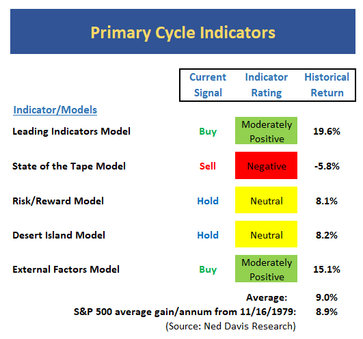
The State of the Big-Picture Market Models
It's a new week, so let's start things off with a review of the state of my favorite big-picture market models, which are designed to tell us which team is in control of the prevailing major trend.
View My Favorite Market Models Online
Executive Summary:
- The long-term oriented Leading Indicators model remains positive and on a buy signal. However, the indicator level itself has pulled back and is closing in on the neutral zone.
- *** NEW SIGNAL *** Perhaps the most important change on any of the indicator boards this week is the sell signal produced by the State of the Tape Model on Wednesday. Note that this is a "binary" model - meaning there is no neutral zone.
- The Risk/Reward model remains neutral. I've been saying for some time that this model did a great job of providing a big-picture warning that risk levels had become elevated.
- My "desert island" model, which is a combination of trend, momentum, and external factors, remains on a long-term buy signal, but the model reading is currently neutral. The neutral reading of this model was also an excellent indicator that the risk of a correction had become elevated.
- The newly expanded External Factors model has improved and is solidly positive at this time. This suggests that the cyclical bull trend remains intact.
- At the risk of repeating myself, the takeaway from the Primary Cycle board is this remains a bull market until proven otherwise. And as most every long-term manager has said this week, it is important to remember that corrections of 10% are normal and happen, on average, a little over than once per year.
The State of the Trend
Digging into the details, I like to start my weekly review with a look at the "state of the trend." These indicators are designed to give us a feel for the overall health of the current short- and intermediate-term trend models.
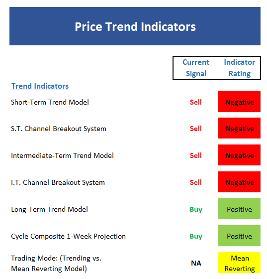
View Trend Indicator Board Online
Executive Summary:
- Feel free to file this in the Captain Obvious column, but with the trend of all our shorter-term ma's down, the trend is negative
- The short-term Channel Breakout system (a modified version of Donchian Channel) produced a timely sell signal on Friday, February 2nd.
- The intermediate-term trend of the market has also turned red. But it is worth noting that the S&P bounced and reversed off its 150-day on a closing basis Thursday and the 200-day MA on Friday. Technicians suggest this improves the likelihood of a bottom.
- The intermediate-term Channel Breakout System flashed a sell signal on Monday 2/5.
- The long-term Trend Model remains positive. This is an indication that what we are seeing now is a correction and not a bear market.
- The Cycle Composite turns modestly green this week. While the timing of the market movement was off by a couple weeks, it is worth noting that the S&P and the cycle composite are in the same spot at the present time.
- From an intermediate-term perspective, the market has shifted into a mean-reverting mode. As such, trend-following strategies should be minimized and mean-reverting strategies should be emphasized.
- In sum, the trend indicators have taken a beating in the last two weeks and the trend is now negative.
The State of Internal Momentum
Next up are the momentum indicators, which are designed to tell us whether there is any "oomph" behind the current trend.
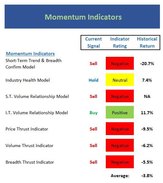
View Momentum Indicator Board Online
Executive Summary:
- The short-term Trend and Breadth Confirm Model remains negative.
- Our Industry Health model fell hard last week but remains in the neutral zone. Note that stocks have gained ground at an annualized rate only slightly below the historical norm when the model is in this mode.
- The short-term Volume Relationship slipped to negative last week as down volume swamped up volume. We should recognize that the 30 dma of down volume is now in a solid uptrend.
- While Supply Volume has been trending higher over the past two weeks, the intermediate-term Volume Relationship Model remains in good shape and on a buy signal.
- As you'd expect, the Price Thrust Indicator fell into the negative zone last week.
- The Volume Thrust Indicator remains red this week.
- The Breadth Thrust Indicator also remains negative and produced a "breadth thrust sell signal."
- The bottom line for the momentum board is the market internals have taken a hit and the historical return for the current model readings is negative.
The State of the "Trade"
We also focus each week on the "early warning" board, which is designed to indicate when traders might start to "go the other way" -- for a trade.

View Early Warning Indicator Board Online
Executive Summary:
- From a near-term perspective, stocks have reached an oversold reading.
- From an intermediate-term view, stocks have largely worked off what had been a VERY overbought condition. However, the market has not yet achieved an oversold buy signal.
- The Mean Reversion Model made a comeback by issuing both timely short and cover signals last week, netting a gain of 1.1% on the trade for the week.
- The short-term VIX indicator is currently in never-land from a signal standpoint.
- This intermediate-term VIX signal remains on a buy signal. But on a weekly closing basis, volatility levels are at the highest levels seen since 2011. This signal has not been of value during the move.
- From a short-term perspective, market sentiment has reached the extreme negative zone. However, the best signals come after the model has reached and extreme and then reversed.
- The intermediate-term Sentiment Model has done a U-turn out of negative territory and is now neutral. For traders, this is a buy signal.
- The Longer-term Sentiment model has reversed but remains in negative territory. As such, an "all clear" signal cannot be issued from a sentiment perspective.
The State of the Macro Picture
Now let's move on to the market's "external factors" - the indicators designed to tell us the state of the big-picture market drivers including monetary conditions, the economy, inflation, and valuations.

View External Factors Indicator Board Online
Executive Summary:
- The Absolute Monetary model remains neutral but the model reading continues to inch closer to a sell signal for the first time since 2011.
- The Relative Monetary Model remains in the neutral zone.
- No change on the economic model front. The Economic Model continues to suggest a strong economic environment and decent equity returns.
- The Inflation Model remains positive and continues to suggest that inflation pressures are not a concern at this point.
- As expected, the Absolute Valuation Model reading spiked to a new high reading for the current cycle.
- Our Relative Valuation Model (which incorporates the current level of interest rates) flashed a timely sell signal three weeks ago and is now at its lowest level since 2009.
- The takeaway from the External Factors board is the historical return for the current environment is well below the historic norm. And if one listens to the bond vigilantes, the Inflation Model could soon turn to neutral.
Sample Tactical Allocation Model
Below is an EXAMPLE (and ONLY an EXAMPLE) of how one might incorporate the indicator boards. The approach shown below is designed to provide the current equity allocation for a balanced tactical asset allocation model with a base target of 60/40 stocks/bonds.
The overall intent of the model is to keep equity exposure in line with current conditions.
Beginning February 2018, the model will be updated monthly.
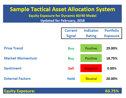
The model above is for illustrative and informational purposes only and does not in any way represent any investment recommendation. The model is merely a sample of how indicators can be grouped to create a guide to market exposure based on the inputs from multiple indicators/models.
Indicators Explained
Short-Term Trend-and-Breadth Signal Explained: History shows the most reliable market moves tend to occur when the breadth indices are in gear with the major market averages. When the breadth measures diverge, investors should take note that a trend reversal may be at hand. This indicator incorporates NDR's All-Cap Dollar Weighted Equity Series and A/D Line. From 1998, when the A/D line is above its 5-day smoothing and the All-Cap Equal Weighted Equity Series is above its 25-day smoothing, the equity index has gained at a rate of +32.5% per year. When one of the indicators is above its smoothing, the equity index has gained at a rate of +13.3% per year. And when both are below, the equity index has lost +23.6% per year.
Channel Breakout System Explained: The short-term and intermediate-term Channel Breakout Systems are modified versions of the Donchian Channel indicator. According to Wikipedia, "The Donchian channel is an indicator used in market trading developed by Richard Donchian. It is formed by taking the highest high and the lowest low of the last n periods. The area between the high and the low is the channel for the period chosen."
Intermediate-Term Trend-and-Breadth Signal Explained: This indicator incorporates NDR's All-Cap Dollar Weighted Equity Series and A/D Line. From 1998, when the A/D line is above its 45-day smoothing and the All-Cap Equal Weighted Equity Series is above its 45-day smoothing, the equity index has gained at a rate of +17.6% per year. When one of the indicators is above its smoothing, the equity index has gained at a rate of +6.5% per year. And when both are below, the equity index has lost -1.3% per year.
Industry Health Model Explained: Designed to provide a reading on the technical health of the overall market, Big Mo Tape takes the technical temperature of more than 100 industry sectors each week. Looking back to early 1980, when the model is rated as "positive," the S&P has averaged returns in excess of 23% per year. When the model carries a "neutral" reading, the S&P has returned over 11% per year. But when the model is rated "negative," stocks fall by more than -13% a year on average.
Cycle Composite Projections: The cycle composite combines the 1-year Seasonal, 4-year Presidential, and 10-year Decennial cycles. The indicator reading shown uses the cycle projection for the upcoming week.
Trading Mode Indicator: This indicator attempts to identify whether the current trading environment is "trending" or "mean reverting." The indicator takes the composite reading of the Efficiency Ratio, the Average Correlation Coefficient, and Trend Strength models.
Volume Relationship Models: These models review the relationship between "supply" and "demand" volume over the short- and intermediate-term time frames.
Price Thrust Model Explained: This indicator measures the 3-day rate of change of the Value Line Composite relative to the standard deviation of the 30-day average. When the Value Line's 3-day rate of change have moved above 0.5 standard deviation of the 30-day average ROC, a "thrust" occurs and since 2000, the Value Line Composite has gained ground at a rate of +20.6% per year. When the indicator is below 0.5 standard deviation of the 30-day, the Value Line has lost ground at a rate of -10.0% per year. And when neutral, the Value Line has gained at a rate of +5.9% per year.
Volume Thrust Model Explained: This indicator uses NASDAQ volume data to indicate bullish and bearish conditions for the NASDAQ Composite Index. The indicator plots the ratio of the 10-day total of NASDAQ daily advancing volume (i.e., the total volume traded in stocks which rose in price each day) to the 10-day total of daily declining volume (volume traded in stocks which fell each day). This ratio indicates when advancing stocks are attracting the majority of the volume (readings above 1.0) and when declining stocks are seeing the heaviest trading (readings below 1.0). This indicator thus supports the case that a rising market supported by heavier volume in the advancing issues tends to be the most bullish condition, while a declining market with downside volume dominating confirms bearish conditions. When in a positive mode, the NASDAQ Composite has gained at a rate of +38.3% per year, When neutral, the NASDAQ has gained at a rate of +13.3% per year. And when negative, the NASDAQ has lost at a rate of -8.5% per year.
Breadth Thrust Model Explained: This indicator uses the number of NASDAQ-listed stocks advancing and declining to indicate bullish or bearish breadth conditions for the NASDAQ Composite. The indicator plots the ratio of the 10-day total of the number of stocks rising on the NASDAQ each day to the 10-day total of the number of stocks declining each day. Using 10-day totals smooths the random daily fluctuations and gives indications on an intermediate-term basis. As expected, the NASDAQ Composite performs much better when the 10-day A/D ratio is high (strong breadth) and worse when the indicator is in its lower mode (weak breadth). The most bullish conditions for the NASDAQ when the 10-day A/D indicator is not only high, but has recently posted an extreme high reading and thus indicated a thrust of upside momentum. Bearish conditions are confirmed when the indicator is low and has recently signaled a downside breadth thrust. In positive mode, the NASDAQ has gained at a rate of +22.1% per year since 1981. In a neutral mode, the NASDAQ has gained at a rate of +14.5% per year. And when in a negative mode, the NASDAQ has lost at a rate of -6.4% per year.
Short-Term Overbought/sold Indicator: This indicator is the current reading of the 14,1,3 stochastic oscillator. When the oscillator is above 80 and the %K is above the %D, the indicator gives an overbought reading. Conversely, when the oscillator is below 20 and %K is below its %D, the indicator is oversold.
Intermediate-Term Overbought/sold Indicator: This indicator is a 40-day RSI reading. When above 57.5, the indicator is considered overbought and when below 45 it is oversold.
Mean Reversion Model: This is a diffusion model consisting of five indicators that can produce buy and sell signals based on overbought/sold conditions.
VIX Indicator: This indicator looks at the current reading of the VIX relative to standard deviation bands. When the indicator reaches an extreme reading in either direction, it is an indication that a market trend could reverse in the near-term.
Short-Term Sentiment Indicator: This is a model-of-models composed of 18 independent sentiment indicators designed to indicate when market sentiment has reached an extreme from a short-term perspective. Historical analysis indicates that the stock market's best gains come after an environment has become extremely negative from a sentiment standpoint. Conversely, when sentiment becomes extremely positive, market returns have been subpar.
Intermediate-Term Sentiment Indicator: This is a model-of-models composed of 7 independent sentiment indicators designed to indicate when market sentiment has reached an extreme from an intermediate-term perspective. Historical analysis indicates that the stock market's best gains come after an environment has become extremely negative from a sentiment standpoint. Conversely, when sentiment becomes extremely positive, market returns have been subpar.
Long-Term Sentiment Indicator: This is a model-of-models composed of 6 independent sentiment indicators designed to indicate when market sentiment has reached an extreme from a long-term perspective. Historical analysis indicates that the stock market's best gains come after an environment has become extremely negative from a sentiment standpoint. Conversely, when sentiment becomes extremely positive, market returns have been subpar.
Absolute Monetary Model Explained: The popular cliché, "Don't fight the Fed" is really a testament to the profound impact that interest rates and Fed policy have on the market. It is a proven fact that monetary conditions are one of the most powerful influences on the direction of stock prices. The Absolute Monetary Model looks at the current level of interest rates relative to historical levels and Fed policy.
Relative Monetary Model Explained: The "relative" monetary model looks at monetary indicators relative to recent levels as well as rates of change and Fed Policy.
Economic Model Explained: During the middle of bull and bear markets, understanding the overall health of the economy and how it impacts the stock market is one of the few truly logical aspects of the stock market. When our Economic model sports a "positive" reading, history (beginning in 1965) shows that stocks enjoy returns in excess of 21% per year. Yet, when the model's reading falls into the "negative" zone, the S&P has lost nearly -25% per year. However, it is vital to understand that there are times when good economic news is actually bad for stocks and vice versa. Thus, the Economic model can help investors stay in tune with where we are in the overall economic cycle.
Inflation Model Explained: They say that "the tape tells all." However, one of the best "big picture" indicators of what the market is expected to do next is inflation. Simply put, since 1962, when the model indicates that inflationary pressures are strong, stocks have lost ground. Yet, when inflationary pressures are low, the S&P 500 has gained ground at a rate in excess of 13%. The bottom line is inflation is one of the primary drivers of stock market returns.
Valuation Model Explained: If you want to get analysts really riled up, you need only to begin a discussion of market valuation. While the question of whether stocks are overvalued or undervalued appears to be a simple one, the subject is extremely complex. To simplify the subject dramatically, investors must first determine if they should focus on relative valuation (which include the current level of interest rates) or absolute valuation measures (the more traditional readings of Price/Earnings, Price/Dividend, and Price/Book Value). We believe that it is important to recognize that environments change. And as such, the market's focus and corresponding view of valuations are likely to change as well. Thus, we depend on our Valuation Models to help us keep our eye on the ball.
Disclosures
The opinions and forecasts expressed herein are those of Mr. David Moenning and may not actually come to pass. Mr. Moenning's opinions and viewpoints regarding the future of the markets should not be construed as recommendations. The analysis and information in this report is for informational purposes only. No part of the material presented in this report is intended as an investment recommendation or investment advice. Neither the information nor any opinion expressed constitutes a solicitation to purchase or sell securities or any investment program.
Any investment decisions must in all cases be made by the reader or by his or her investment adviser. Do NOT ever purchase any security without doing sufficient research. There is no guarantee that the investment objectives outlined will actually come to pass. All opinions expressed herein are subject to change without notice. Neither the editor, employees, nor any of their affiliates shall have any liability for any loss sustained by anyone who has relied on the information provided.
Mr. Moenning may at times have positions in the securities referred to and may make purchases or sales of these securities while publications are in circulation. Positions may change at any time.
The analysis provided is based on both technical and fundamental research and is provided "as is" without warranty of any kind, either expressed or implied. Although the information contained is derived from sources which are believed to be reliable, they cannot be guaranteed.
Investments in equities carry an inherent element of risk including the potential for significant loss of principal. Past performance is not an indication of future results.