Time To Hit Reset?
As long-time readers are aware, the main objective of my oftentimes meandering market missive is to identify the driving forces behind the action in the stock market. For the past 20+ years, my thinking has been that if I can stay in tune with what is happening and why in Ms. Market's game, I may be able to avoid getting fooled badly when something really big happens.
In looking back at the week that was, it is clear (as in "crystal") that the most recent spike in interest rates was the driving factor in the stock market action. In just five trading sessions, the yield on the U.S. 10-year went from 3.056% to 3.225%, which represents (a) a new high for the year, (b) a breakout to a new cycle high, and (c) the highest level seen since April 2011. So, yea, it was a pretty big deal.
As the chart below illustrates, this is simply the latest in a string of spikes that began in mid-2016.
US Govt 10-Year Treasury Yield - Weekly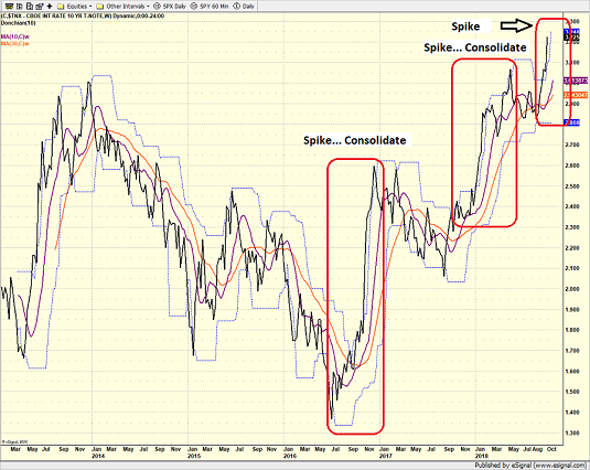
View Larger Image Online
It is also worth noting that the spikes tend to be swift and are then followed by a period of consolidation.
So, the logical questions become: Why did rates spike? And why now?
Cutting to the chase, I believe that a reset in expectations from a macro perspective and some pretty important comments from some pretty influential folks were the primary reasons behind the big move in the bond market. You see, suddenly everyone is worried that the Fed will be forced to overshoot and that when combined with a prolonged trade war, higher rates could become a drag on economic growth.
From my seat, the keys to the surge in bond yields included a round of stronger economic data, technical breaks, and comments from the likes of Powell, Warsh, Gundlach, and Hatzius. So, let's run it down.
Better Than Expected
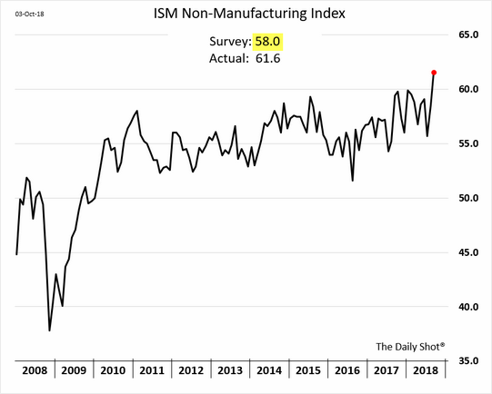
First up is the economic data. The bottom line here simple. While everybody knows the economy is doing just fine, thank you, last week's ISM Non-Manufacturing, ADP, and Nonfarm Payroll reports all raised eyebrows.
For example, the ISM services index came in at 61, which was leaps and bounds better than the expected level of 58. Analysts were also fooled by the ADP report as private sector payrolls were significantly higher than consensus. And then the monthly jobs report sported the lowest level of unemployment since December 1969. Yowza.
At first blush, all of the above certainly sounds good. But unfortunately, we are at that stage in the game where the data was perhaps a bit too good.
He Said, What?
While likely not directly in response to last week's data, comments from Fed Chairman Jerome Powell and former Fed Governor Kevin Warsh also appeared to get bond traders fired up.
First, Powell told PBS that "really extremely accommodative low interest rates" are "not appropriate" anymore. Frankly, this shouldn't have surprised anyone. However, the next comments the Fed Chair made certainly did.
First, Powell said that rates may go higher than the markets currently expect. Specifically, the Fed Chairman said, "We may go past neutral." The issue here is markets have been expecting the Fed to stop raising rates once the "neutral" level in the Fed Funds Rate is achieved. This was the first traders have heard about the potential for rate hikes to continue past the neutral zone.
Then, on the subject of what "neutral" actually means, Powell added, "we're a long way from neutral at this point." Again, the key is this appeared to take traders by surprise.
Yes, there is a chance that this was taken out of context as the current consensus for "neutral" is 3% on the Fed Funds Rate. And since it can be argued that 3% is indeed a long way from the current range of 2.0% - 2.25%, perhaps traders overreacted.
Next up were the comments on inflation from Kevin Warsh. The former Fed Governor said the labor market is "booming" and that wage pressures are visible everywhere except in the government data. As such, Warsh opined that wage pressures will begin showing up in the near future. And lest we forget, wages are the toughest part of inflation for the Fed to fight.
Oh, and in case you missed it; Ned Davis Research declared that the bear market in bonds has finally arrived. (But for the record, NDR is waiting for German yields to confirm in order to officially declare the bond bear intact.)
Speaking of big calls, the new "Bond King" - aka Jeffrey Gundlach - pointed out on Friday that he was indeed right back in the summer of 2016 when he declared the low point in bond yields had been seen and that a bear was upon us. Mr. Gundlach also suggested that "significantly higher bond yields" are ahead.
Finally, Goldman's Chief Economist, Jan Hatzius summed up the situation nicely Friday when he told CNBC that the Fed is likely to continue to hike rates and probably by more than the markets are currently pricing in.
Time To Hit Reset?
So there you have it; a nearly perfect storm for the bond bears. And with key technical levels snapping like toothpicks, bond buyers were simply overrun by sellers last week.
And as a result of the data and the commentary, traders may now be in the process of rethinking their base case macro scenario going forward. And the bottom line is this "reset" in expectations may include higher rates and higher inflation. Neither of which has not been particularly kind to stocks in the past.
Moving On... Now let's turn to the weekly review of my favorite indicators and market models...
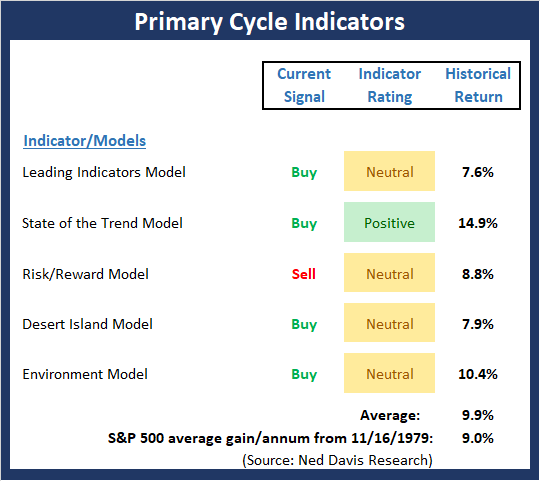
The State of the Big-Picture Market Models
I like to start each week with a review of the state of my favorite big-picture market models, which are designed to help me determine which team is in control of the primary cycle.
View My Favorite Market Models Online
The Bottom Line:
- A quick glance at the Signal column and the colors of the indicator rating boxes says it all about Primary Cycle board this week. While there were no signal changes, the readings of the State of the Trend and Desert Island model both slipped into the neutral zone with the State of the Trend reading at its 2nd lowest level of the year.
This week's mean percentage score of my 5 favorite models slipped a bit to 55.5% while the median held steady at 65%. The current readings suggest to me that the underlying strength of the overall market structure continues to falter.
The State of the Trend
Once I've reviewed the big picture, I then turn to the "state of the trend." These indicators are designed to give us a feel for the overall health of the current short- and intermediate-term trend models.

View Trend Indicator Board Online
The Bottom Line:
- The status of the Trend Board slipped a bit this week as the short-term trend indicators broke down. FYI, the Cycle Composite points slightly lower this week and then up for the next two. The question of the day is if the "generals" (Dow/S&P 500) will follow the "troops" (small-, mid-caps) into full-fledged downtrends. The divergence here continues to warrant some attention.
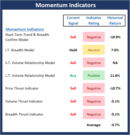
The State of Internal Momentum
Next up are the momentum indicators, which are designed to tell us whether there is any "oomph" behind the current trend.
View Momentum Indicator Board Online
The Bottom Line:
- With only a single "buy" signal currently on the board, Momentum has to be considered a problem. Three indicators on the board fell into the red this week (I.T. Breadth, S.T. Volume Relationship, and Breadth Thrust Indicator) and only the longer-term volume relationship indicator remains on a buy signal.
The State of the "Trade"
We also focus each week on the "early warning" board, which is designed to indicate when traders might start to "go the other way" -- for a trade.
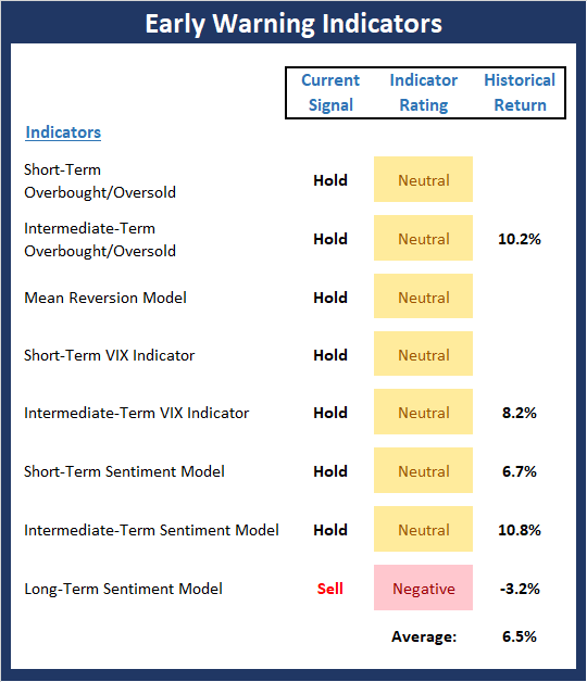
View Early Warning Indicator Board Online
The Bottom Line:
- The "Early Warning" board did a nice job of signaling that the bears were due to get in the game recently. However, the overbought/overbelieved tailwinds have now waned and the board is clearly neutral.
The State of the Macro Picture
Now let's move on to the market's "environmental factors" - the indicators designed to tell us the state of the big-picture market drivers including monetary conditions, the economy, inflation, and valuations.
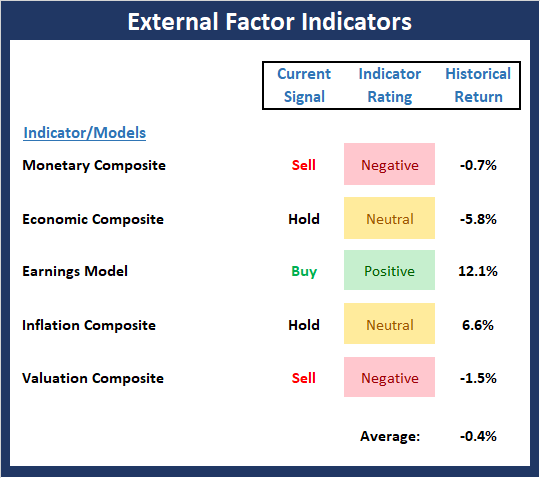
View Environment Indicator Board Online
The Bottom Line:
- The External Factors board continues to suggest that this is not a low risk environment and that some degree of caution is warranted.
Thought For The Day:
Commitment means staying loyal to what you said you were going to do, long after the mood you said it in has left you. -Inky Johnson
Wishing you green screens and all the best for a great day,

David D. Moenning
Founder, Chief Investment Officer
Heritage Capital Research
HCR Focuses on a Risk-Managed Approach to Investing
What Risk Management Can and Cannot Do

ANNOUNCEMENT:
HCR Awarded Top Honors in 2018 NAAIM Shark Tank Portfolio Strategy Competition
Each year, NAAIM (National Association of Active Investment Managers) hosts a competition to identify the best actively managed investment strategies. In April, HCR's Dave Moenning took home first place for his flagship risk management strategy.
Disclosures
At the time of publication, Mr. Moenning held long positions in the following securities mentioned: none - Note that positions may change at any time.
Indicators Explained
Short-Term Trend-and-Breadth Signal Explained: History shows the most reliable market moves tend to occur when the breadth indices are in gear with the major market averages. When the breadth measures diverge, investors should take note that a trend reversal may be at hand. This indicator incorporates NDR's All-Cap Dollar Weighted Equity Series and A/D Line. From 1998, when the A/D line is above its 5-day smoothing and the All-Cap Equal Weighted Equity Series is above its 25-day smoothing, the equity index has gained at a rate of +32.5% per year. When one of the indicators is above its smoothing, the equity index has gained at a rate of +13.3% per year. And when both are below, the equity index has lost +23.6% per year.
Channel Breakout System Explained: The short-term and intermediate-term Channel Breakout Systems are modified versions of the Donchian Channel indicator. According to Wikipedia, "The Donchian channel is an indicator used in market trading developed by Richard Donchian. It is formed by taking the highest high and the lowest low of the last n periods. The area between the high and the low is the channel for the period chosen."
Intermediate-Term Trend-and-Breadth Signal Explained: This indicator incorporates NDR's All-Cap Dollar Weighted Equity Series and A/D Line. From 1998, when the A/D line is above its 45-day smoothing and the All-Cap Equal Weighted Equity Series is above its 45-day smoothing, the equity index has gained at a rate of +17.6% per year. When one of the indicators is above its smoothing, the equity index has gained at a rate of +6.5% per year. And when both are below, the equity index has lost -1.3% per year.
Cycle Composite Projections: The cycle composite combines the 1-year Seasonal, 4-year Presidential, and 10-year Decennial cycles. The indicator reading shown uses the cycle projection for the upcoming week.
Trading Mode Indicator: This indicator attempts to identify whether the current trading environment is "trending" or "mean reverting." The indicator takes the composite reading of the Efficiency Ratio, the Average Correlation Coefficient, and Trend Strength models.
Volume Relationship Models: These models review the relationship between "supply" and "demand" volume over the short- and intermediate-term time frames.
Price Thrust Model Explained: This indicator measures the 3-day rate of change of the Value Line Composite relative to the standard deviation of the 30-day average. When the Value Line's 3-day rate of change have moved above 0.5 standard deviation of the 30-day average ROC, a "thrust" occurs and since 2000, the Value Line Composite has gained ground at a rate of +20.6% per year. When the indicator is below 0.5 standard deviation of the 30-day, the Value Line has lost ground at a rate of -10.0% per year. And when neutral, the Value Line has gained at a rate of +5.9% per year.
Volume Thrust Model Explained: This indicator uses NASDAQ volume data to indicate bullish and bearish conditions for the NASDAQ Composite Index. The indicator plots the ratio of the 10-day total of NASDAQ daily advancing volume (i.e., the total volume traded in stocks which rose in price each day) to the 10-day total of daily declining volume (volume traded in stocks which fell each day). This ratio indicates when advancing stocks are attracting the majority of the volume (readings above 1.0) and when declining stocks are seeing the heaviest trading (readings below 1.0). This indicator thus supports the case that a rising market supported by heavier volume in the advancing issues tends to be the most bullish condition, while a declining market with downside volume dominating confirms bearish conditions. When in a positive mode, the NASDAQ Composite has gained at a rate of +38.3% per year, When neutral, the NASDAQ has gained at a rate of +13.3% per year. And when negative, the NASDAQ has lost at a rate of -10.6% per year.
Breadth Thrust Model Explained: This indicator uses the number of NASDAQ-listed stocks advancing and declining to indicate bullish or bearish breadth conditions for the NASDAQ Composite. The indicator plots the ratio of the 10-day total of the number of stocks rising on the NASDAQ each day to the 10-day total of the number of stocks declining each day. Using 10-day totals smooths the random daily fluctuations and gives indications on an intermediate-term basis. As expected, the NASDAQ Composite performs much better when the 10-day A/D ratio is high (strong breadth) and worse when the indicator is in its lower mode (weak breadth). The most bullish conditions for the NASDAQ when the 10-day A/D indicator is not only high, but has recently posted an extreme high reading and thus indicated a thrust of upside momentum. Bearish conditions are confirmed when the indicator is low and has recently signaled a downside breadth thrust. In positive mode, the NASDAQ has gained at a rate of +22.1% per year since 1981. In a neutral mode, the NASDAQ has gained at a rate of +14.5% per year. And when in a negative mode, the NASDAQ has lost at a rate of -6.4% per year.
Short-Term Overbought/sold Indicator: This indicator is the current reading of the 14,1,3 stochastic oscillator. When the oscillator is above 80 and the %K is above the %D, the indicator gives an overbought reading. Conversely, when the oscillator is below 20 and %K is below its %D, the indicator is oversold.
Intermediate-Term Overbought/sold Indicator: This indicator is a 40-day RSI reading. When above 57.5, the indicator is considered overbought and when below 45 it is oversold.
Mean Reversion Model: This is a diffusion model consisting of five indicators that can produce buy and sell signals based on overbought/sold conditions.
VIX Indicator: This indicator looks at the current reading of the VIX relative to standard deviation bands. When the indicator reaches an extreme reading in either direction, it is an indication that a market trend could reverse in the near-term.
Short-Term Sentiment Indicator: This is a model-of-models composed of 18 independent sentiment indicators designed to indicate when market sentiment has reached an extreme from a short-term perspective. Historical analysis indicates that the stock market's best gains come after an environment has become extremely negative from a sentiment standpoint. Conversely, when sentiment becomes extremely positive, market returns have been subpar.
Intermediate-Term Sentiment Indicator: This is a model-of-models composed of 7 independent sentiment indicators designed to indicate when market sentiment has reached an extreme from an intermediate-term perspective. Historical analysis indicates that the stock market's best gains come after an environment has become extremely negative from a sentiment standpoint. Conversely, when sentiment becomes extremely positive, market returns have been subpar.
Long-Term Sentiment Indicator: This is a model-of-models composed of 6 independent sentiment indicators designed to indicate when market sentiment has reached an extreme from a long-term perspective. Historical analysis indicates that the stock market's best gains come after an environment has become extremely negative from a sentiment standpoint. Conversely, when sentiment becomes extremely positive, market returns have been subpar.
Absolute Monetary Model Explained: The popular cliché, "Don't fight the Fed" is really a testament to the profound impact that interest rates and Fed policy have on the market. It is a proven fact that monetary conditions are one of the most powerful influences on the direction of stock prices. The Absolute Monetary Model looks at the current level of interest rates relative to historical levels and Fed policy.
Relative Monetary Model Explained: The "relative" monetary model looks at monetary indicators relative to recent levels as well as rates of change and Fed Policy.
Economic Model Explained: During the middle of bull and bear markets, understanding the overall health of the economy and how it impacts the stock market is one of the few truly logical aspects of the stock market. When our Economic model sports a "positive" reading, history (beginning in 1965) shows that stocks enjoy returns in excess of 21% per year. Yet, when the model's reading falls into the "negative" zone, the S&P has lost nearly -25% per year. However, it is vital to understand that there are times when good economic news is actually bad for stocks and vice versa. Thus, the Economic model can help investors stay in tune with where we are in the overall economic cycle.
Inflation Model Explained: They say that "the tape tells all." However, one of the best "big picture" indicators of what the market is expected to do next is inflation. Simply put, since 1962, when the model indicates that inflationary pressures are strong, stocks have lost ground. Yet, when inflationary pressures are low, the S&P 500 has gained ground at a rate in excess of 13%. The bottom line is inflation is one of the primary drivers of stock market returns.
Valuation Model Explained: If you want to get analysts really riled up, you need only to begin a discussion of market valuation. While the question of whether stocks are overvalued or undervalued appears to be a simple one, the subject is extremely complex. To simplify the subject dramatically, investors must first determine if they should focus on relative valuation (which include the current level of interest rates) or absolute valuation measures (the more traditional readings of Price/Earnings, Price/Dividend, and Price/Book Value). We believe that it is important to recognize that environments change. And as such, the market's focus and corresponding view of valuations are likely to change as well. Thus, we depend on our Valuation Models to help us keep our eye on the ball.
Disclosures
The opinions and forecasts expressed herein are those of Mr. David Moenning and may not actually come to pass. Mr. Moenning's opinions and viewpoints regarding the future of the markets should not be construed as recommendations. The analysis and information in this report is for informational purposes only. No part of the material presented in this report is intended as an investment recommendation or investment advice. Neither the information nor any opinion expressed constitutes a solicitation to purchase or sell securities or any investment program.
Any investment decisions must in all cases be made by the reader or by his or her investment adviser. Do NOT ever purchase any security without doing sufficient research. There is no guarantee that the investment objectives outlined will actually come to pass. All opinions expressed herein are subject to change without notice. Neither the editor, employees, nor any of their affiliates shall have any liability for any loss sustained by anyone who has relied on the information provided.
Mr. Moenning may at times have positions in the securities referred to and may make purchases or sales of these securities while publications are in circulation. Positions may change at any time.
The analysis provided is based on both technical and fundamental research and is provided "as is" without warranty of any kind, either expressed or implied. Although the information contained is derived from sources which are believed to be reliable, they cannot be guaranteed.
Investments in equities carry an inherent element of risk including the potential for significant loss of principal. Past performance is not an indication of future results.