Will Valuations Spoil The Bull's Party?
In spite of the escalating trade "skirmish" and a long list of purported negatives, stocks continued to trudge higher last week with the DJIA finishing at a new all-time high on Friday. The S&P 500 wasn't far off the pace, closing just 0.04% off Thursday's record high. However, for the rest of the major indices, that's where the good news ended.
The bottom line is there are short-term divergences developing in the major indices as those seeing Ms. Market's glass as half-empty point out that the "troops" may not be following the "generals" at the present time.
Let's start by looking at the good stuff on the chart of the Dow Jones Industrial Average (aka the original "generals" of the market)... Can you say "good times?"
DJIA - Daily 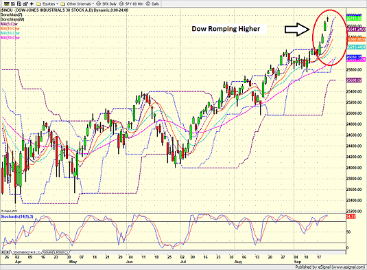
View Larger Image Online
As the saying goes, the most bullish thing a market can do is make new highs. 'Nuff said.
Next up is the S&P 500. While the Dow is romping to new highs, the action in the primary blue-chip index is not quite as encouraging. My take is good, but not great.
S&P 500 - Daily 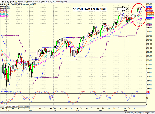
View Larger Image Online
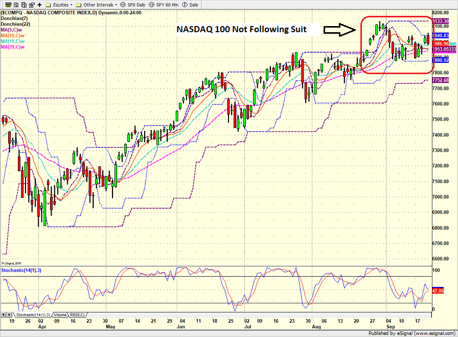
Now let's move on to the "troops". As the chart of the NASDAQ indicates, the market's long-term leaders do not appear to be following the Dow and S&'s lead. This week's sector rebalancing as well as some possible rotation away from the FANG's looks to be taking it's toll.
NASDAQ 100 - Daily 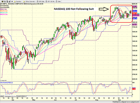
View Larger Image Online
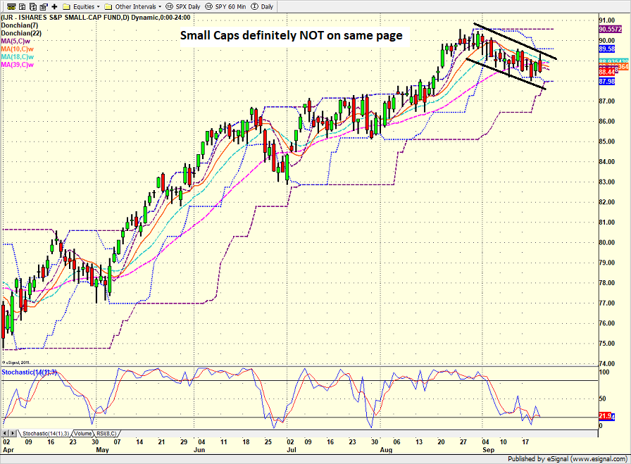
Then there are the small-caps. When you compare the charts of the DJIA and the IJR since the beginning of September, you have what amounts to a textbook example of a technical divergence.
iShares S&P Small-Cap (IJR) - Daily 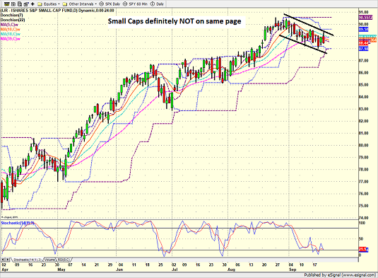
View Larger Image Online
So, the first point I'd like to make on this fine Monday morning is that technical divergences CAN become problematic for the overall market over time. Not always. But, should the current divergent trends continue, our furry friends in the bear camp suggest that things may not end well for the bulls.
However, it is also important to note that short-term divergences are fairly common and may not last long. As such, it is probably not a good idea to run and hide at the present time due to the fact that small-caps are trending down slightly while the Dow is making new highs.
Can The Bulls Keep It Going?
The bulls point to the weekly charts of the Dow and S&P and ask simply, what's not to like? As such, the question of the day seems to be, how much higher can the current bull market run?
Obviously, nobody knows the answer to this question. Nor will I offer up an opinion on the subject. But I can say from experience that aging bulls tend to cause the bears a fair amount of pain as they often persist much longer than our furry friends can imagine.
While I'm not in the prediction business (sorry), I do believe that looking at some macro indicators can help determine whether or not the bears might wake up from hibernation sometime soon.
As I opined in last week's missive, entitled The Good, The Bad, and The Ugly, the economy, earnings, the labor market, and the state of the consumer lead the list of fundamental positives.
But if you asked 10 analysts to offer up their biggest negatives, I'd be willing to bet dollars to donuts that stock market valuations would be on every list. And since there has been a LOT of discussion on this recently, I'm going to spend the rest of my pixels this morning on the subject.
The Issue of Valuations
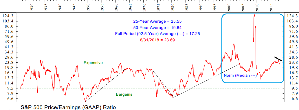
First up, I saw several references to the Price-to-Sales Ratio last week - which I highlighted as well in last week's report. The key point here is that the P/S Ratio recently exceeded the levels seen in 2000. Yikes.
Frankly, the folks yammering on about this stat are a bit late as my data shows the P/S, as well as most other traditional metrics, currently backing away from their recent highs. But, when looking at the Price-to-Earnings, Price-to-Dividend, and Price-to-Book Value indicators from a long-term perspective, there can be no arguing that all are at historically high levels.
Yet at the same time, it is also important to note that these metrics have been improving for much of the year. For example, as you are no doubt aware, the "E" in the P/E ratio has been "movin' on up" in 2018. And since price hadn't really done much until late summer, the P/E ratios have actually been trending lower.
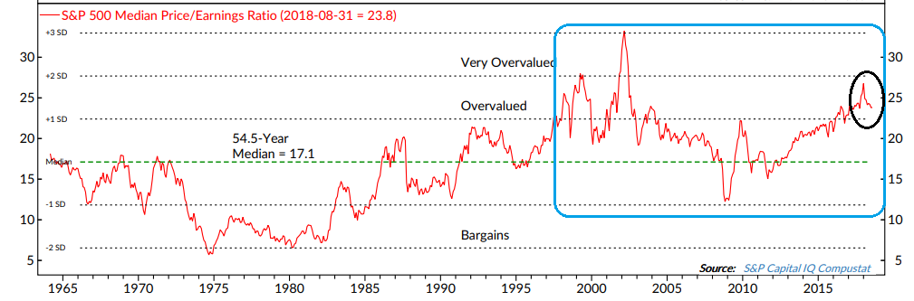
As Exhibit A here, I offer a long-term chart of the S&P's GAAP P/E Ratio - which is the P/E ratio using generally accepted accounting principles instead of the traditional earnings Corporate America reports on a quarterly basis (which tend to involve a fair amount of "financial engineering" and a bunch of non-recurring stuff that seems to show up with remarkable regularity).
S&P 500 GAAP P/E Ratio
View Chart Online
As you can see, the recent trend of the GAAP P/E is down. In short, this is good news if you are a stock market bull.
But the real question is whether the current readings are at extreme levels, which tend to give the bulls the edge, or something a bit less scary?
A Matter Of Perspective
From my seat, this is really a matter of perspective. As in, what time-frame are you looking at?
In the chart above, it is clear that the GAAP P/E remains well above the "Expensive" line (as determined by Ned Davis Research). However, this chart goes back into the 1920's. And as many bulls like to say, should we really be comparing today's market with anything that occurred before computers ruled the roost?
So, if you are bull or the manager of a mutual fund that, by prospectus, is required to stay nearly fully invested at all times, you may decide to change your "perspective" a bit. To something like the last 20 years. After all, 20 years is a pretty long time, right?
To help with this exercise, I've outlined the last 20 years in each of the charts in blue.
Now look at the GAAP P/E chart again. But this time, look only at the readings within the blue box. Voila. Suddenly valuations are not extreme. Heck, they aren't bad at all.
Next up, let's look at the Median P/E ratio, which looks at the P/E of the median stock in the S&P 500. I like this approach because it zeros in on the median stock within the S&P 500 instead of using the average of all stocks.
S&P 500 Median P/E Ratio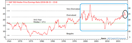
View Chart Online
Looking only at the data contained in the blue box, the median P/E appears to be a bit above the average over the last 20 years. While not cheap by any stretch, the point is the ratio isn't in nose bleed territory either.
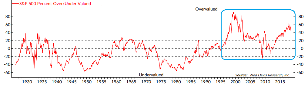
Finally, let's look at NDR's "Normalized Valuations" Model, which looks at long-term averages of six independent valuation indicators based on dividends, earnings, cash flow, sales, inflation-adjusted P/E and trend.
Normalized Valuation Model
View Chart Online
Looking at the entire series back into the 1920's, it is clear that stocks are currently at one of the most overvalued levels in history. And THIS is what the bears are fussing about.
But looking only the last 20 years, the picture is quite a bit different. While the model suggests that stocks definitely aren't cheap, they are also not at the extreme levels that the nattering nabobs of negativism have been screaming about.
The Bottom Line
There can be no arguing that the traditional valuation metrics are elevated relative to historical levels. But, depending on the time frame being used, one can argue that the market is not currently "extremely" overvalued.
Frankly, this approach to the valuation subject reminds me of an old saying... "There are three kinds of lies. Lies. Damned lies. And statistics."
But at the same time, there is an awful lot of money in the markets that is not "risk managed." Think about the trillions allocated to passive investing and the money that is simply automatically invested each month inside of 401K programs. This money is going to continue to be invested in stocks (well, up until it isn't, of course). But until then, I believe the passive craze suggests that another old saw may apply here: Valuations don't matter until they do - and then they matter a lot. And for now anyway, they don't seem to matter too terribly much. Party on, Wayne!
Have a great week!
Moving On... Now let's turn to the weekly review of my favorite indicators and market models... "But first a word from our sponsor ;-)"...
INTRODUCING: THE ELEVATION STRATEGY
A Tax-Efficient Risk Management Strategy for the U.S. Stock Market
Believed to be unique in the industry, the Elevation strategy is a long-term, risk-managed portfolio solution designed for growth-oriented investors seeking a tax-efficient, risk-managed approach to the stock market. Our tests show that 75% of the Strategy's profitable trades since 3/31/1999 would have qualified as long-term for tax purposes.
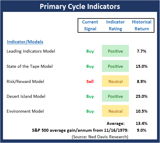
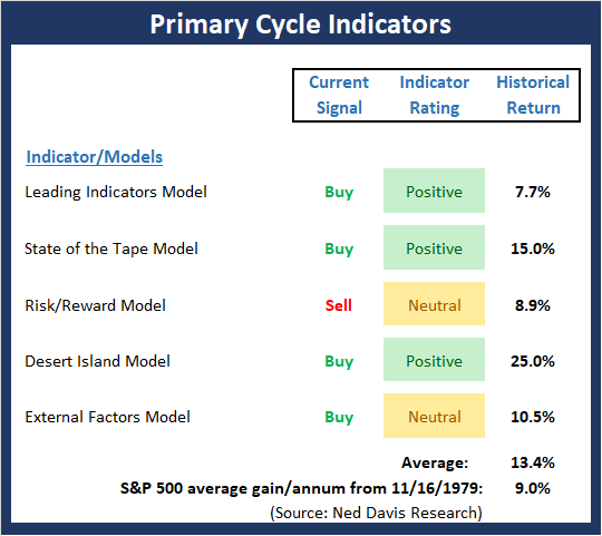
The State of the Big-Picture Market Models
I like to start each week with a review of the state of my favorite big-picture market models, which are designed to help me determine which team is in control of the primary cycle.
View My Favorite Market Models Online
The Bottom Line:
- The Primary Cycle board upticked a bit this week as the Leading Indicators Model moved up a smidge from high-neutral to moderately positive. In order to gauge the overall "tone" of the board, we have decided to begin reporting the mean and median reading of the models each week. This week's mean percentage score of my 5 favorite models is 62% while the median is 65%. We will expand on this analysis in the coming weeks
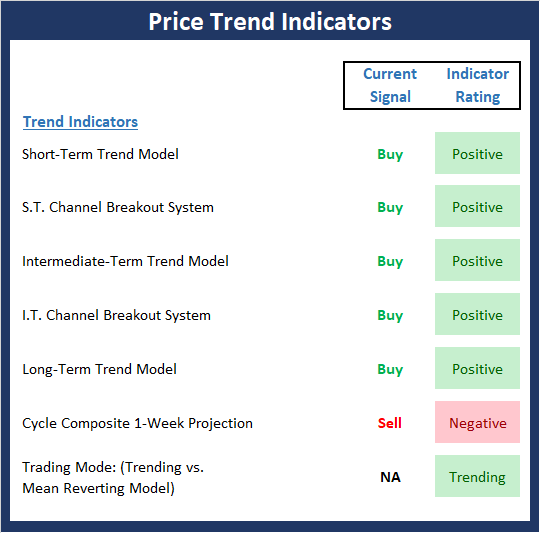
The State of the Trend
Once I've reviewed the big picture, I then turn to the "state of the trend." These indicators are designed to give us a feel for the overall health of the current short- and intermediate-term trend models.
View Trend Indicator Board Online
The Bottom Line:
- With the Dow and S&P finishing the week at all-time highs, it makes sense that the Trend Board is in good shape. The "yea, but" here is the recent action seen in the NASDAQ, mid-caps, and small-caps - which are actually in a downtrend at this time. As such, I can argue the troops are not following the generals from a near-term perspective, which is something to watch going forward.
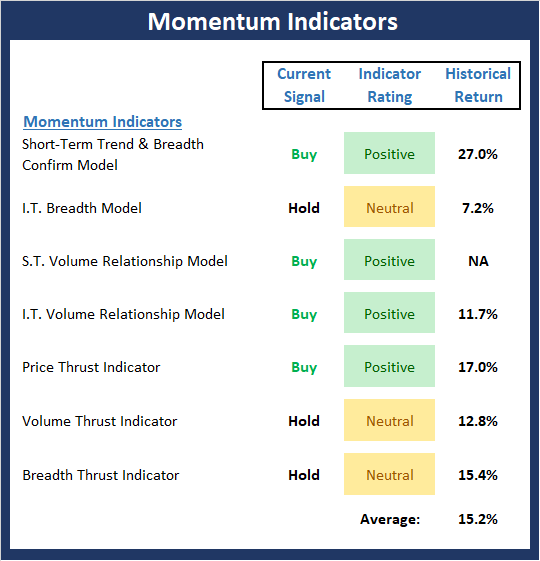
The State of Internal Momentum
Next up are the momentum indicators, which are designed to tell us whether there is any "oomph" behind the current trend.
View Momentum Indicator Board Online
The Bottom Line:
- Despite the new highs seen in the blue-chip indices, the Momentum board downticked slightly last week as our Intermediate-Term Breadth model slipped into the neutral zone. This represents a slight divergence and remains something to watch as the market exits the seasonally week period in a few weeks.
The State of the "Trade"
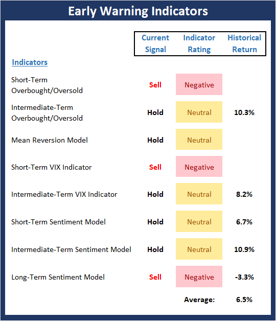
We also focus each week on the "early warning" board, which is designed to indicate when traders might start to "go the other way" -- for a trade.
View Early Warning Indicator Board Online
The Bottom Line:
- The message from the "Early Warning" board would seem to be one of caution. While there are not enough outright sell signals to give the bears a clear edge, the overbought condition coupled with the divergences seen in trend and momentum provides, at the very least, a reason to raise an eyebrow.
The State of the Macro Picture
Now let's move on to the market's "environmental factors" - the indicators designed to tell us the state of the big-picture market drivers including monetary conditions, the economy, inflation, and valuations.
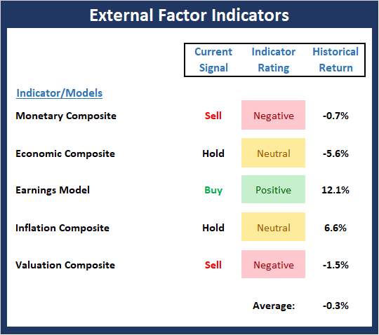
View Environment Indicator Board Online
The Bottom Line:
- The External Factors board continues to be a hot mess. The recent spike in rates has caused the Monetary Composite (a combination of two monetary models) so slip into the negative zone. The bottom line here seems to be that while earnings may be the "lifeblood" of the stock market, the external factors present the bulls with, at the very least, a significant headwind.
Thought For The Day:
The greatest deception men suffer is from their own opinions -- Leonardo da Vinci
Wishing you green screens and all the best for a great day,

David D. Moenning
Founder, Chief Investment Officer
Heritage Capital Research
HCR Focuses on a Risk-Managed Approach to Investing
What Risk Management Can and Cannot Do

ANNOUNCEMENT:
HCR Awarded Top Honors in 2018 NAAIM Shark Tank Portfolio Strategy Competition
Each year, NAAIM (National Association of Active Investment Managers) hosts a competition to identify the best actively managed investment strategies. In April, HCR's Dave Moenning took home first place for his flagship risk management strategy.
Disclosures
At the time of publication, Mr. Moenning held long positions in the following securities mentioned: none - Note that positions may change at any time.
Indicators Explained
Short-Term Trend-and-Breadth Signal Explained: History shows the most reliable market moves tend to occur when the breadth indices are in gear with the major market averages. When the breadth measures diverge, investors should take note that a trend reversal may be at hand. This indicator incorporates NDR's All-Cap Dollar Weighted Equity Series and A/D Line. From 1998, when the A/D line is above its 5-day smoothing and the All-Cap Equal Weighted Equity Series is above its 25-day smoothing, the equity index has gained at a rate of +32.5% per year. When one of the indicators is above its smoothing, the equity index has gained at a rate of +13.3% per year. And when both are below, the equity index has lost +23.6% per year.
Channel Breakout System Explained: The short-term and intermediate-term Channel Breakout Systems are modified versions of the Donchian Channel indicator. According to Wikipedia, "The Donchian channel is an indicator used in market trading developed by Richard Donchian. It is formed by taking the highest high and the lowest low of the last n periods. The area between the high and the low is the channel for the period chosen."
Intermediate-Term Trend-and-Breadth Signal Explained: This indicator incorporates NDR's All-Cap Dollar Weighted Equity Series and A/D Line. From 1998, when the A/D line is above its 45-day smoothing and the All-Cap Equal Weighted Equity Series is above its 45-day smoothing, the equity index has gained at a rate of +17.6% per year. When one of the indicators is above its smoothing, the equity index has gained at a rate of +6.5% per year. And when both are below, the equity index has lost -1.3% per year.
Cycle Composite Projections: The cycle composite combines the 1-year Seasonal, 4-year Presidential, and 10-year Decennial cycles. The indicator reading shown uses the cycle projection for the upcoming week.
Trading Mode Indicator: This indicator attempts to identify whether the current trading environment is "trending" or "mean reverting." The indicator takes the composite reading of the Efficiency Ratio, the Average Correlation Coefficient, and Trend Strength models.
Volume Relationship Models: These models review the relationship between "supply" and "demand" volume over the short- and intermediate-term time frames.
Price Thrust Model Explained: This indicator measures the 3-day rate of change of the Value Line Composite relative to the standard deviation of the 30-day average. When the Value Line's 3-day rate of change have moved above 0.5 standard deviation of the 30-day average ROC, a "thrust" occurs and since 2000, the Value Line Composite has gained ground at a rate of +20.6% per year. When the indicator is below 0.5 standard deviation of the 30-day, the Value Line has lost ground at a rate of -10.0% per year. And when neutral, the Value Line has gained at a rate of +5.9% per year.
Volume Thrust Model Explained: This indicator uses NASDAQ volume data to indicate bullish and bearish conditions for the NASDAQ Composite Index. The indicator plots the ratio of the 10-day total of NASDAQ daily advancing volume (i.e., the total volume traded in stocks which rose in price each day) to the 10-day total of daily declining volume (volume traded in stocks which fell each day). This ratio indicates when advancing stocks are attracting the majority of the volume (readings above 1.0) and when declining stocks are seeing the heaviest trading (readings below 1.0). This indicator thus supports the case that a rising market supported by heavier volume in the advancing issues tends to be the most bullish condition, while a declining market with downside volume dominating confirms bearish conditions. When in a positive mode, the NASDAQ Composite has gained at a rate of +38.3% per year, When neutral, the NASDAQ has gained at a rate of +13.3% per year. And when negative, the NASDAQ has lost at a rate of -9.23% per year.
Breadth Thrust Model Explained: This indicator uses the number of NASDAQ-listed stocks advancing and declining to indicate bullish or bearish breadth conditions for the NASDAQ Composite. The indicator plots the ratio of the 10-day total of the number of stocks rising on the NASDAQ each day to the 10-day total of the number of stocks declining each day. Using 10-day totals smooths the random daily fluctuations and gives indications on an intermediate-term basis. As expected, the NASDAQ Composite performs much better when the 10-day A/D ratio is high (strong breadth) and worse when the indicator is in its lower mode (weak breadth). The most bullish conditions for the NASDAQ when the 10-day A/D indicator is not only high, but has recently posted an extreme high reading and thus indicated a thrust of upside momentum. Bearish conditions are confirmed when the indicator is low and has recently signaled a downside breadth thrust. In positive mode, the NASDAQ has gained at a rate of +22.1% per year since 1981. In a neutral mode, the NASDAQ has gained at a rate of +14.5% per year. And when in a negative mode, the NASDAQ has lost at a rate of -6.4% per year.
Short-Term Overbought/sold Indicator: This indicator is the current reading of the 14,1,3 stochastic oscillator. When the oscillator is above 80 and the %K is above the %D, the indicator gives an overbought reading. Conversely, when the oscillator is below 20 and %K is below its %D, the indicator is oversold.
Intermediate-Term Overbought/sold Indicator: This indicator is a 40-day RSI reading. When above 57.5, the indicator is considered overbought and when below 45 it is oversold.
Mean Reversion Model: This is a diffusion model consisting of five indicators that can produce buy and sell signals based on overbought/sold conditions.
VIX Indicator: This indicator looks at the current reading of the VIX relative to standard deviation bands. When the indicator reaches an extreme reading in either direction, it is an indication that a market trend could reverse in the near-term.
Short-Term Sentiment Indicator: This is a model-of-models composed of 18 independent sentiment indicators designed to indicate when market sentiment has reached an extreme from a short-term perspective. Historical analysis indicates that the stock market's best gains come after an environment has become extremely negative from a sentiment standpoint. Conversely, when sentiment becomes extremely positive, market returns have been subpar.
Intermediate-Term Sentiment Indicator: This is a model-of-models composed of 7 independent sentiment indicators designed to indicate when market sentiment has reached an extreme from an intermediate-term perspective. Historical analysis indicates that the stock market's best gains come after an environment has become extremely negative from a sentiment standpoint. Conversely, when sentiment becomes extremely positive, market returns have been subpar.
Long-Term Sentiment Indicator: This is a model-of-models composed of 6 independent sentiment indicators designed to indicate when market sentiment has reached an extreme from a long-term perspective. Historical analysis indicates that the stock market's best gains come after an environment has become extremely negative from a sentiment standpoint. Conversely, when sentiment becomes extremely positive, market returns have been subpar.
Absolute Monetary Model Explained: The popular cliché, "Don't fight the Fed" is really a testament to the profound impact that interest rates and Fed policy have on the market. It is a proven fact that monetary conditions are one of the most powerful influences on the direction of stock prices. The Absolute Monetary Model looks at the current level of interest rates relative to historical levels and Fed policy.
Relative Monetary Model Explained: The "relative" monetary model looks at monetary indicators relative to recent levels as well as rates of change and Fed Policy.
Economic Model Explained: During the middle of bull and bear markets, understanding the overall health of the economy and how it impacts the stock market is one of the few truly logical aspects of the stock market. When our Economic model sports a "positive" reading, history (beginning in 1965) shows that stocks enjoy returns in excess of 21% per year. Yet, when the model's reading falls into the "negative" zone, the S&P has lost nearly -25% per year. However, it is vital to understand that there are times when good economic news is actually bad for stocks and vice versa. Thus, the Economic model can help investors stay in tune with where we are in the overall economic cycle.
Inflation Model Explained: They say that "the tape tells all." However, one of the best "big picture" indicators of what the market is expected to do next is inflation. Simply put, since 1962, when the model indicates that inflationary pressures are strong, stocks have lost ground. Yet, when inflationary pressures are low, the S&P 500 has gained ground at a rate in excess of 13%. The bottom line is inflation is one of the primary drivers of stock market returns.
Valuation Model Explained: If you want to get analysts really riled up, you need only to begin a discussion of market valuation. While the question of whether stocks are overvalued or undervalued appears to be a simple one, the subject is extremely complex. To simplify the subject dramatically, investors must first determine if they should focus on relative valuation (which include the current level of interest rates) or absolute valuation measures (the more traditional readings of Price/Earnings, Price/Dividend, and Price/Book Value). We believe that it is important to recognize that environments change. And as such, the market's focus and corresponding view of valuations are likely to change as well. Thus, we depend on our Valuation Models to help us keep our eye on the ball.
Disclosures
The opinions and forecasts expressed herein are those of Mr. David Moenning and may not actually come to pass. Mr. Moenning's opinions and viewpoints regarding the future of the markets should not be construed as recommendations. The analysis and information in this report is for informational purposes only. No part of the material presented in this report is intended as an investment recommendation or investment advice. Neither the information nor any opinion expressed constitutes a solicitation to purchase or sell securities or any investment program.
Any investment decisions must in all cases be made by the reader or by his or her investment adviser. Do NOT ever purchase any security without doing sufficient research. There is no guarantee that the investment objectives outlined will actually come to pass. All opinions expressed herein are subject to change without notice. Neither the editor, employees, nor any of their affiliates shall have any liability for any loss sustained by anyone who has relied on the information provided.
Mr. Moenning may at times have positions in the securities referred to and may make purchases or sales of these securities while publications are in circulation. Positions may change at any time.
The analysis provided is based on both technical and fundamental research and is provided "as is" without warranty of any kind, either expressed or implied. Although the information contained is derived from sources which are believed to be reliable, they cannot be guaranteed.
Investments in equities carry an inherent element of risk including the potential for significant loss of principal. Past performance is not an indication of future results.